After the “chaos” of the Bound Together book, the yearbook staff (myself especially), wanted to develop a theme that felt cleaner and more consistent throughout, so the staff landed on the name “Sharp”. And while the name was meant to serve as a representation of the cleanliness of the design, it also led to a strong visual cue that could be incorporated throughout the book: the triangle. So we leaned heavily into incorporated “sharp” shapes & typefaces throughout the book.
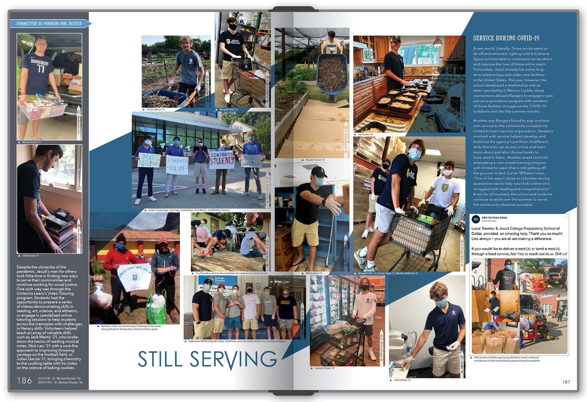
We also incorporated a thin sidebar along the right side of every spread because of that desire for consistency. That consistent sidebar ended up providing for an interesting & unexpected opportunity mid-year when everything got turned upside-down — and so, for our pages covering the impact of Covid in the spring of 2020, we reversed the template and placed the sidebar for those spreads on the left side.
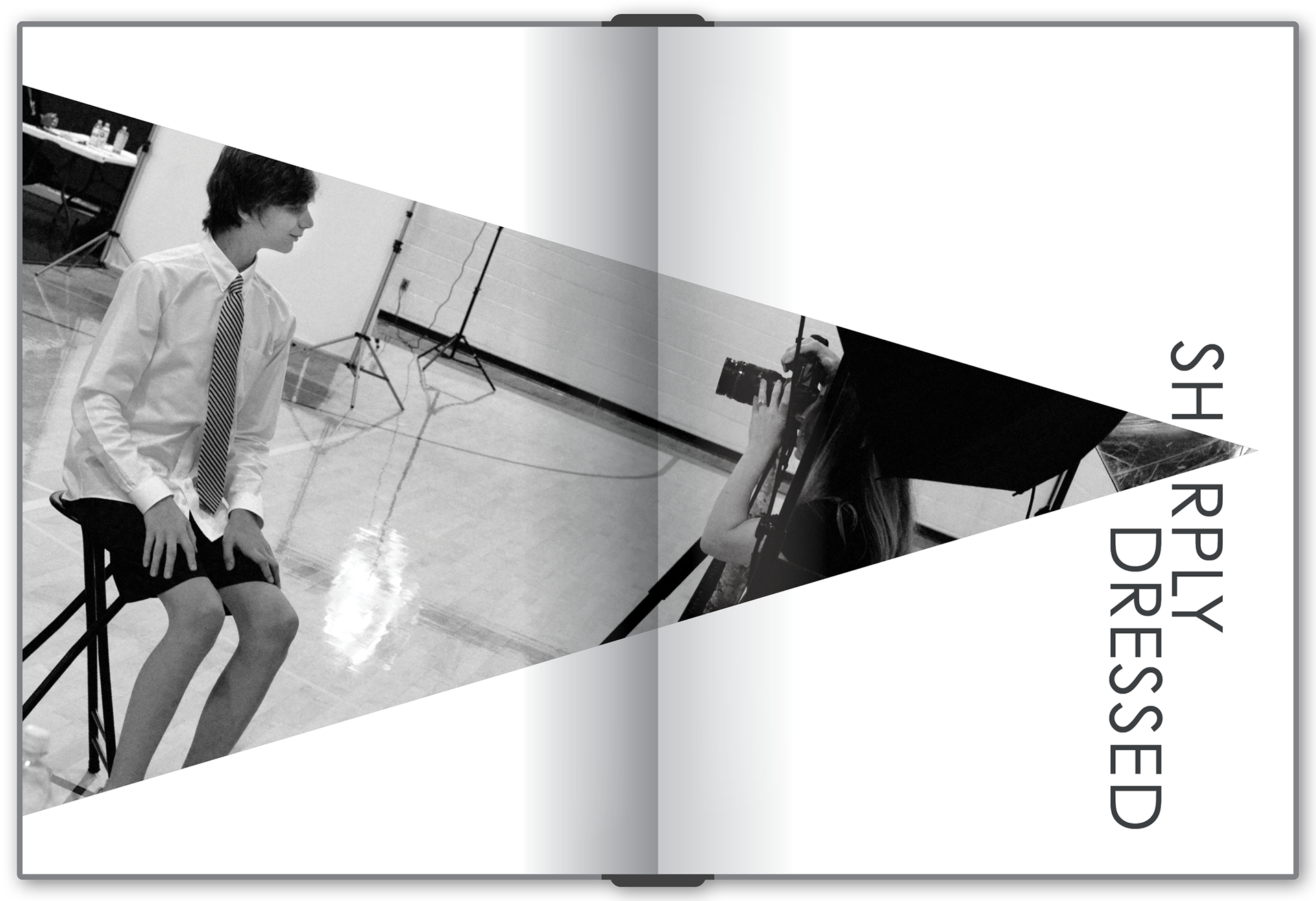
Portraits Section Division Spread
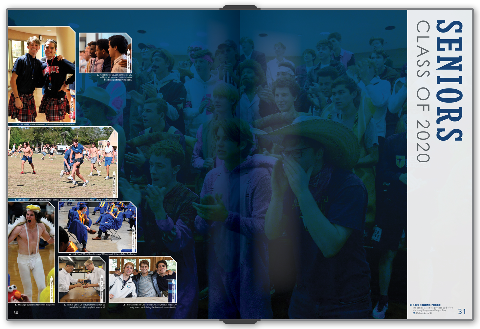
Senior Portraits Division Spread
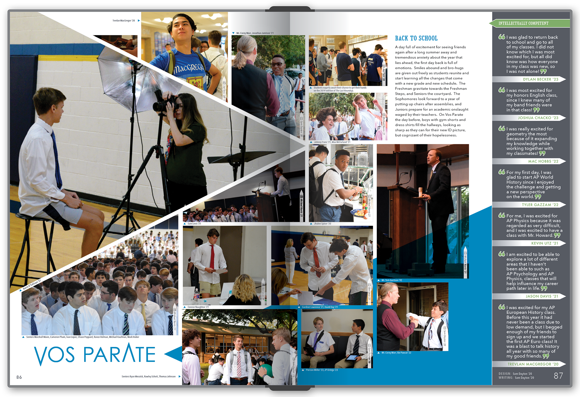
"Back to School" Spread
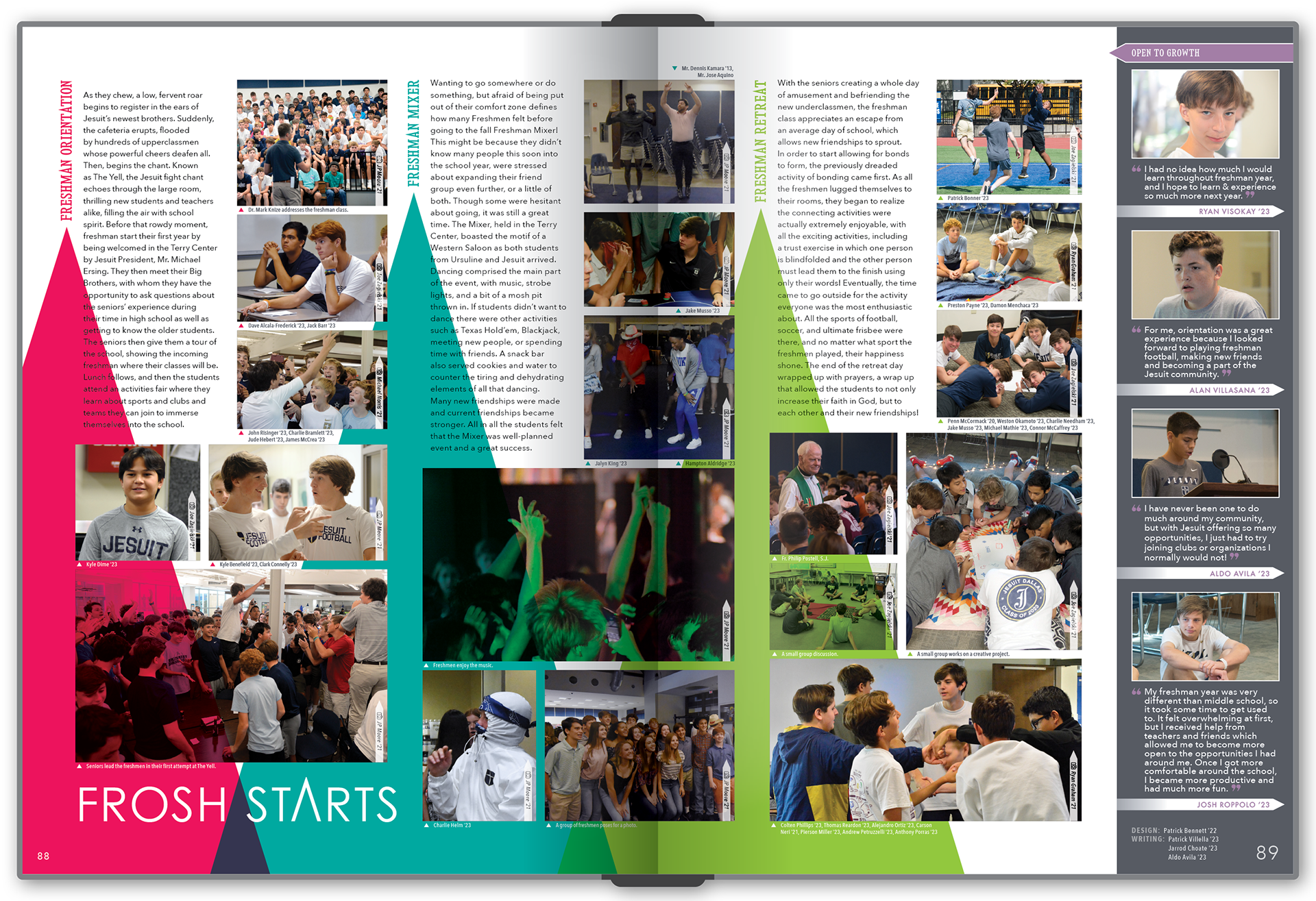
"Freshman Experience" Spread
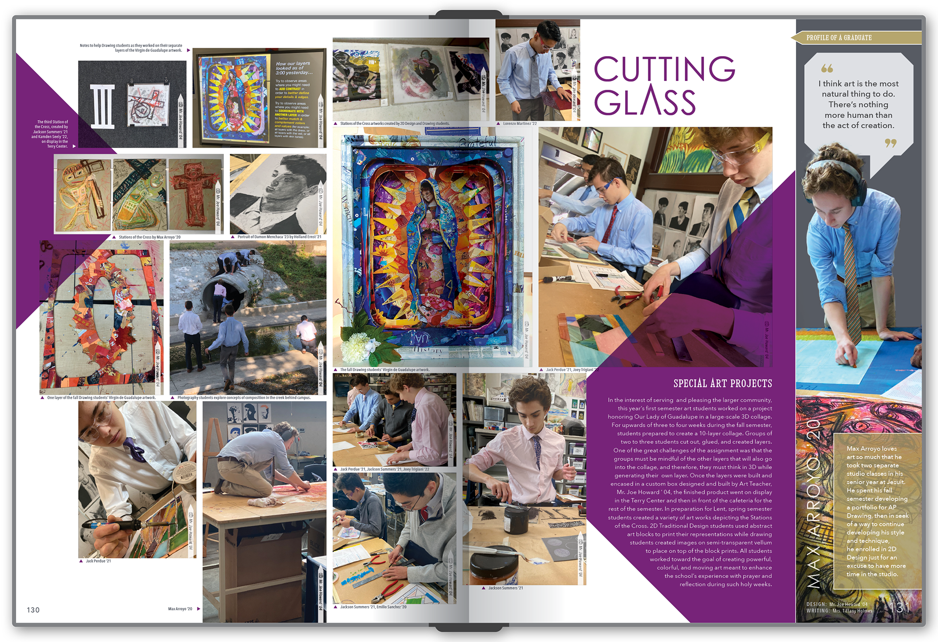
"Art Classes" Spread
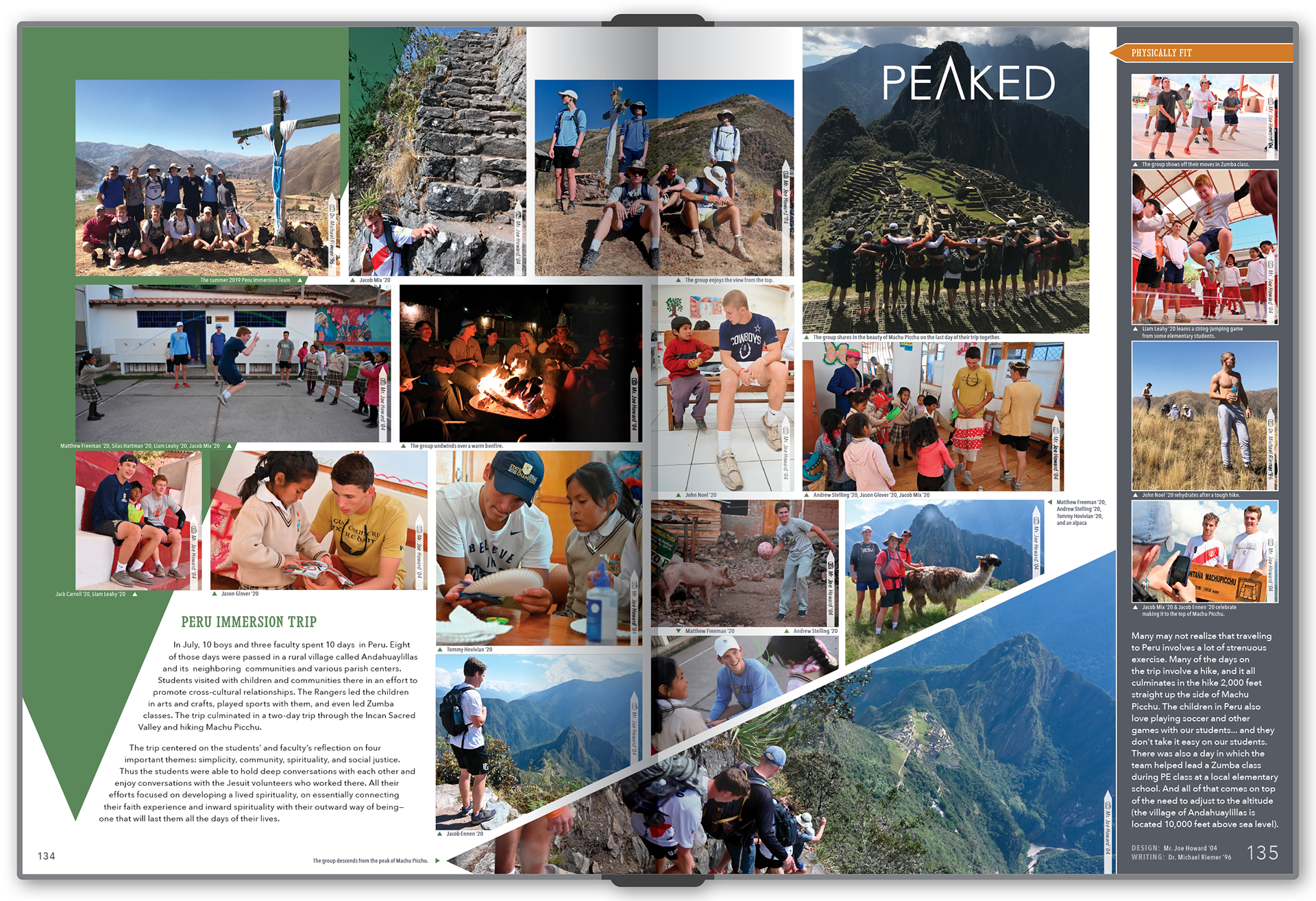
"Peru Trip" Spread
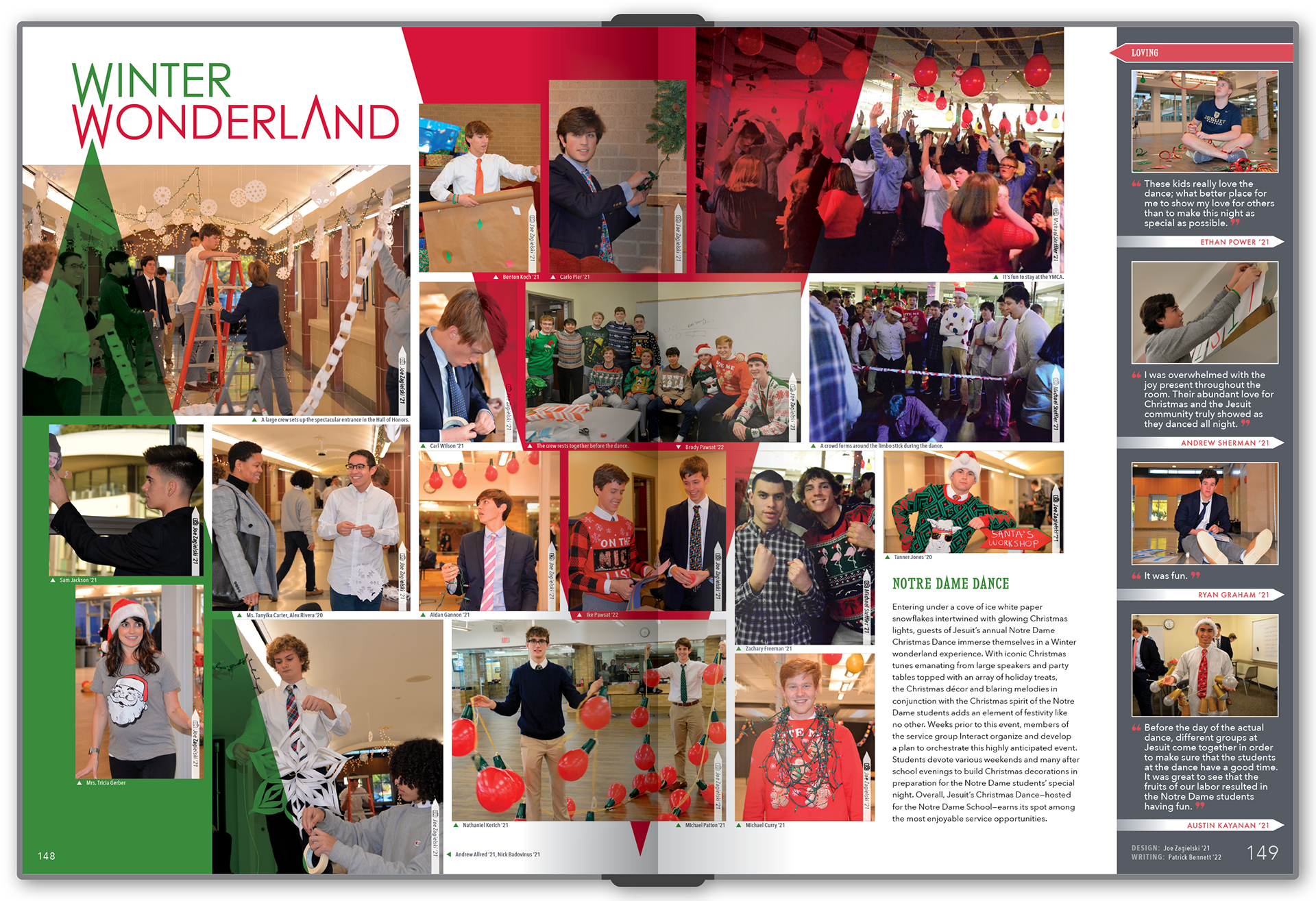
"Winter Dance" Spread
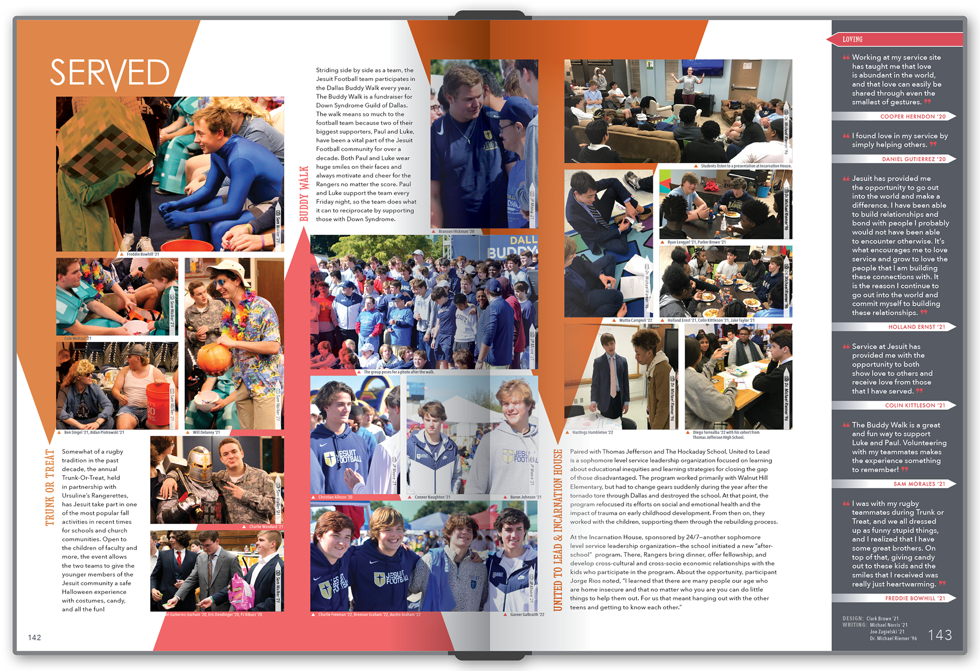
"Community Service Spread"
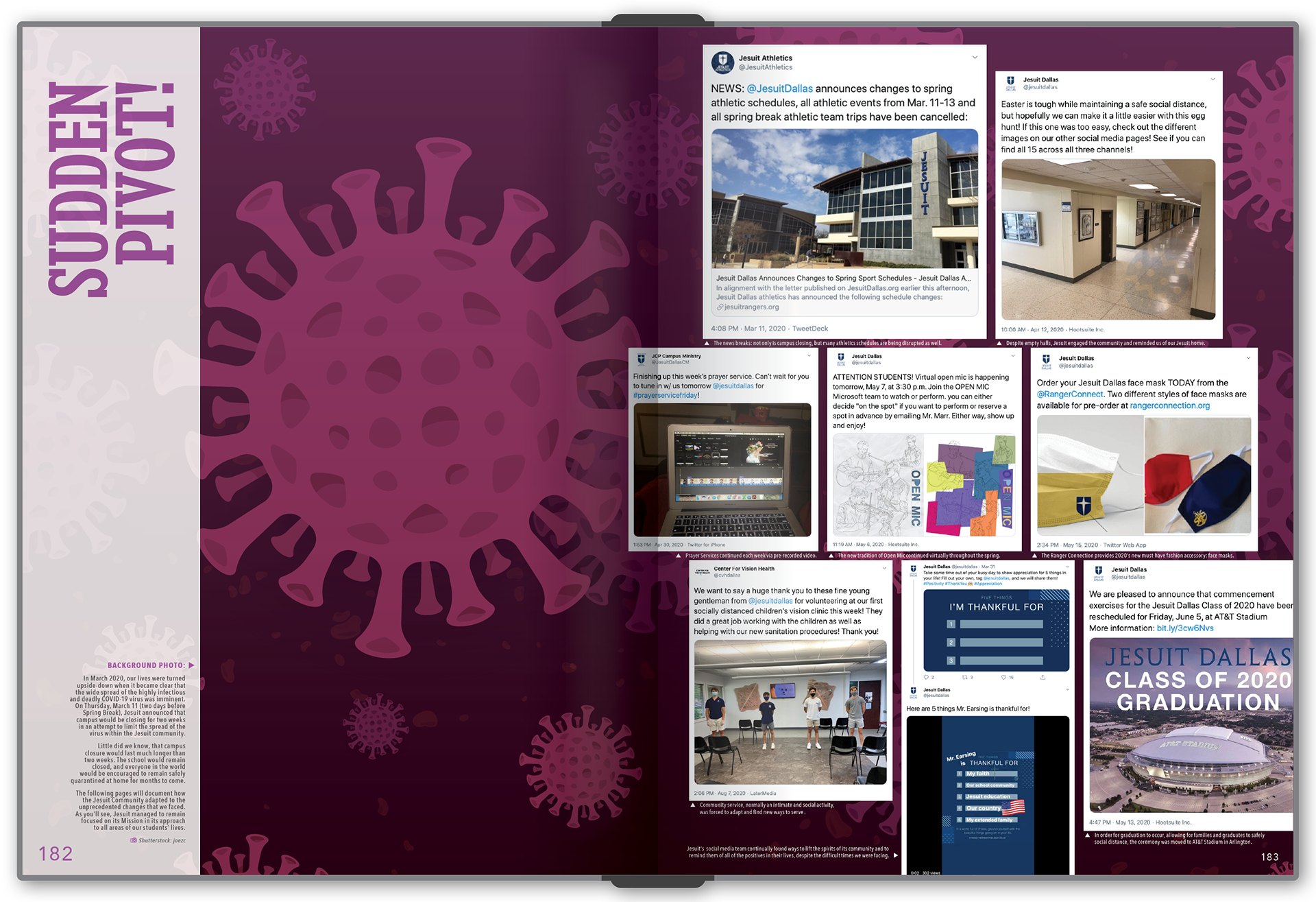
Covid Section Division Spread (with reversed orientation)