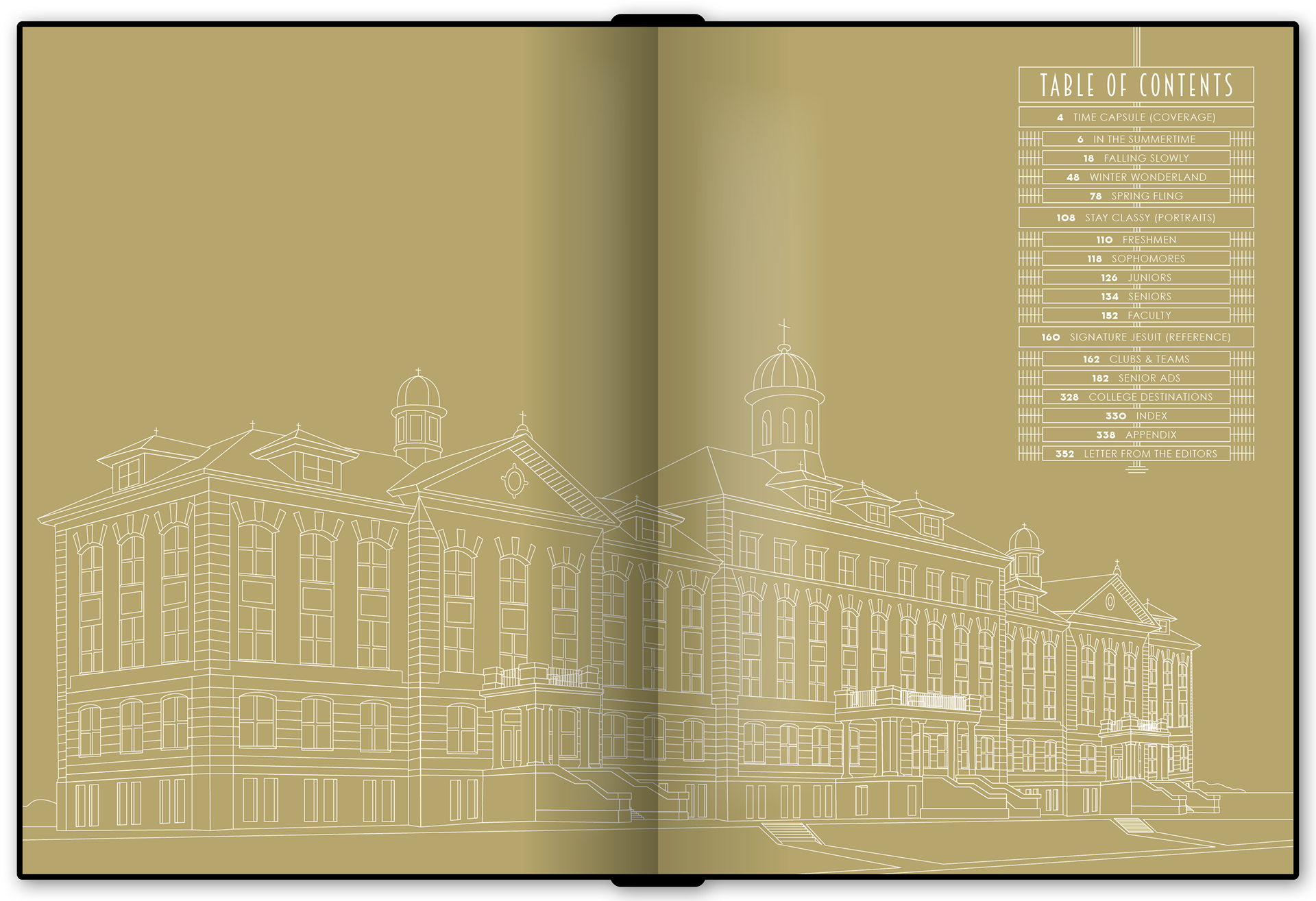
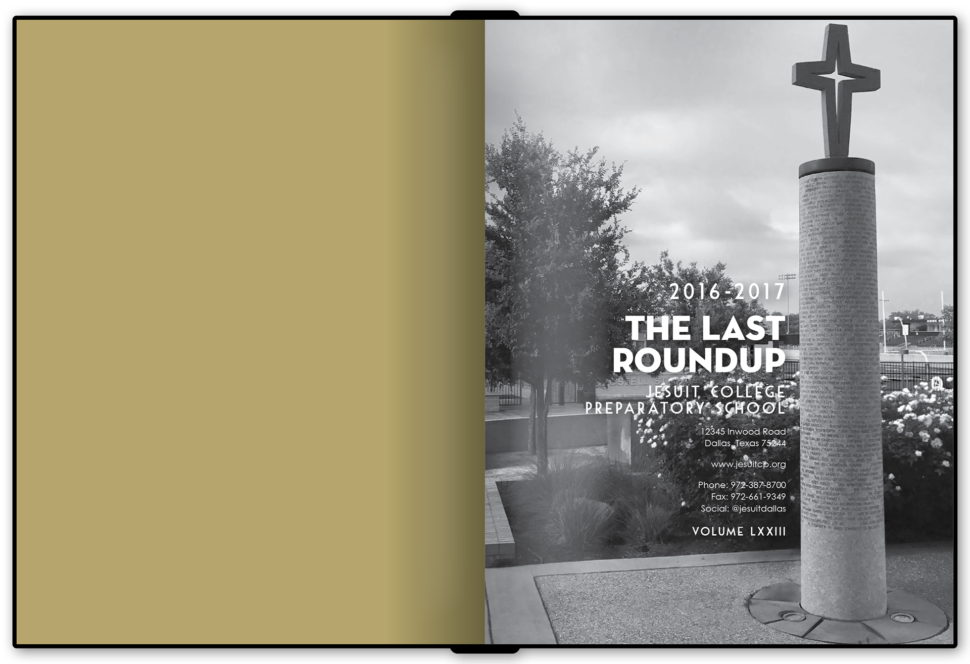
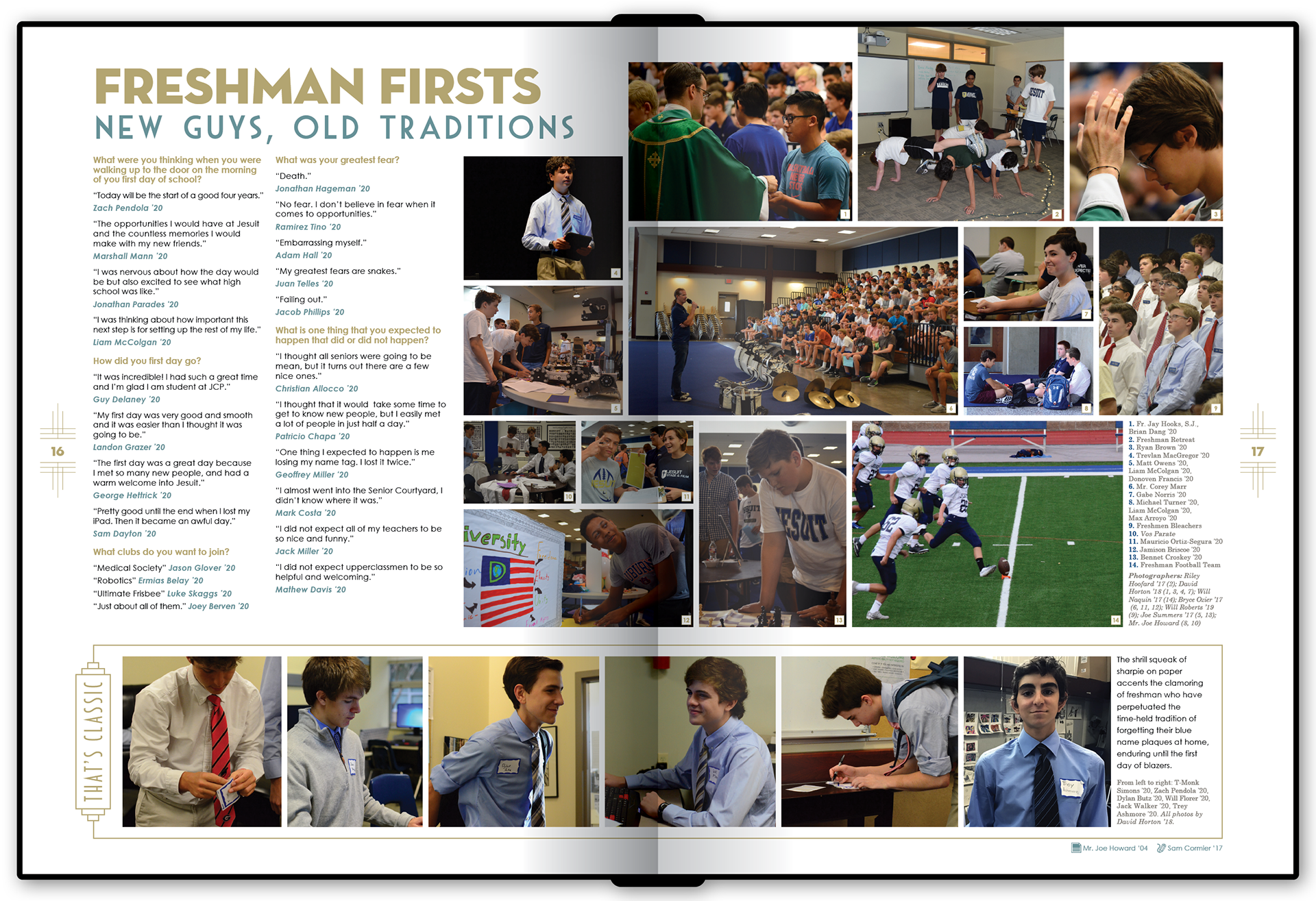
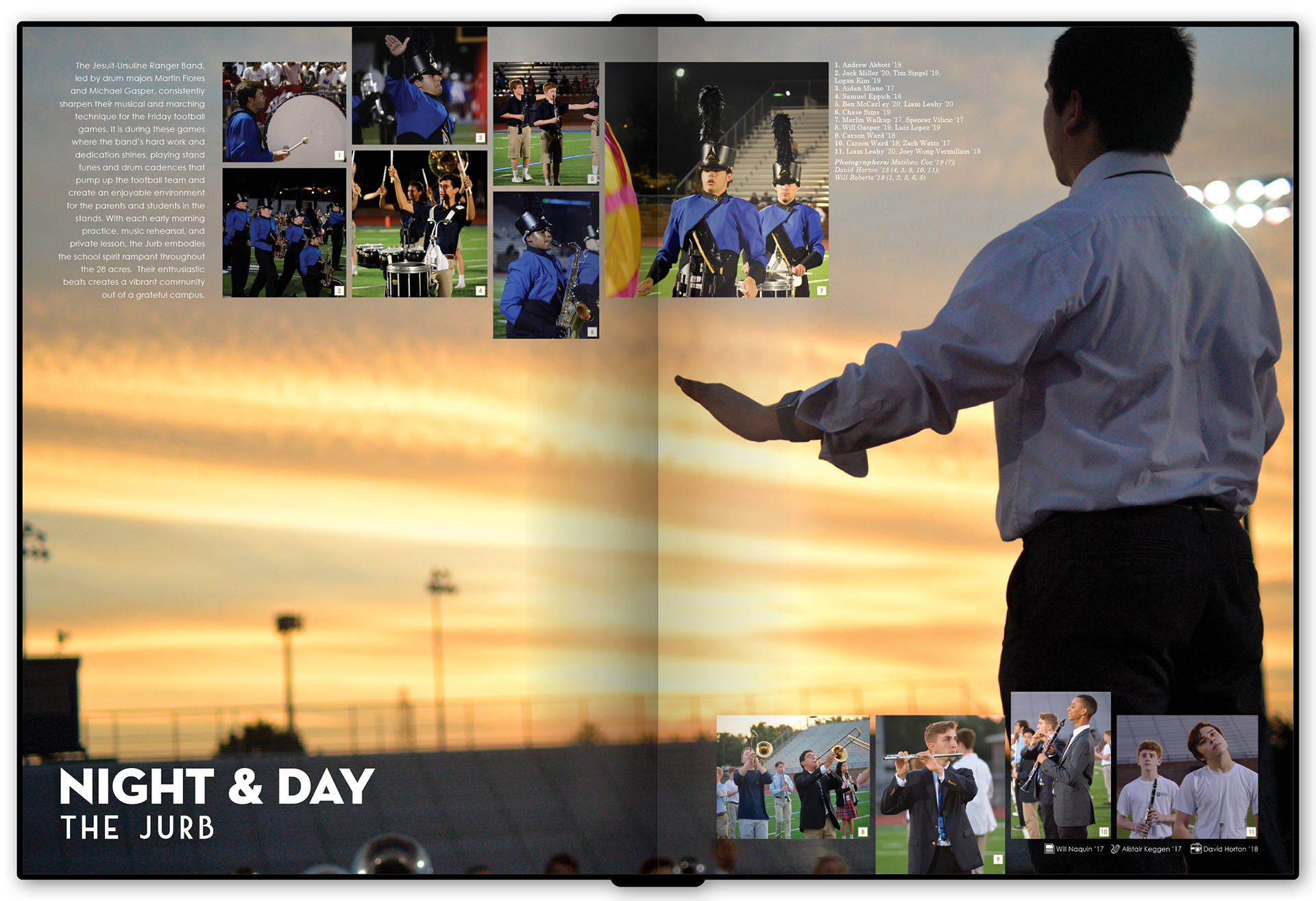
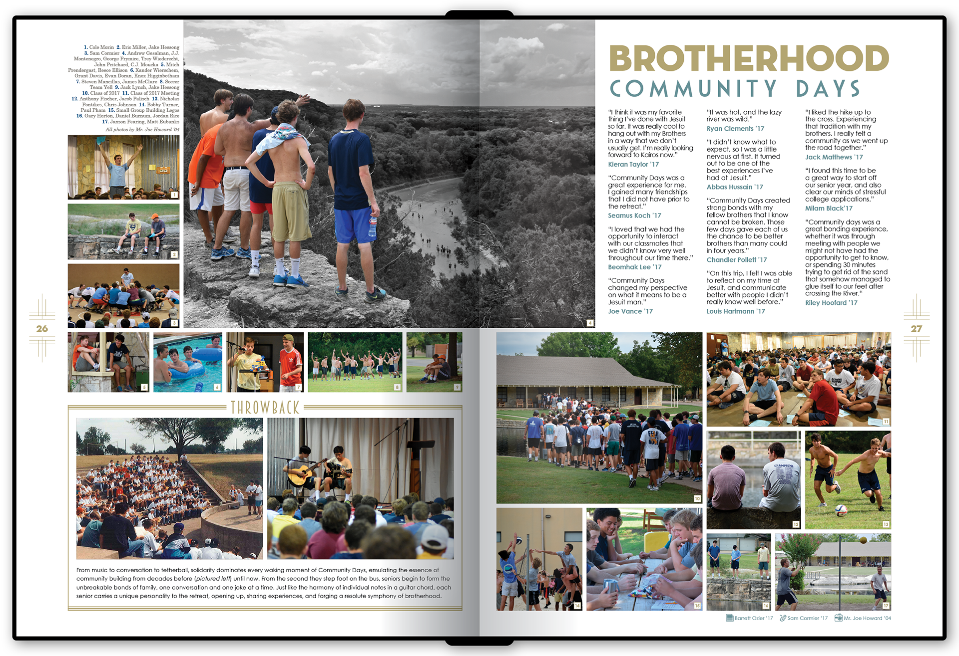
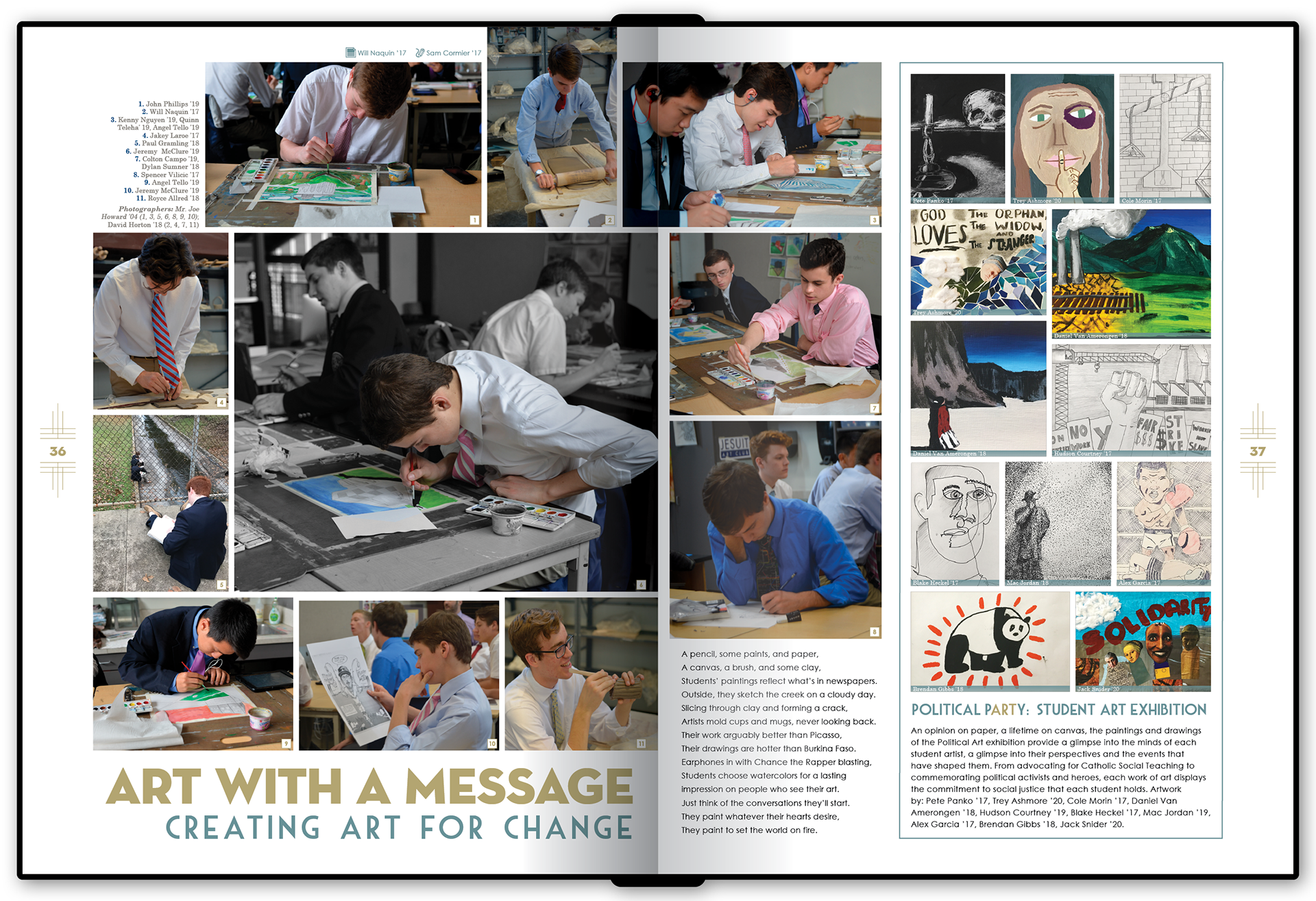
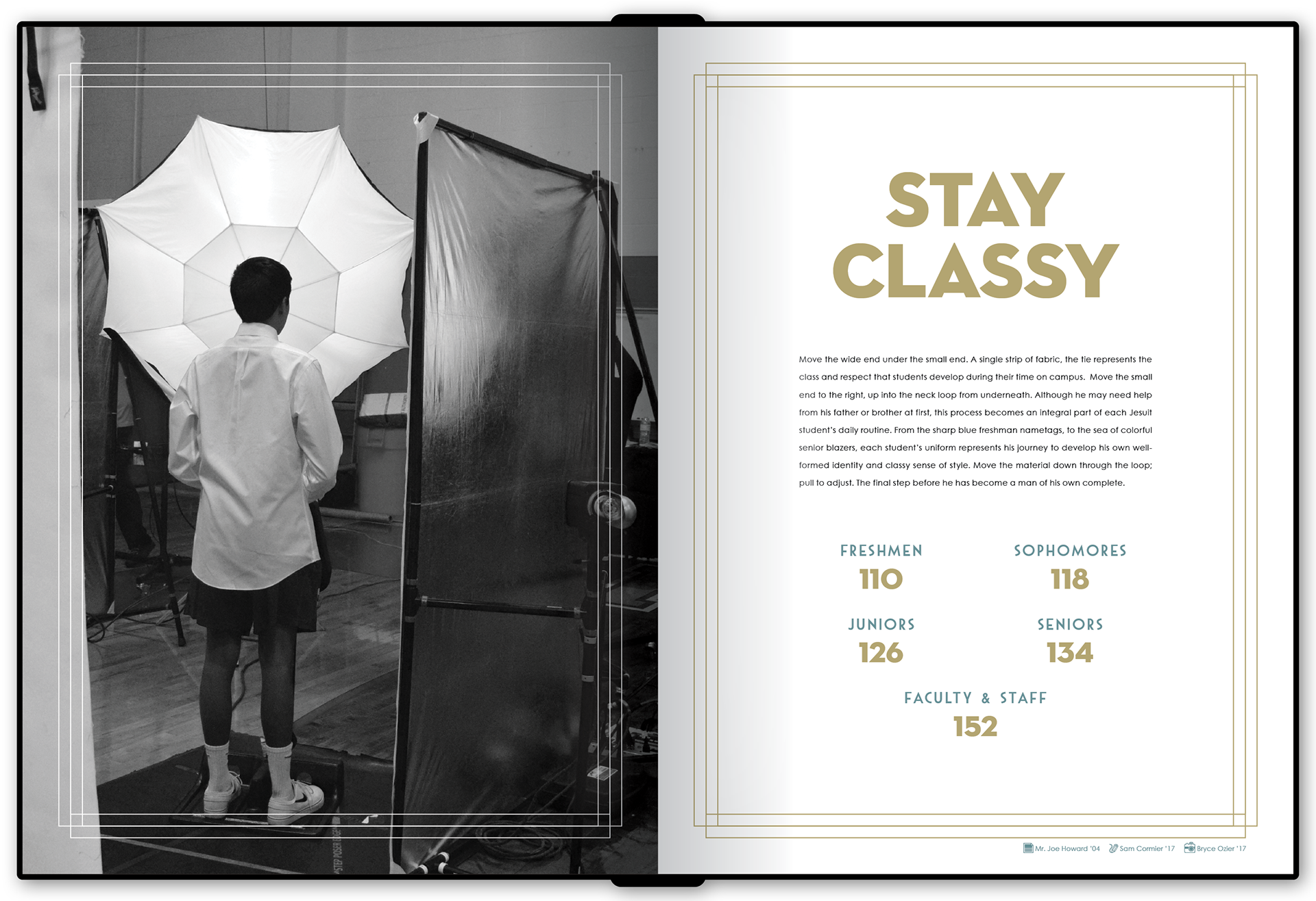
My first year as Yearbook Moderator happened to fall on a milestone anniversary year for the school, so as a staff, we wanted to highlight Jesuit’s 75 years by creating a book that felt “classy” and timeless. Ultimately, that led us toward developing a look inspired by Art Deco (which also inspired the school’s 50th anniversary book 25 years earlier).
That meant using a lot of gold & turquoise, graphic patterns, and even some black & white photography. We also developed modules to be used throughout the book that would emphasize long-standing traditions at the school by making use of archival photos for comparison to the modern event coverage.
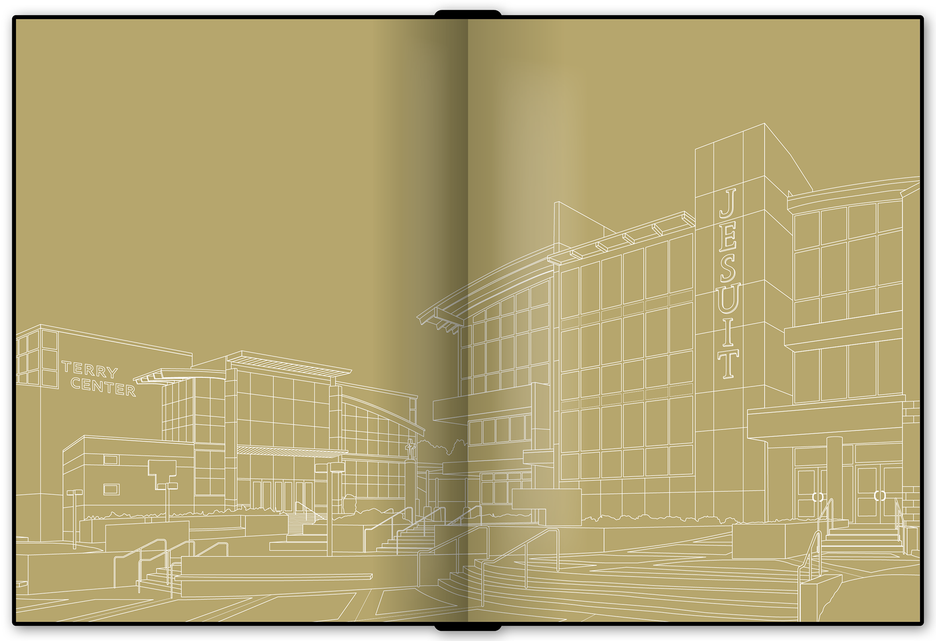
The endpages (seen below) were printed using metallic gold ink, and incorporated detailed vector illustrations that I made of the school's original campus (in the front of the book) and current campus (in the back of the book).
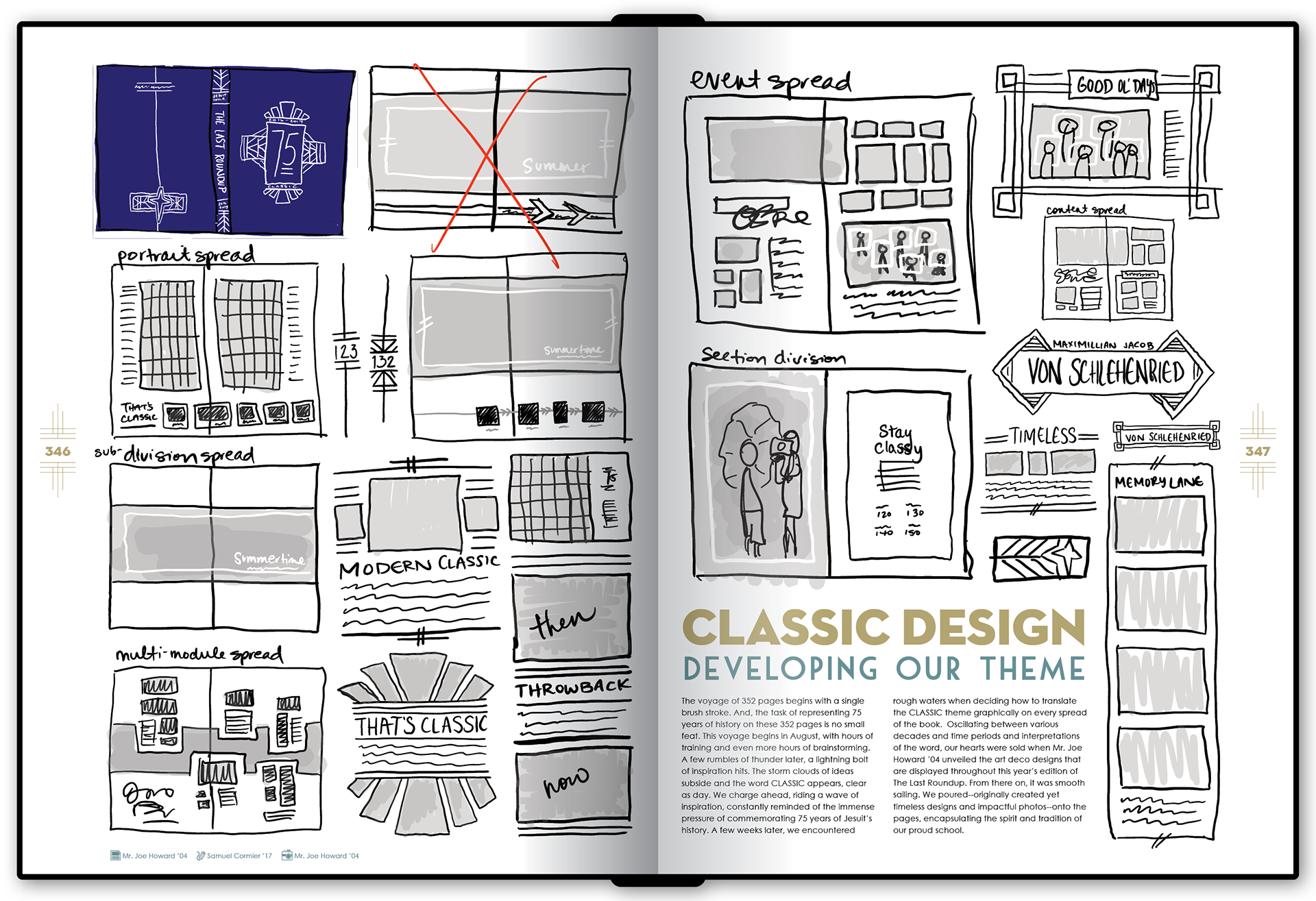
Additionally, toward the end of the book, I created a couple of pages explaining how the theme was developed, including some of the preliminary sketching & thumb nailing that was done to try to determine the visual direction of the book.
One highlight for me was the cover, which made use of a thermochromic UV coating, so it appeared as a solid black until exposed to sunlight, at which point an image of the current & original school buildings appeared.
