

When I was hired at Jesuit Dallas to serve as the Digital Communications Specialist, the primary focus of my role was the school's web site and social media. However, because of my background in graphic design, I own began to take on other responsibilities as well – first, leading the creation of various print & collateral needs for the school (posters, brochures, mailers, etc.), and eventually taking over the design of the school's alumni magazine which had, until that point, been entirely outsourced for decades.
During my tenure as the graphic designer for the school, I took the Jesuit Today magazine from an inconsistent & bare-boned 24-page magazine to a hefty 60-page publication that was much more aligned with the visual brand of the school (including a new "logo" for the magazine). I'm proud to say that, while it's been nearly a decade since my last issue designing the publication, the majority of the templates and style decisions I made in my three years working on it are still being used by the staff designer today.
In the summer of 2013, the school became interested in releasing a special publication highlighting the various donations that the school had received in the past fiscal year, so I spearheaded the effort to create the school's first comprehensive annual Impact Report – essentially a third issue of the magazine – full of lists, charts, and other infographics. Like the Jesuit Today, the overall design of the annual Impact Report that I developed in 2013 is still being used by the school today.
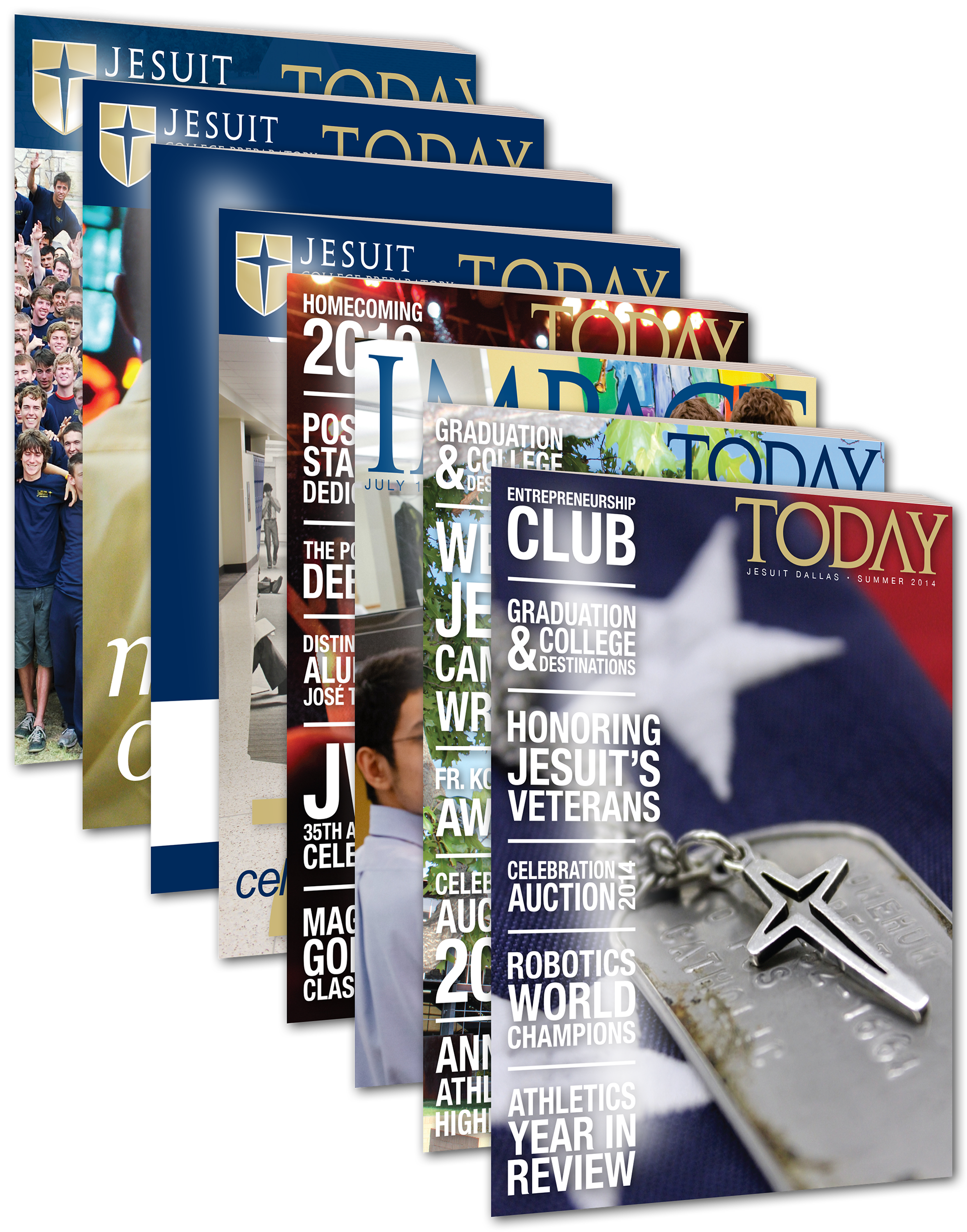
Below, you can see some of the highlights from the six issues (and two impact reports) I created before shifting to my new role in August 2014.
— — — — — — — — — — —
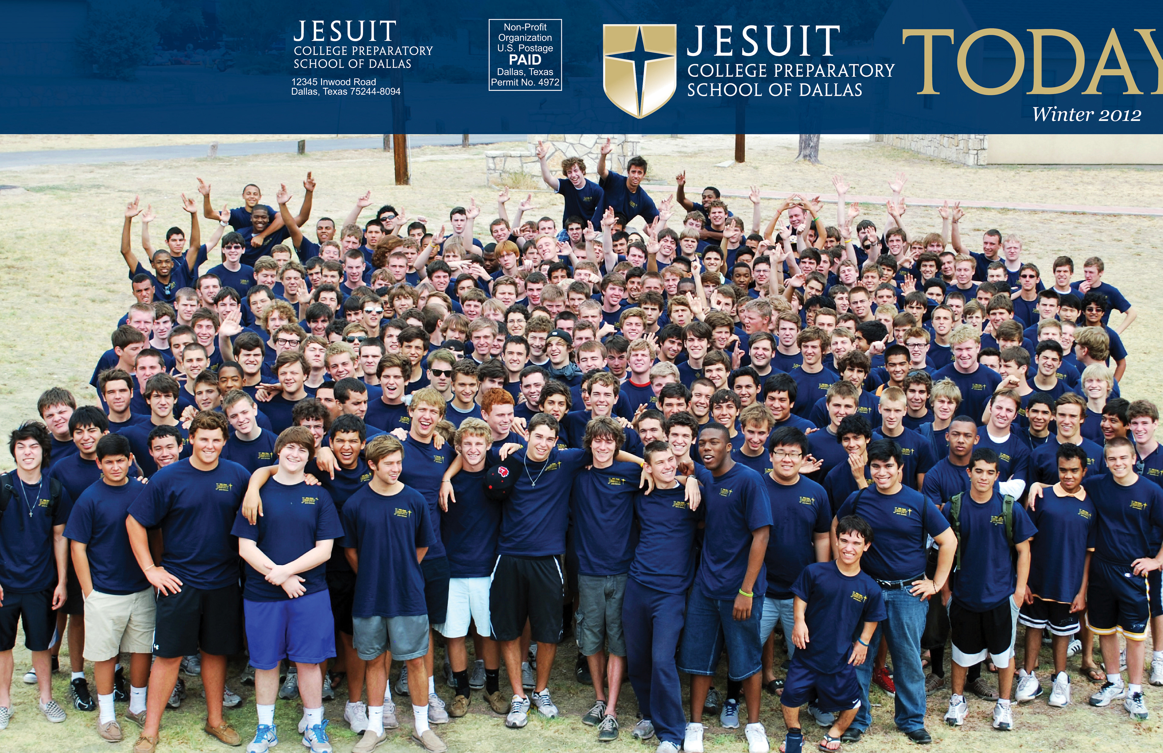
Winter 2012
My first step into designing for the magazine was just a cover – the school's Director of Communications wanted to reimagine the look of the cover for the first time since the school's major rebrand a few years prior. In addition to attempting make the "logo" more consistent (it's positioning and appearance would change from issue to issue), she also wanted to create a "special edition poster" with an image of the senior class that wrapped around to the back. As you'll see, my first couple of issues weren't a major departure from the magazine as it had existed before (other than a playful choice to intentionally bleed the "Y" off the edge of the page), but the introduction of a consistent blue bar across the top helped to visually connect the new Jesuit logo with the "Today" on the magazine's title.
— — — — — — — — — — —
Summer 2012
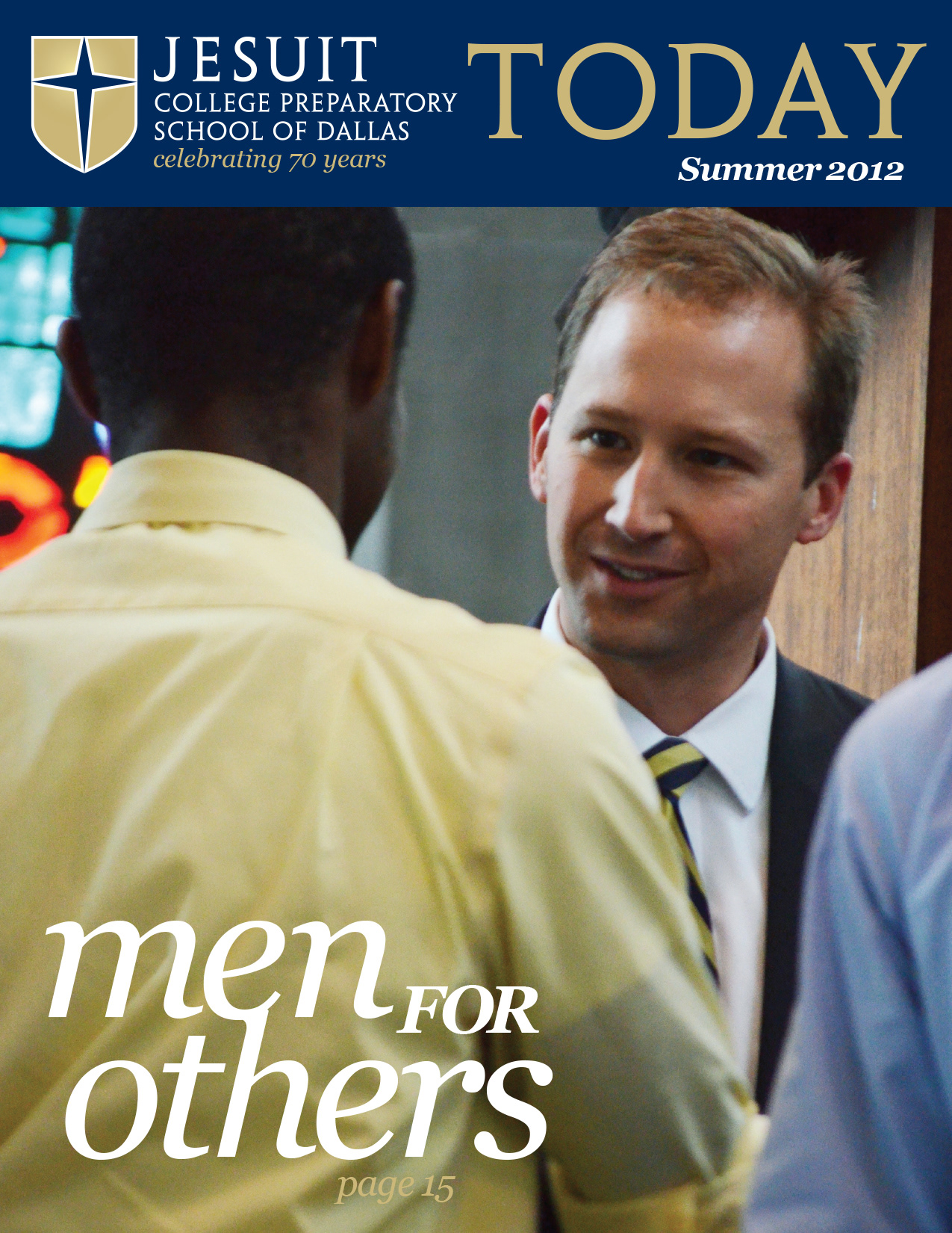
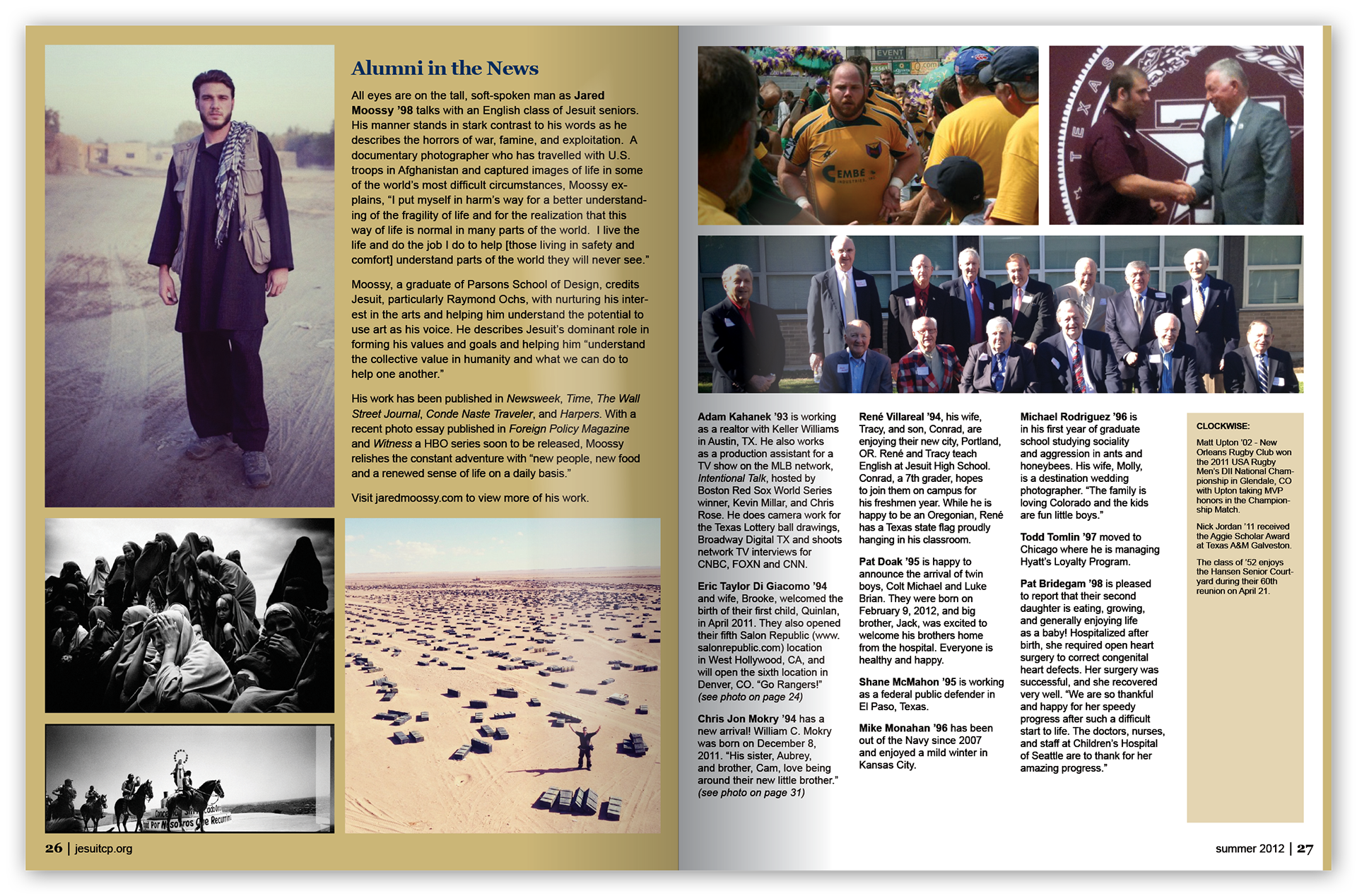
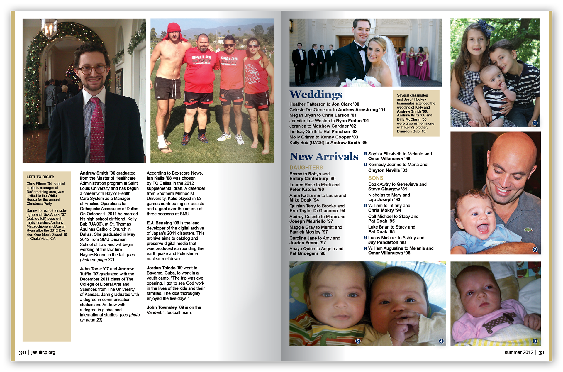
My first full issue of the magazine was also the first major overhaul of the organization and appearance of the publication. For one thing, it was the first issue to increase the number of pages from 24 (this time to 36 pages).
Some of the primary areas of change were the layout of the inside-front cover and title page, the visual appearance of the cover story, and the class notes section.
The front cover maintained consistency with the previous issue, utilizing the new blue bar in order to visually connect the school's logo with the magazine title (although this time, the word "Today" did not bleed off of the page).
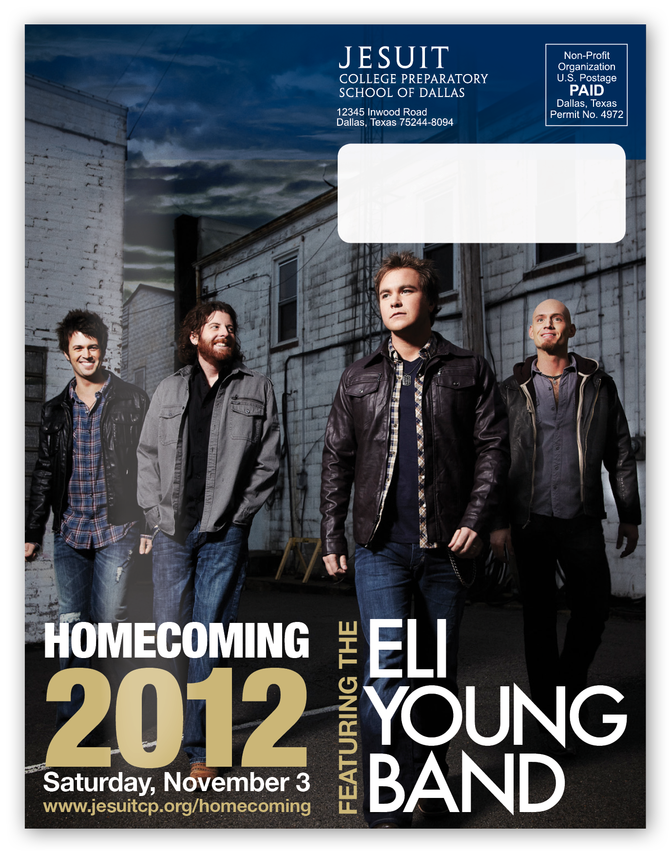
On the back cover, the space was used as an ad for the school's upcoming homecoming concert (for parents & alumni) featuring the Eli Young Band.
— — — — — — — — — — —
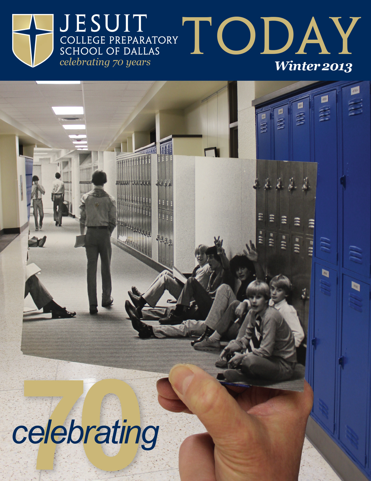
Winter 2013
My first full issue of the magazine was also the first major overhaul of the organization and appearance of the publication. For one thing, it was the first issue to increase the number of pages from 24 (this time to 36 pages).
Some of the primary areas of change were the layout of the inside-front cover and title page, the visual appearance of the cover story, and the class notes section.
The front cover maintained consistency with the previous issue, utilizing the new blue bar in order to visually connect the school's logo with the magazine title (although this time, the word "Today" did not bleed off of the page).
On the back cover, the space was used as an ad for the school's upcoming homecoming concert (for parents & alumni) featuring the Eli Young Band.
— — — — — — — — — — —
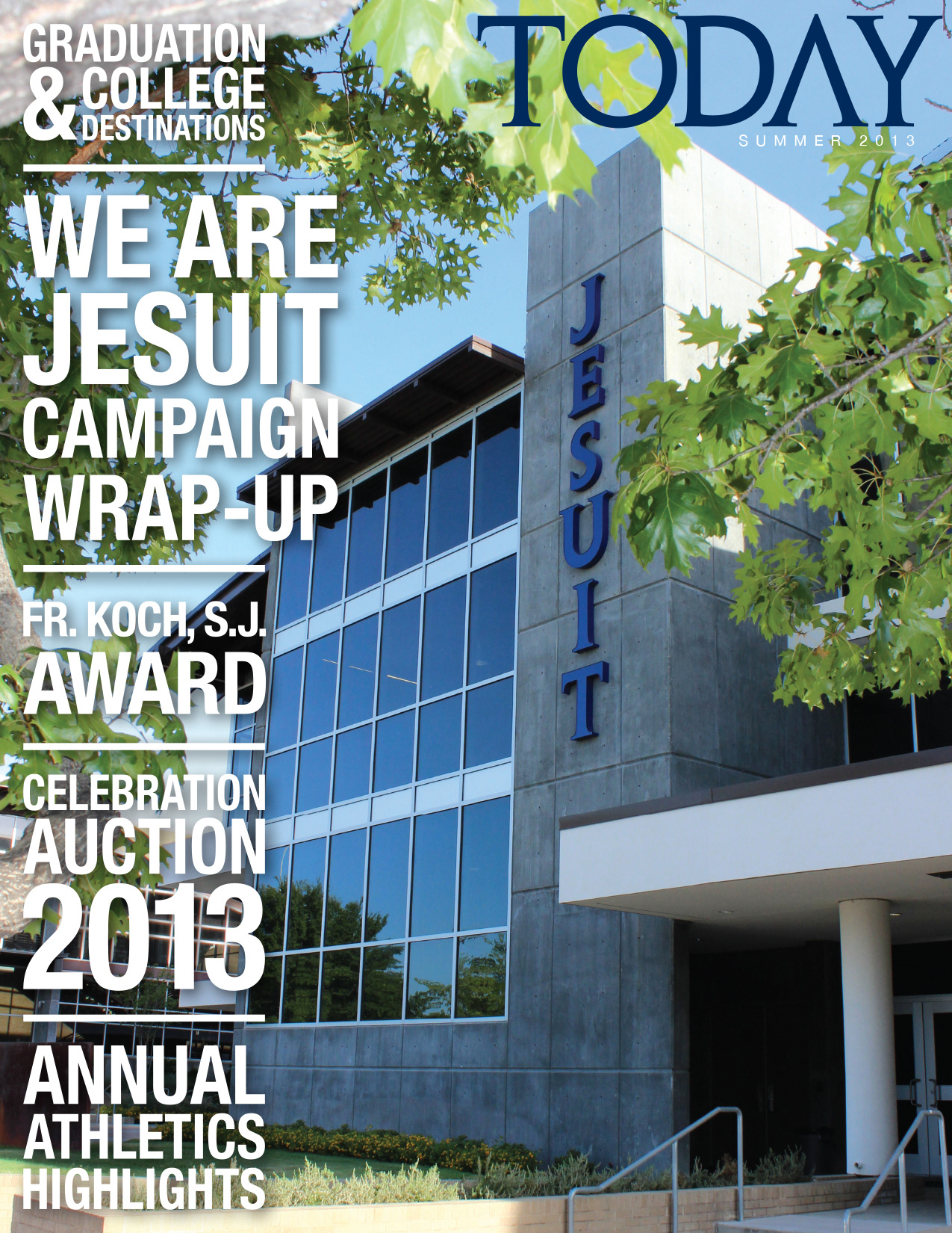
Summer 2013
My first full issue of the magazine was also the first major overhaul of the organization and appearance of the publication. For one thing, it was the first issue to increase the number of pages from 24 (this time to 36 pages).
Some of the primary areas of change were the layout of the inside-front cover and title page, the visual appearance of the cover story, and the class notes section.
The front cover maintained consistency with the previous issue, utilizing the new blue bar in order to visually connect the school's logo with the magazine title (although this time, the word "Today" did not bleed off of the page).
On the back cover, the space was used as an ad for the school's upcoming homecoming concert (for parents & alumni) featuring the Eli Young Band.
— — — — — — — — — — —
2012-13 Impact Report
My first full issue of the magazine was also the first major overhaul of the organization and appearance of the publication. For one thing, it was the first issue to increase the number of pages from 24 (this time to 36 pages).
Some of the primary areas of change were the layout of the inside-front cover and title page, the visual appearance of the cover story, and the class notes section.
The front cover maintained consistency with the previous issue, utilizing the new blue bar in order to visually connect the school's logo with the magazine title (although this time, the word "Today" did not bleed off of the page).
On the back cover, the space was used as an ad for the school's upcoming homecoming concert (for parents & alumni) featuring the Eli Young Band.

— — — — — — — — — — —
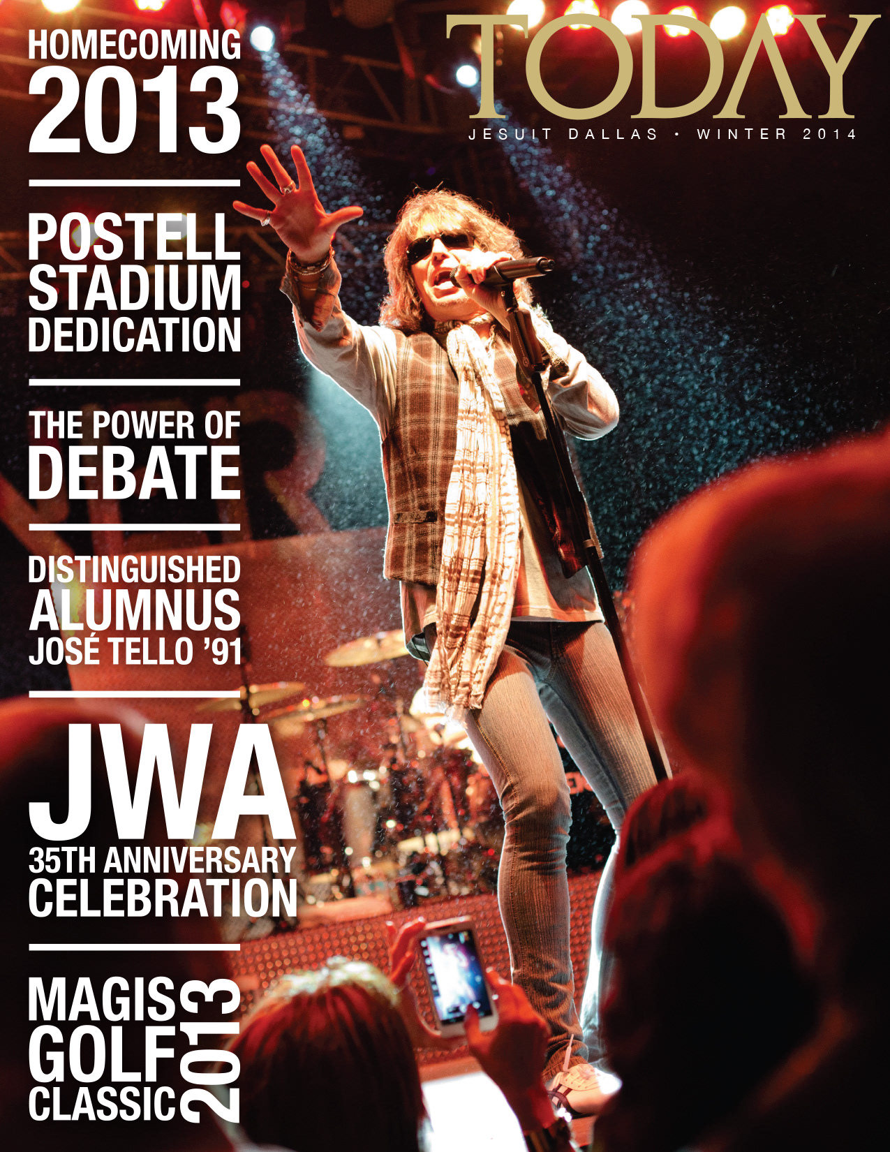
Winter 2014
My first full issue of the magazine was also the first major overhaul of the organization and appearance of the publication. For one thing, it was the first issue to increase the number of pages from 24 (this time to 36 pages).
Some of the primary areas of change were the layout of the inside-front cover and title page, the visual appearance of the cover story, and the class notes section.
The front cover maintained consistency with the previous issue, utilizing the new blue bar in order to visually connect the school's logo with the magazine title (although this time, the word "Today" did not bleed off of the page).
On the back cover, the space was used as an ad for the school's upcoming homecoming concert (for parents & alumni) featuring the Eli Young Band.
— — — — — — — — — — —
Summer 2014
My first full issue of the magazine was also the first major overhaul of the organization and appearance of the publication. For one thing, it was the first issue to increase the number of pages from 24 (this time to 36 pages).
Some of the primary areas of change were the layout of the inside-front cover and title page, the visual appearance of the cover story, and the class notes section.
The front cover maintained consistency with the previous issue, utilizing the new blue bar in order to visually connect the school's logo with the magazine title (although this time, the word "Today" did not bleed off of the page).
On the back cover, the space was used as an ad for the school's upcoming homecoming concert (for parents & alumni) featuring the Eli Young Band.

— — — — — — — — — — —
2013-14 Impact Report
My first full issue of the magazine was also the first major overhaul of the organization and appearance of the publication. For one thing, it was the first issue to increase the number of pages from 24 (this time to 36 pages).
Some of the primary areas of change were the layout of the inside-front cover and title page, the visual appearance of the cover story, and the class notes section.
The front cover maintained consistency with the previous issue, utilizing the new blue bar in order to visually connect the school's logo with the magazine title (although this time, the word "Today" did not bleed off of the page).
On the back cover, the space was used as an ad for the school's upcoming homecoming concert (for parents & alumni) featuring the Eli Young Band.