Ballistic Triage Mobile Product Design
The Problem
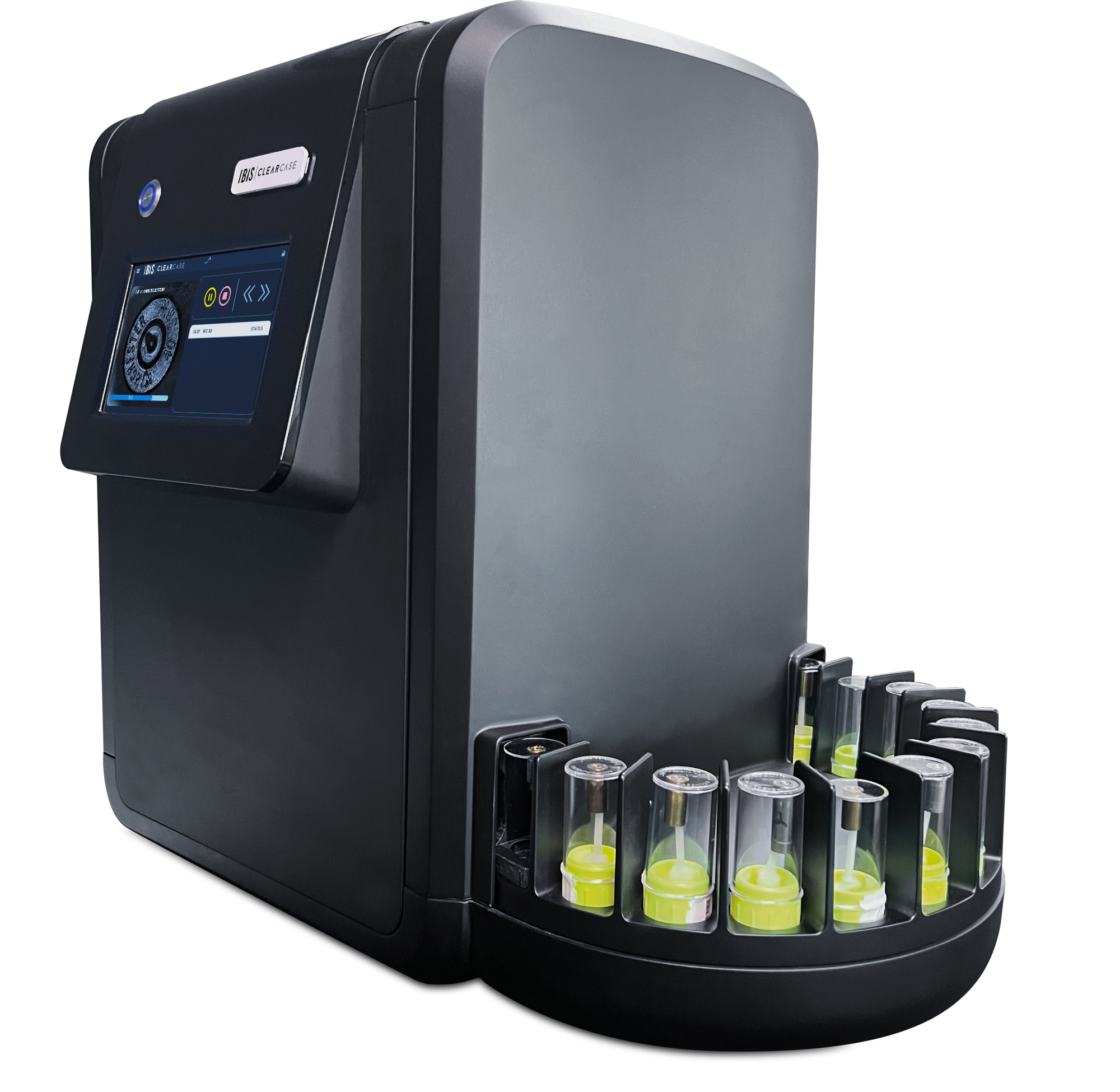
ClearCase was LeadsOnline's first mobile product, built to help crime scene investigators capture and track ballistic evidence in the field and in forensic labs. By the time I joined the project, the core app and general workflow were already functional, but the interface was still a developer-built foundation: the necessary text, fields, and buttons were there, with little visual hierarchy or interaction design beyond default components.
The goal sounded simple: keep the app stripped back enough that a CSI could use it quickly without complex training. In practice, that became the central challenge. As we worked through real tasks like creating a case, adding exhibits, pairing physical evidence, tracking processing, and reviewing results, workflows that seemed simple on paper kept revealing new states, exceptions, and information needs.
The Approach
I worked primarily with the product manager, translating requirements into UI and iterating when the design exposed questions the original requirement had not accounted for. When the behavior of the machine itself mattered, I worked directly with engineers to understand what was happening behind the interface and what the app needed to communicate.
Because the underlying workflow already existed, I wasn't redesigning the product from scratch. My role was to turn a functioning but bare-bones application into a coherent mobile experience, establishing the first purpose-built UI for the product while refining individual processes as we learned more.
- 01Create Case
- 02Collect Exhibit
- 03Pair Evidence
- 04Monitor Processing
- 05Review Results
Building the Core Workflow
Case creation and evidence collection had to work at the pace of the user, not the pace of the technology. The interface asks for the information needed at each step, keeps location and photography close to the task, and connects individual exhibits back to the larger case. NFC pairing became the bridge between a physical evidence container and its digital record.
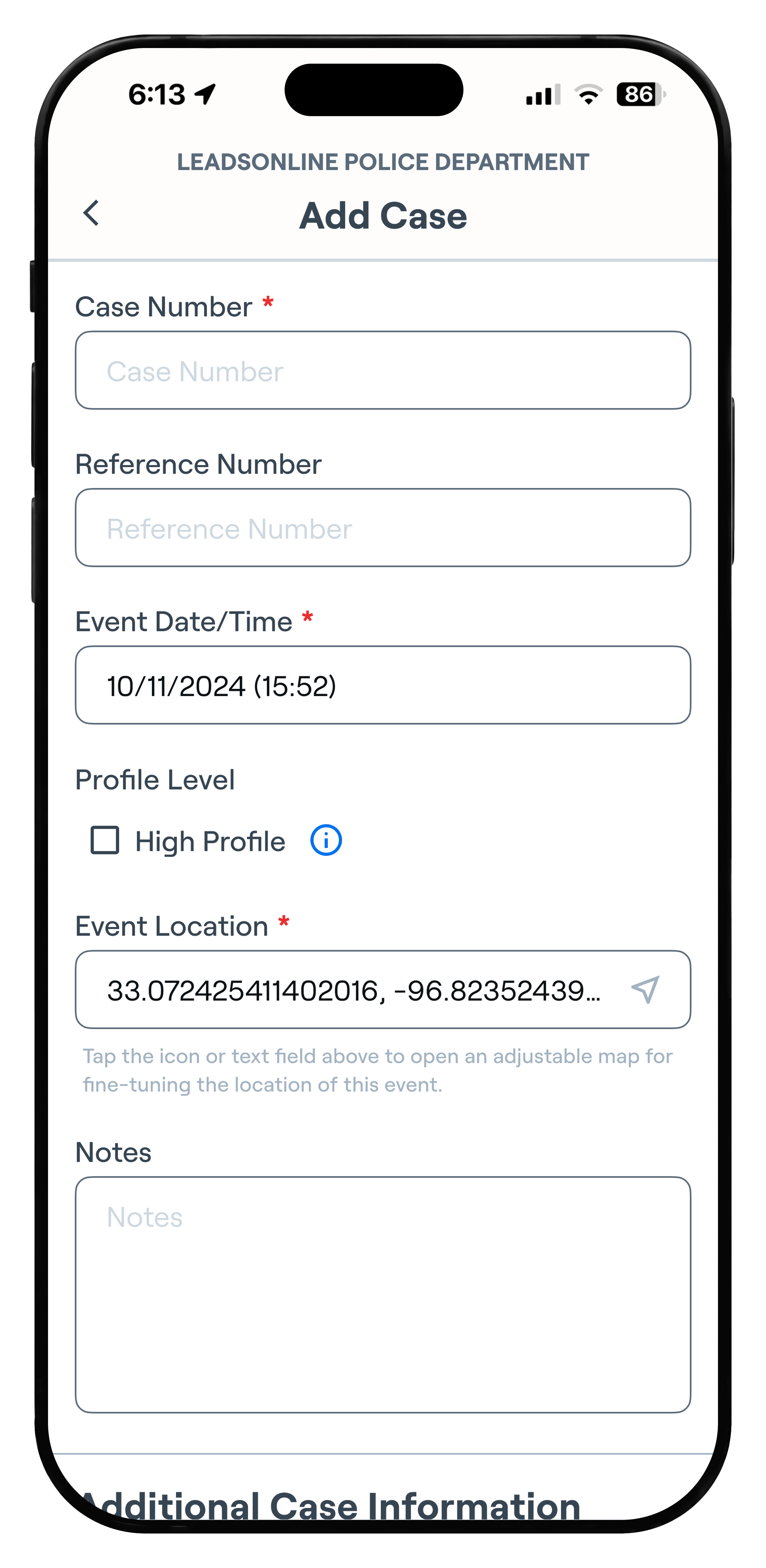
Establish the core record and location before evidence is added.
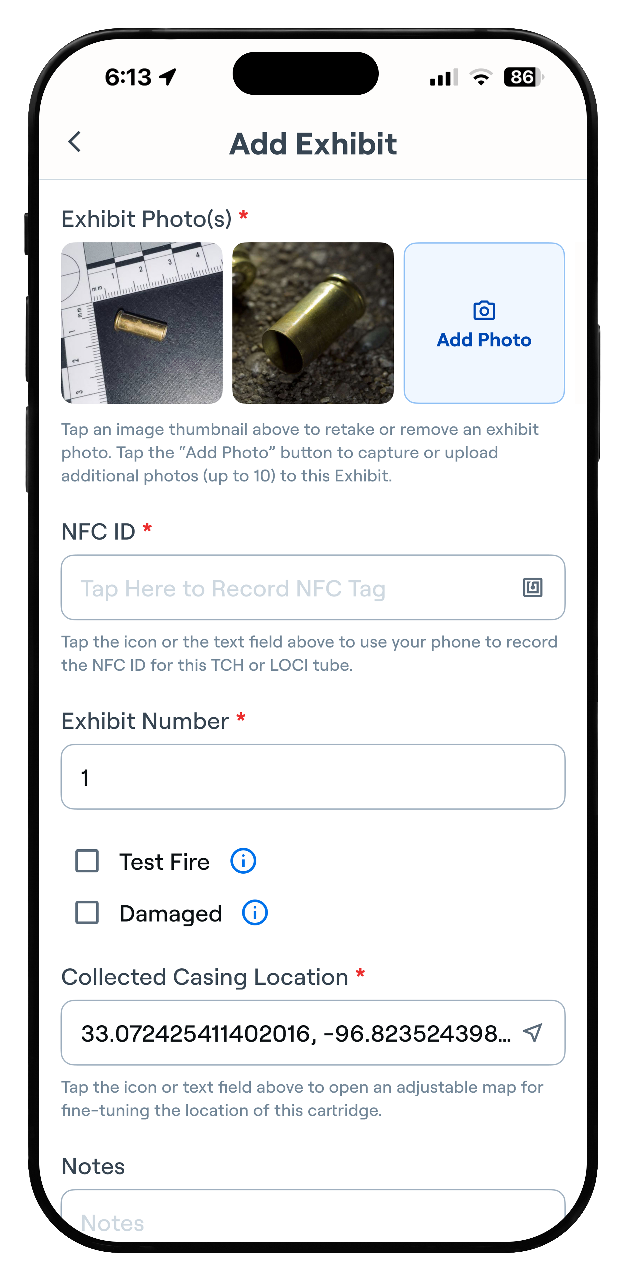
Capture photos, evidence details, and where the casing was collected.
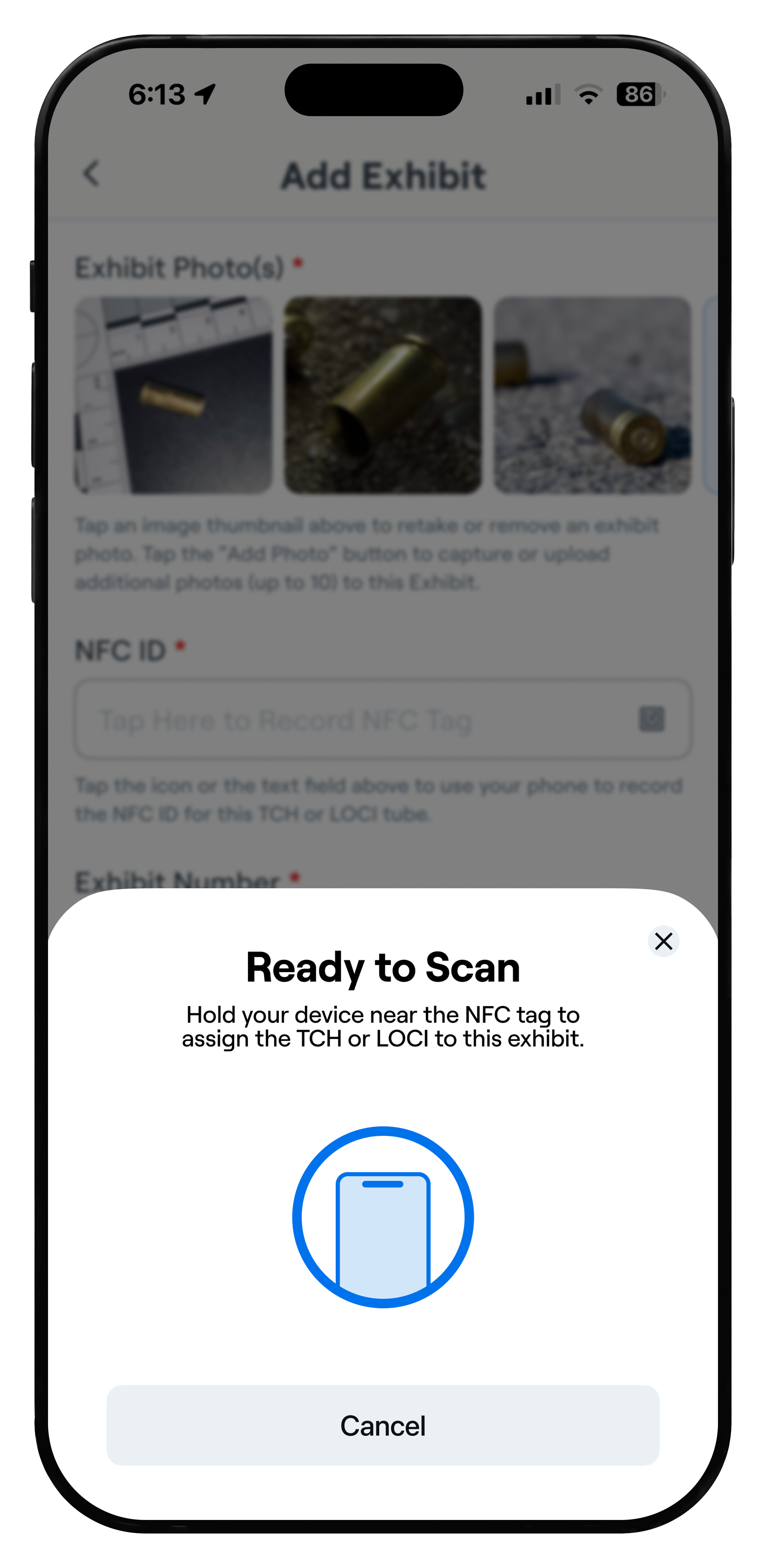
Use NFC scanning to connect the physical evidence container to the digital exhibit.
The more complex the workflow became, the more important it was for the interface to stay simple.
Status at a Glance
One of my first design tasks was creating an icon system for case and exhibit statuses. Color-vision deficiency was an important consideration for our user base, so status could not depend on color alone. Each state received a distinct icon, label, and supporting color treatment, making it easier to recognize quickly without requiring users to learn a color code.
That system became more valuable as the product grew. Users could distinguish collection, processing, acquisition, failure, and candidate states without opening every record, helping increasingly complex screens remain scannable.
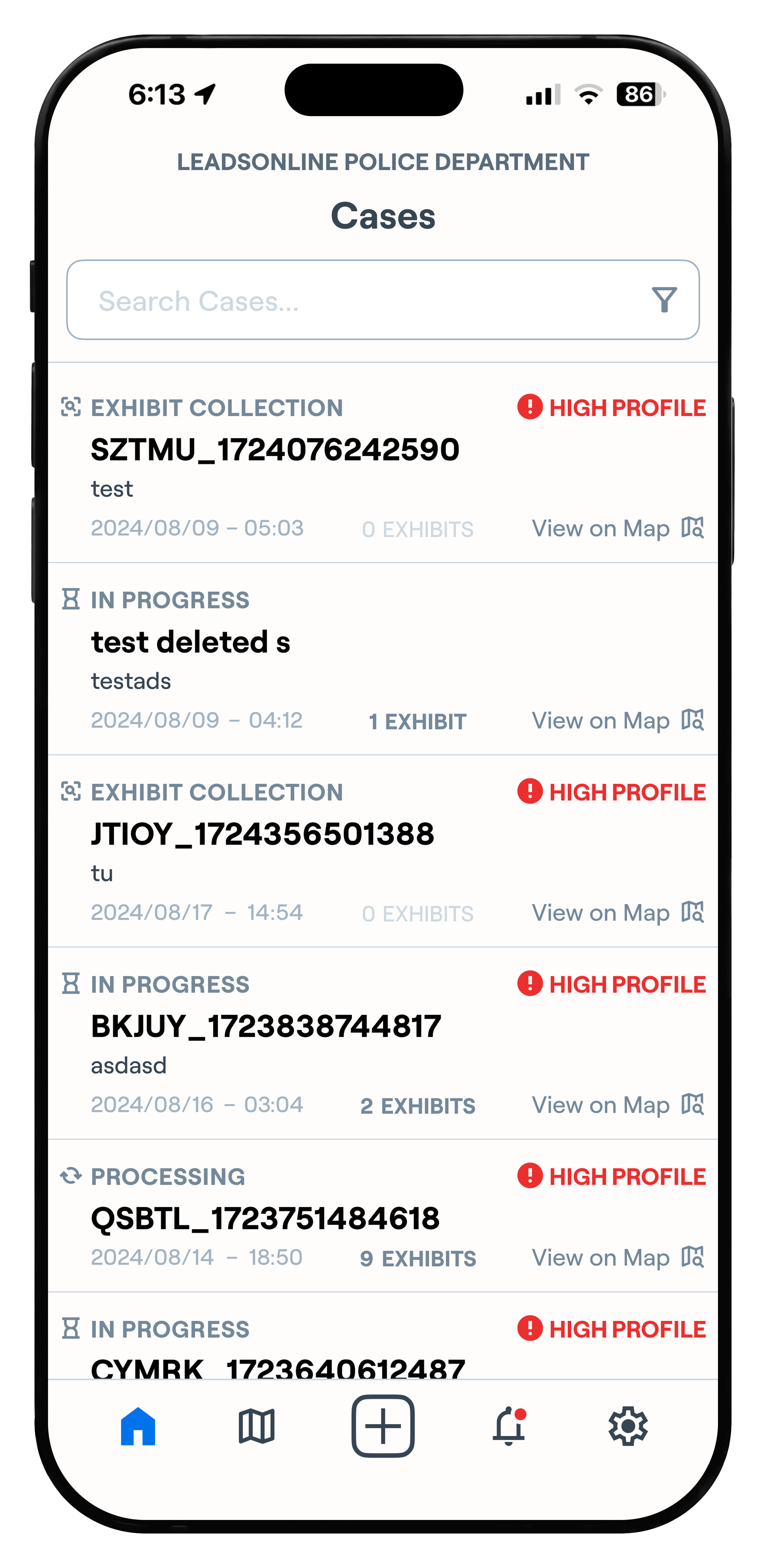
Icons and labels distinguish collection, in-progress, and processing states without relying on color alone.
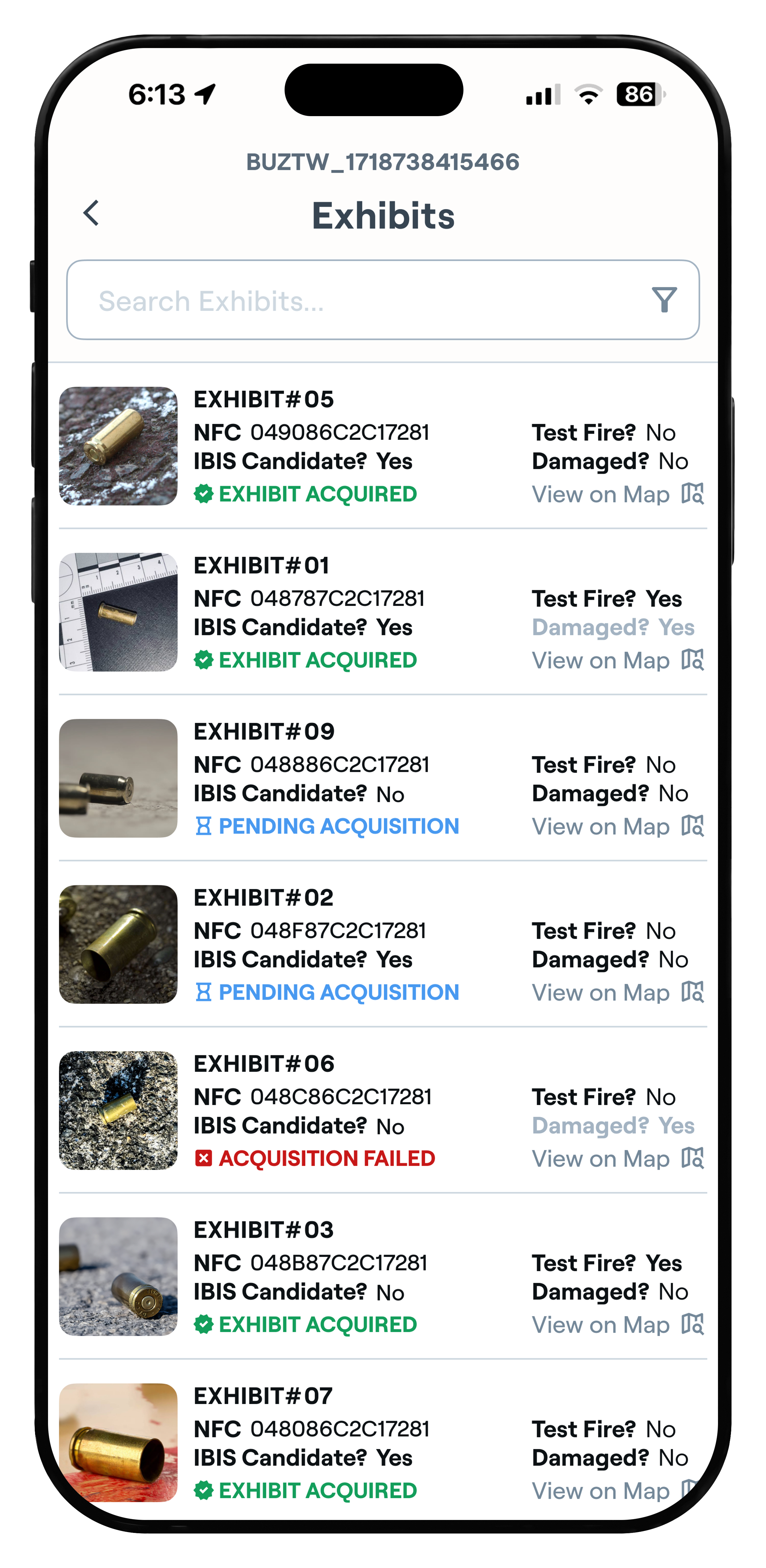
The same visual language carries into individual evidence records as each exhibit moves through acquisition and analysis.
From Processing to Results
ClearCase does not end when evidence leaves the user's hands. Because analysis happens asynchronously, the app also has to explain what is happening while a case is in progress, then surface the results without turning the main interface into a forensic report.
The case view keeps status, ownership, exhibits, and mapping together. Once processing is complete, the same screen adds a concise summary and access to the full ballistic report, so the user can move from “what is happening?” to “what does this mean?” without losing the context of the case.
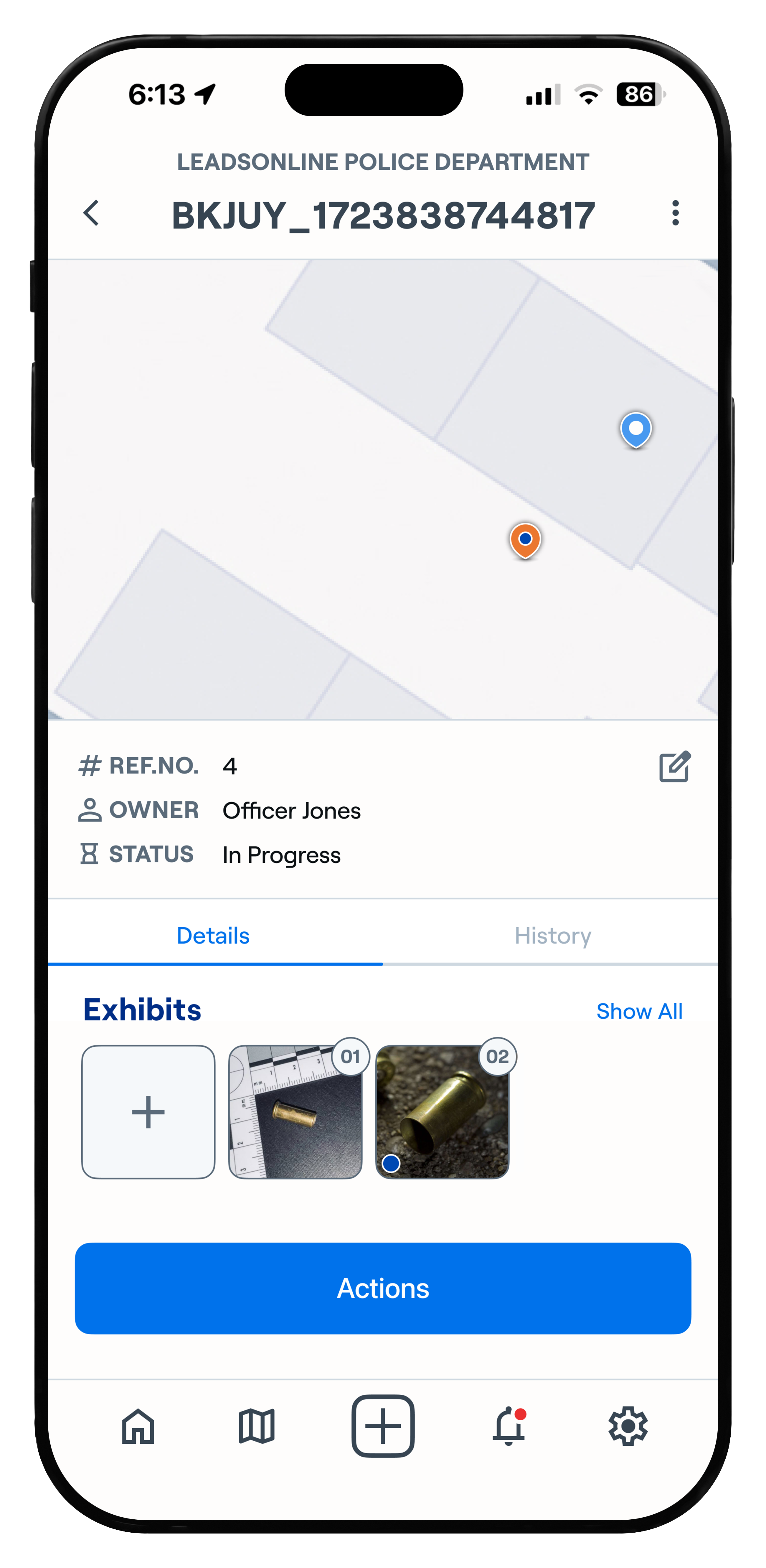
Keep the case context visible while evidence moves through the system.
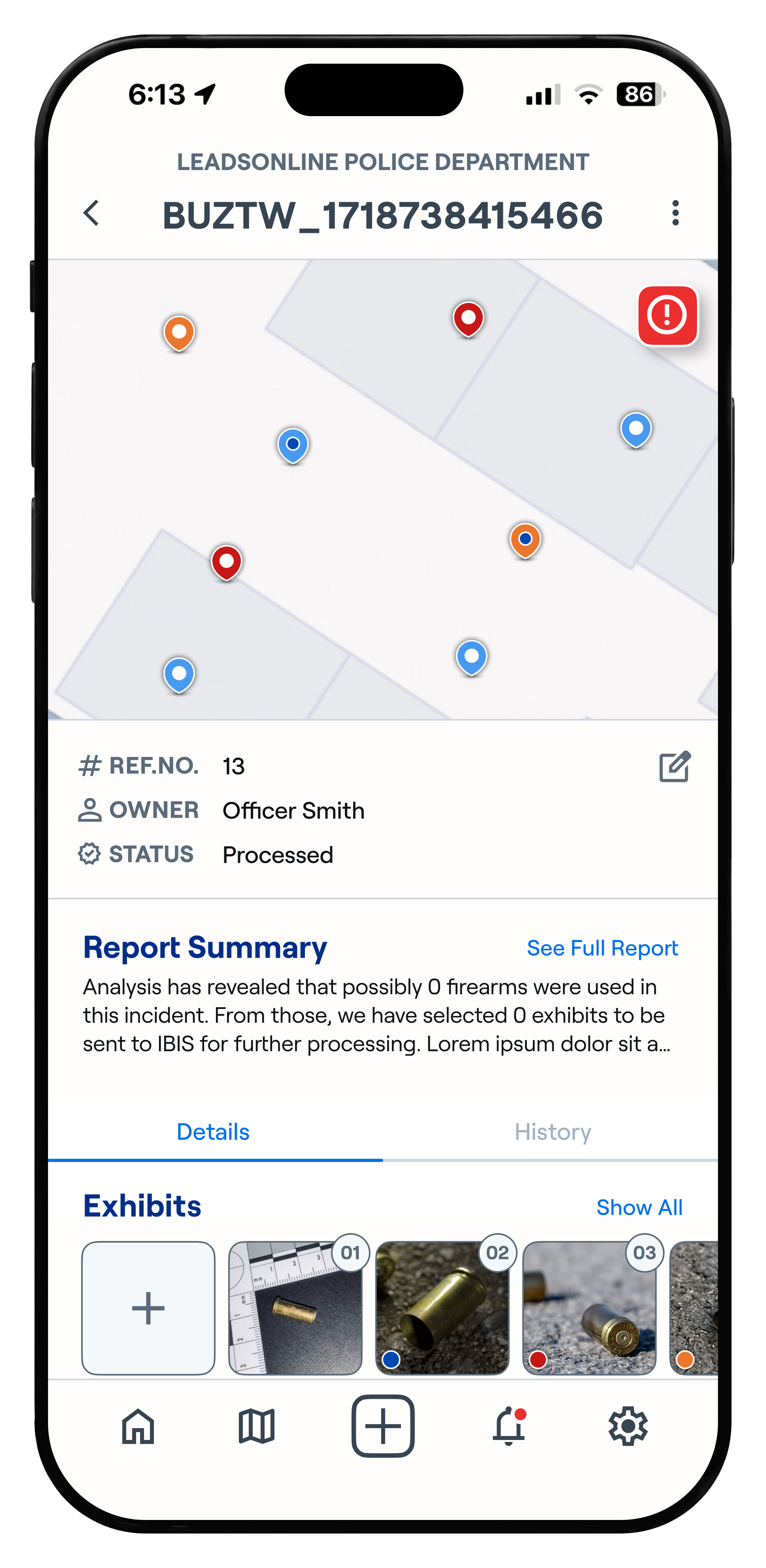
Bring the analysis back into the same case view instead of making results feel like a separate workflow.
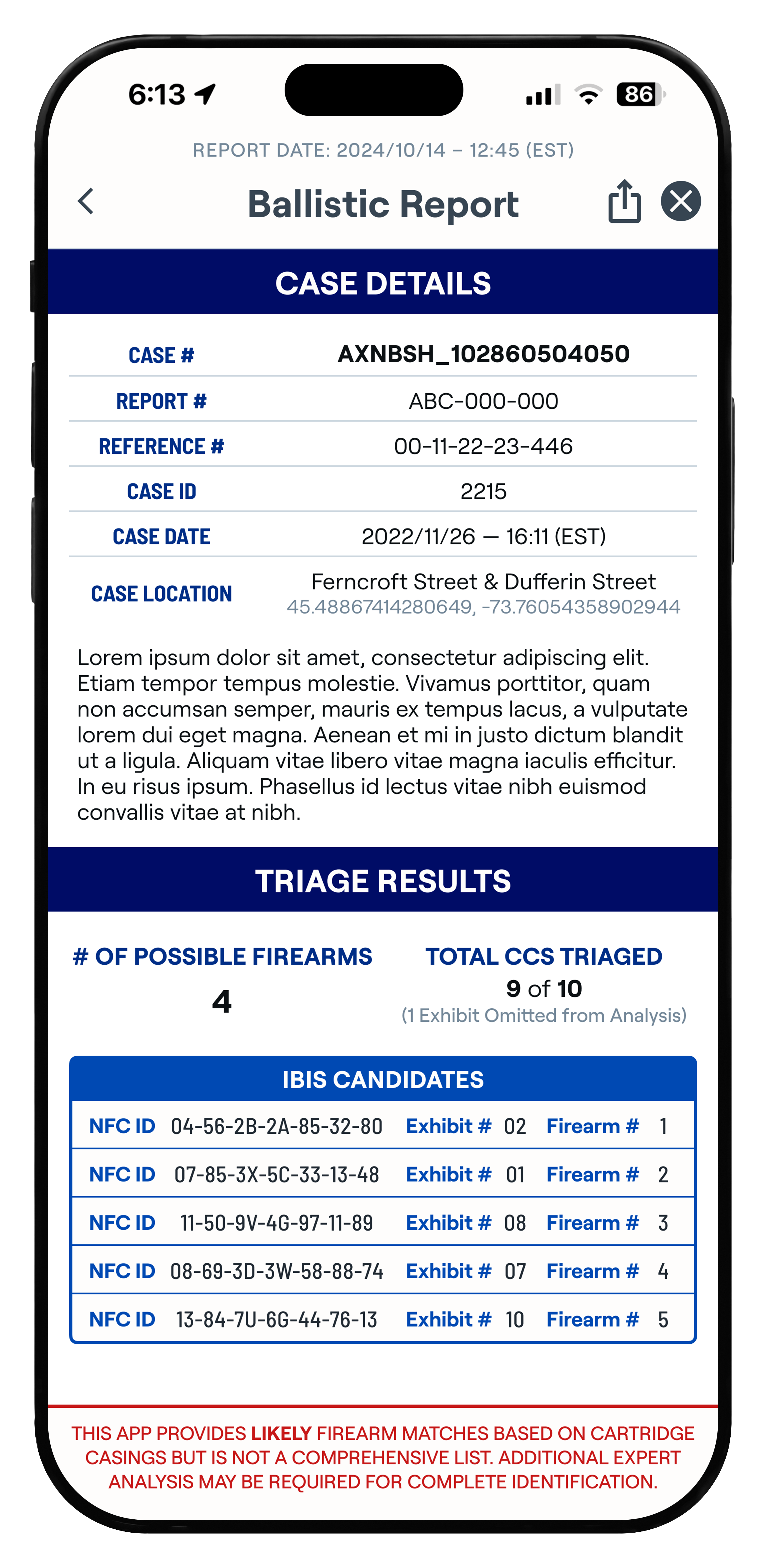
Preserve the technical detail for users who need to dig deeper into the analysis.
Outcome
The redesigned experience shipped with ClearCase in December 2024 as LeadsOnline's first mobile product. It gave the functional developer-built app its first cohesive visual system and established the field experience used during that phase of the product's rollout.
The work shown here reflects the 2024 mobile release. After my role shifted away from the product, ClearCase later moved toward a web-first architecture and was redesigned as part of that larger rebuild.
Reflection
The part of this project that stayed with me was how quickly “simple” becomes complicated once a workflow touches real evidence, hardware, asynchronous processing, permissions, and different users. The answer wasn't to show more. It was to keep asking what the user needed to understand at that moment, then build enough structure that the growing complexity did not feel like complexity.
ClearCase also reinforced the value of designing in conversation with the people who understand a system from different angles. Product could define the need, engineering could explain the machine, and the interface often revealed questions neither side had surfaced yet. My role was frequently to bring those pieces together and turn them into something a CSI could move through with confidence.