Pediatric Therapy Center Rebrand
The Problem
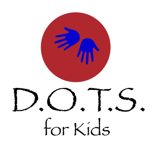
Dallas Occupational Therapy Services for Kids reached out because their logo wasn't working for them. In our initial briefing, they described wanting something that felt “more professional,” but that was only part of the challenge.
Their existing identity felt dated and didn't reflect the balance they wanted the organization itself to communicate: professional expertise alongside the warmth and playfulness of working with children. For a practice built largely on trust, referrals, and relationships with families, the brand needed to inspire confidence without feeling clinical or impersonal.
The challenge wasn't simply to modernize the logo. It was to create an identity that felt credible to parents and healthcare professionals while still feeling welcoming to the children D.O.T.S. serves.
The Approach
With that balance in mind, our first round explored two primary directions. One drew from the rounded forms and bright colors of playground equipment; the other drew from children's lined writing paper to suggest learning and development. The dots in the company's name became a natural visual thread between the two.
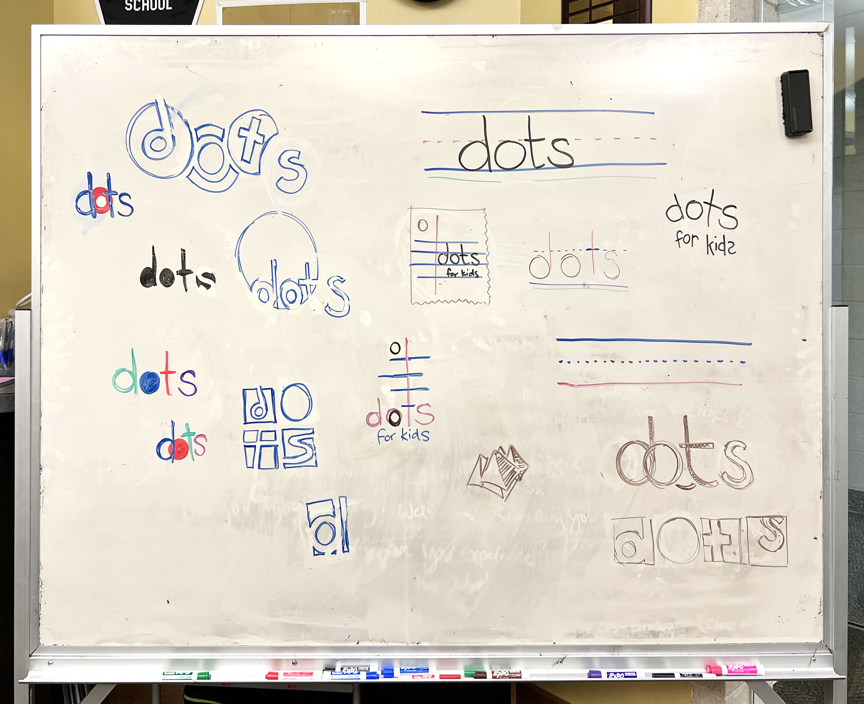 My design partner and I used a shared whiteboard to explore a wide range of ideas before committing to a direction.
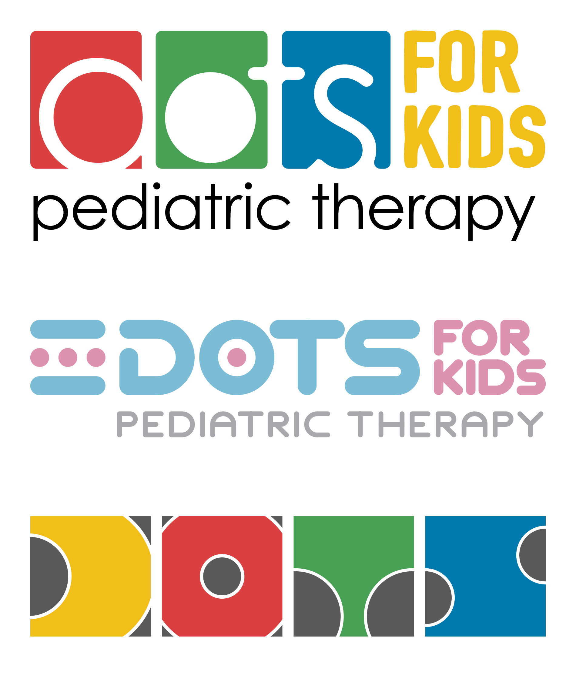 The first round of logo concepts, including a design inspired by children’s playground equipment (top) and a design inspired by children’s writing paper (center).
One request we pushed back on was the client's desire to incorporate a literal child figure into the mark. We felt that approach risked making the identity feel generic and limiting how well it could age. Instead, we showed how the dots themselves could create a sense of personality and playfulness without relying on a literal character.
The client agreed, and the dots became the foundation of the final identity.
Selected Work
The final identity grew out of both initial directions. We carried forward the bright colors and rounded forms of the playground concept while incorporating the simple lines and dots of the writing-paper direction. As we refined the mark, we stripped away some of the complexity of the early concepts and customized the lettering to reinforce the same soft, rounded personality.
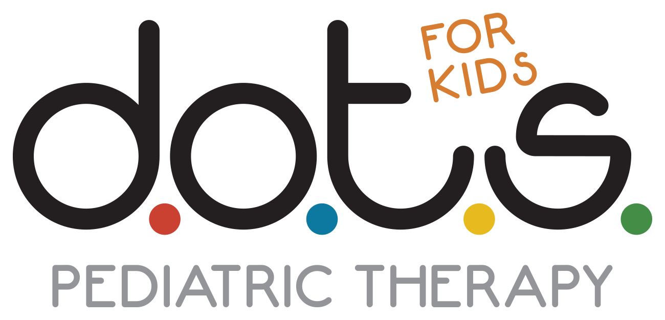
We also developed variations of the mark and showed how the identity could extend beyond the primary logo into apparel, stationery, signage, and the physical environment of the practice.



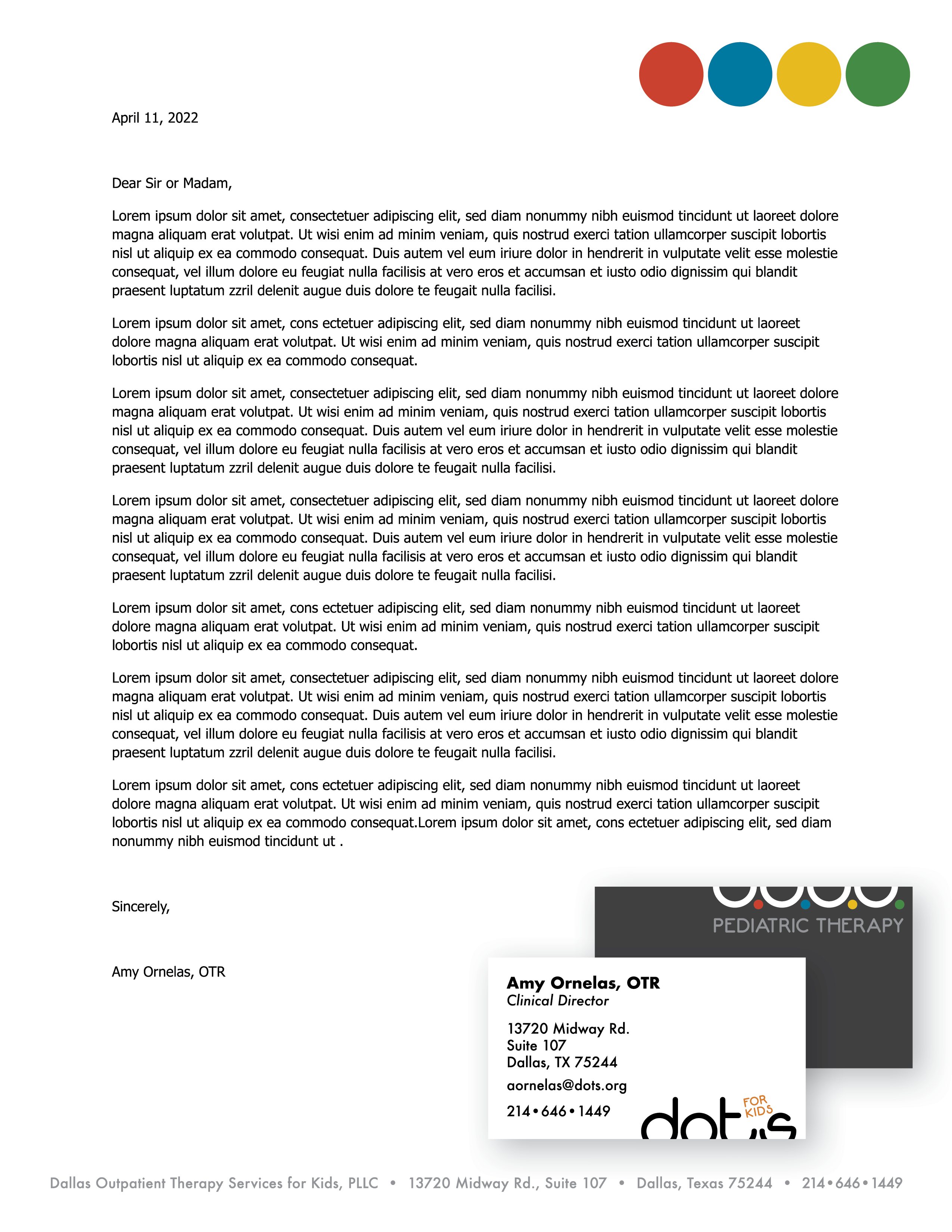 Letterhead mockups helped demonstrate how the identity could extend into everyday brand applications.
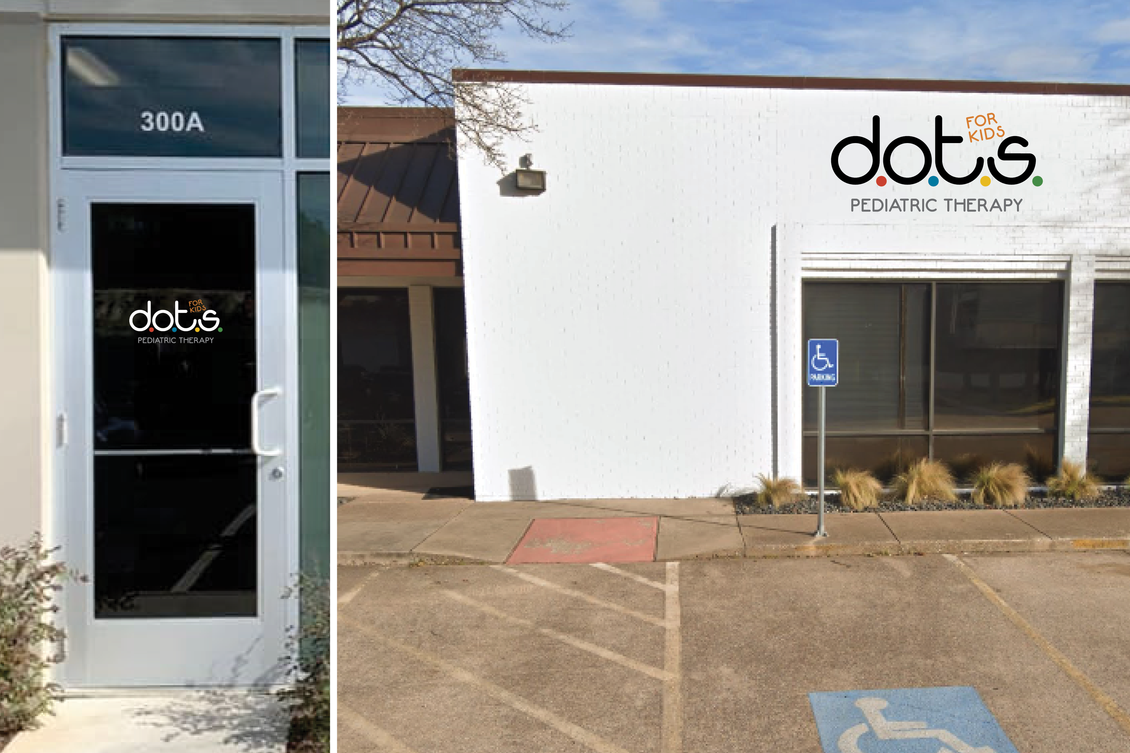 Signage mockups helped the client visualize how the identity could translate into the physical environment.
Reflection
This project reinforced something I've learned repeatedly in client work: people don't always have the language to describe what they're looking for, but that doesn't mean the answer is simply to show them more options. The more clearly I can explain the thinking behind a creative decision, the easier it becomes for everyone to react to the reasoning rather than just the aesthetics.
If I approached the project again, I'd spend more time understanding the client's internal culture before developing the first concepts. The playground direction ultimately resonated because it reflected how the staff described their environment in conversation, something that hadn't fully surfaced in the written brief. One additional conversation early in the process probably would have gotten us there faster.