Corporate Brand Refresh
The Problem
By 2026, LeadsOnline had grown far beyond its original roots in stolen-property data into a much broader investigative technology company. The brand had been changing too, but mostly one decision at a time. Colors shifted, logo details changed, templates evolved, and different teams solved immediate needs without a single framework tying those decisions together.
This was roughly the third evolution of the brand in two years. Another full rebrand would have been easy to propose, but I did not think the company needed another reset. Most of the ingredients were already there. What was missing was a shared definition of who LeadsOnline was, what should stay consistent, and how the brand could feel more distinct without throwing away the recognition it had already built.
A Brand That Has to Stretch
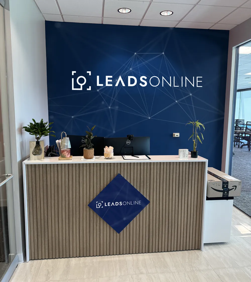
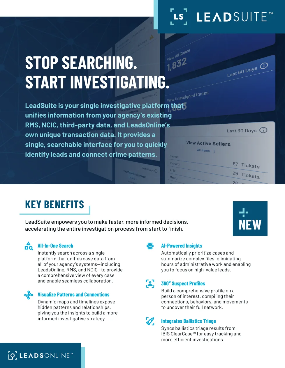
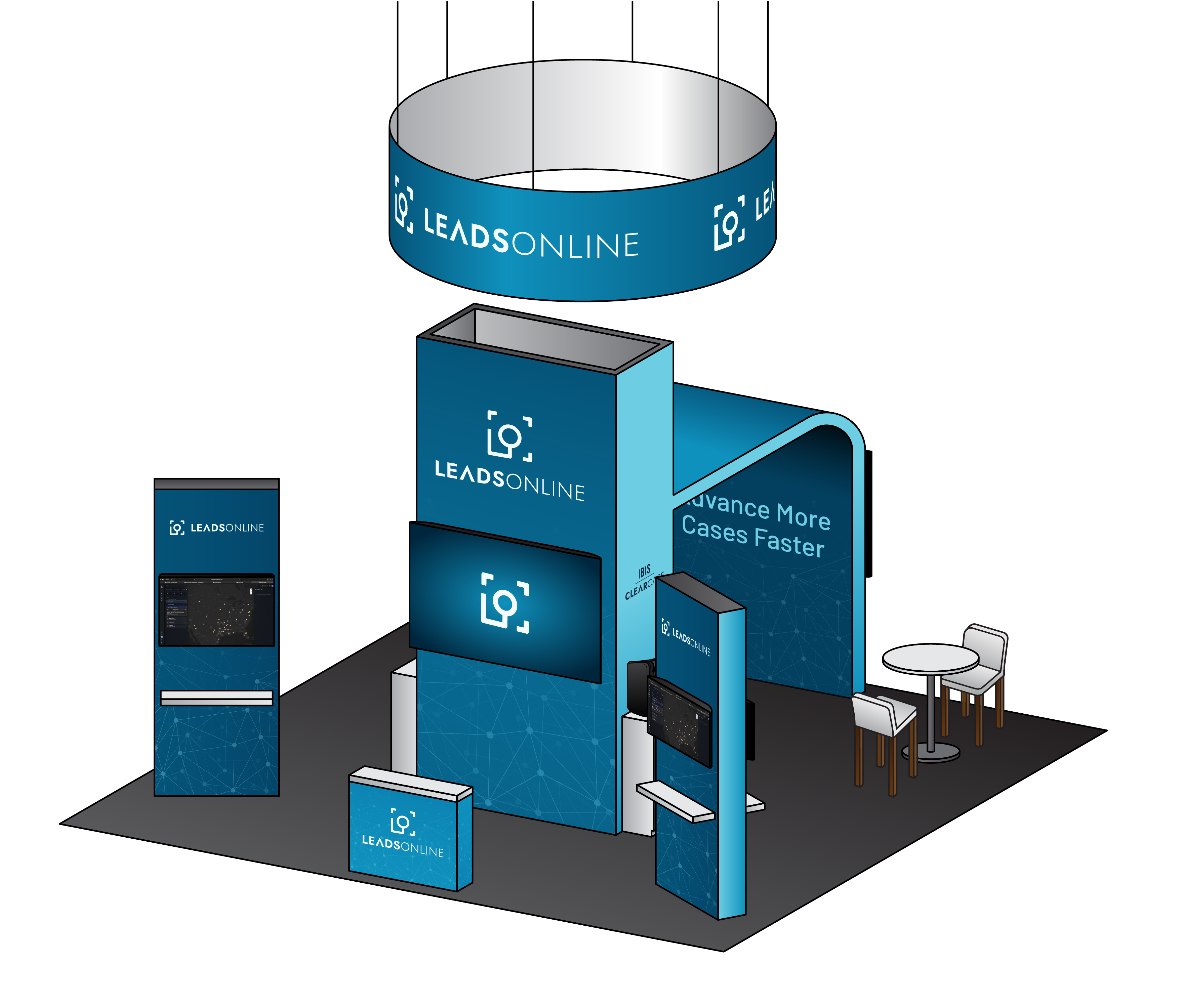
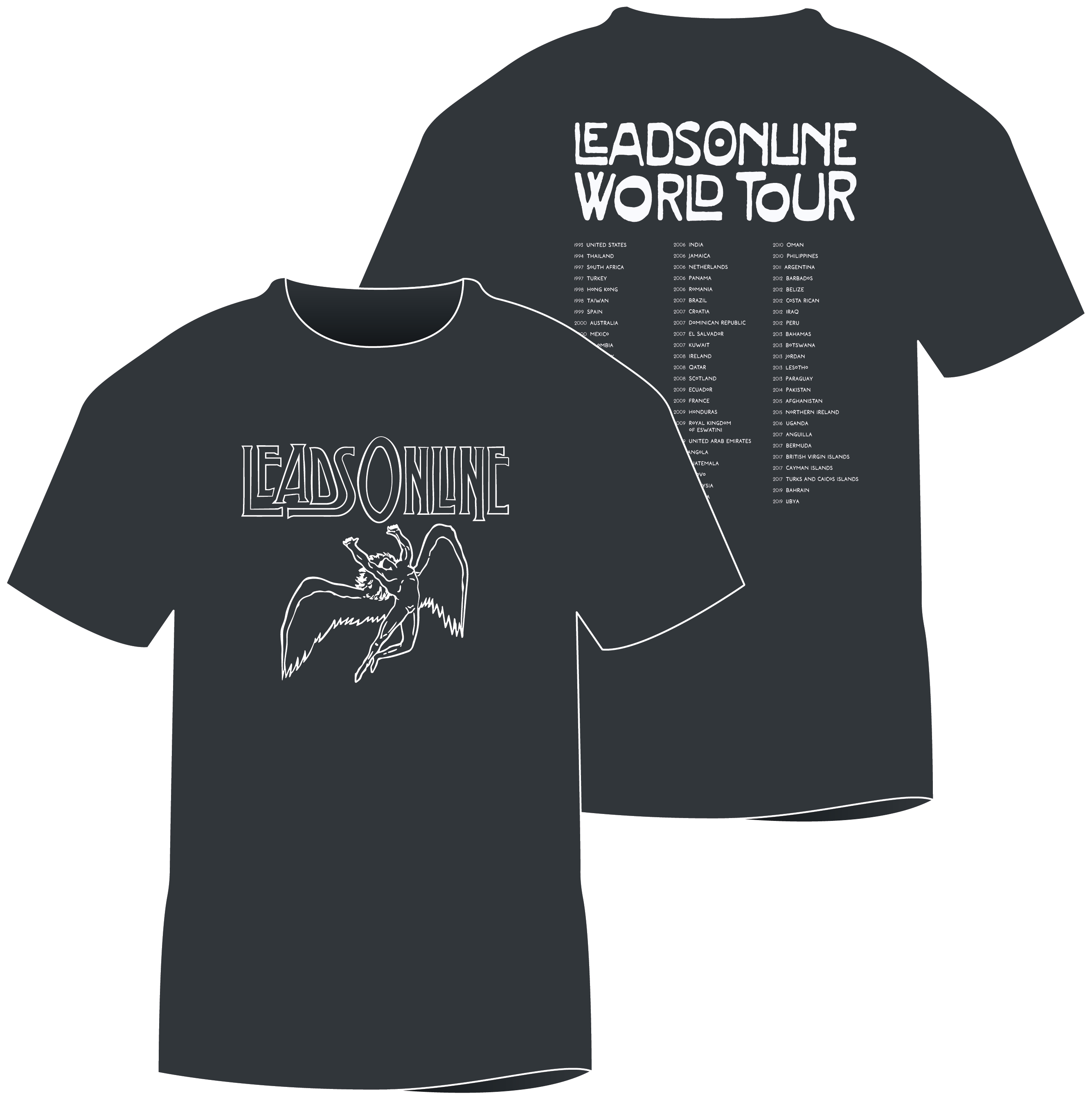
The system has to work across very different touchpoints: product collateral, customer stories, trade-show environments, recruiting, office spaces, presentations, and more. The examples below are a small sample of the kinds of work the refresh needed to support.
Starting With the Company, Not the Logo
I deliberately did not start by opening Illustrator and trying to make the logo feel newer. I started by documenting the company itself: its history, audiences, customer groups, positioning, mission, and the things people should consistently understand about LeadsOnline no matter which product or team they encounter.
From there I reviewed more than 30 direct, adjacent, and aspirational brands across law enforcement and investigative technology. The goal was not to copy the category. It was to understand which visual cues were necessary for credibility, which ones had become generic, and where LeadsOnline had room to behave differently.
01 Blue is Table Stakes
Blue is a category expectation, not a point of differentiation. It still gives LeadsOnline necessary credibility, but distinction has to come from somewhere else.
02 The Category Often Feels Cold
Abstract networks, technical imagery, and all-sans typography make many competitors feel interchangeable.
03 Humanity Creates Room to Stand Apart
The brands that connect technology back to people, purpose, and outcomes feel more confident and memorable.
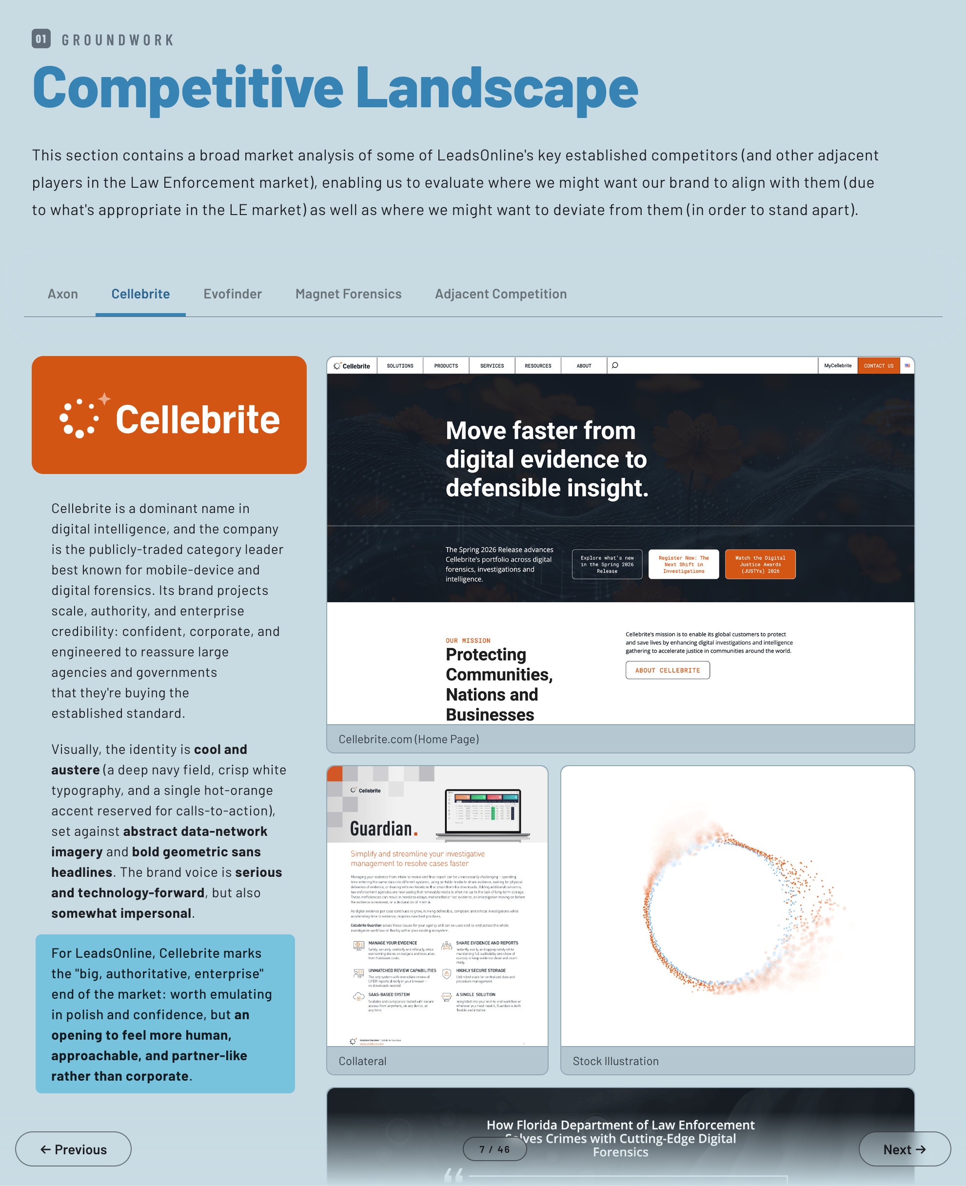 An example of the market-competitor analysis I conducted on Cellebrite
Finding the Center of the Brand
Across the research, four qualities kept surfacing as essential to the LeadsOnline brand. Trusted and Tireless protect the seriousness and reliability the work demands. Empowering and Genuine keep the brand useful, direct, and human. Together they gave me a much clearer filter for every decision that followed, starting with the mood boards below and the direction that follows.



The Direction
Approachable Authority
The credibility law enforcement expects, delivered by a brand that actually feels human.
A Refresh, Not a Restart
Once the direction was clear, restraint became one of the most important design decisions. With several recent brand changes already behind us, I wanted the refresh to compound recognition rather than reset it again. That meant separating what had earned equity from what was creating confusion.
Keep
What Was Already Working
The core logo, the Barlow type family, the blue-family credibility, and established product naming conventions.
Evolve
What Needed Clearer Rules
Color roles, voice, photography, iconography, logo usage, graphic forms, and the relationship between marketing and product UI colors.
Add
Only Where It Earns a Place
Roboto Slab for warmer display typography, a defined gradient language, motion principles, and a more intentional visual vocabulary.
Turning the Strategy Into a System
The refresh is intentionally less about inventing more brand elements and more about giving the existing ones clear jobs. Each recommendation connects back to the same question: does this make LeadsOnline feel credible, useful, and human at the same time?
Color Evolve
Give every color a job.
The four core brand colors stay, but their roles become explicit. Turquoise takes the lead, Blue and Navy anchor the system, and Cyan provides brighter support. Additional accent colors add warmth without competing with the identity.
Turquoise
Primary
Blue
Anchor
Navy
Anchor
Cyan
Support
Typography Evolve
Keep the workhorse. Add warmth at the top.
Barlow remains the primary body and UI family. Roboto Slab is introduced only for display use, giving the system a more human voice without abandoning the modern, engineered feel people already recognize.
Advance more cases faster.
Roboto Slab · Display
Clear hierarchy, direct language, and typography that feels authoritative without becoming clinical.
Barlow · Body & UI
Imagery & Graphics New
Put people back into the picture.
One of the biggest shifts is away from relying on cold, abstract technology imagery as the default. The new direction favors real people, warm natural light, softer shapes, rounded iconography, and organic graphic forms. Technical imagery still has a place, but it should support the human story rather than replace it.



Logo Keep
Document it instead of redesigning it.
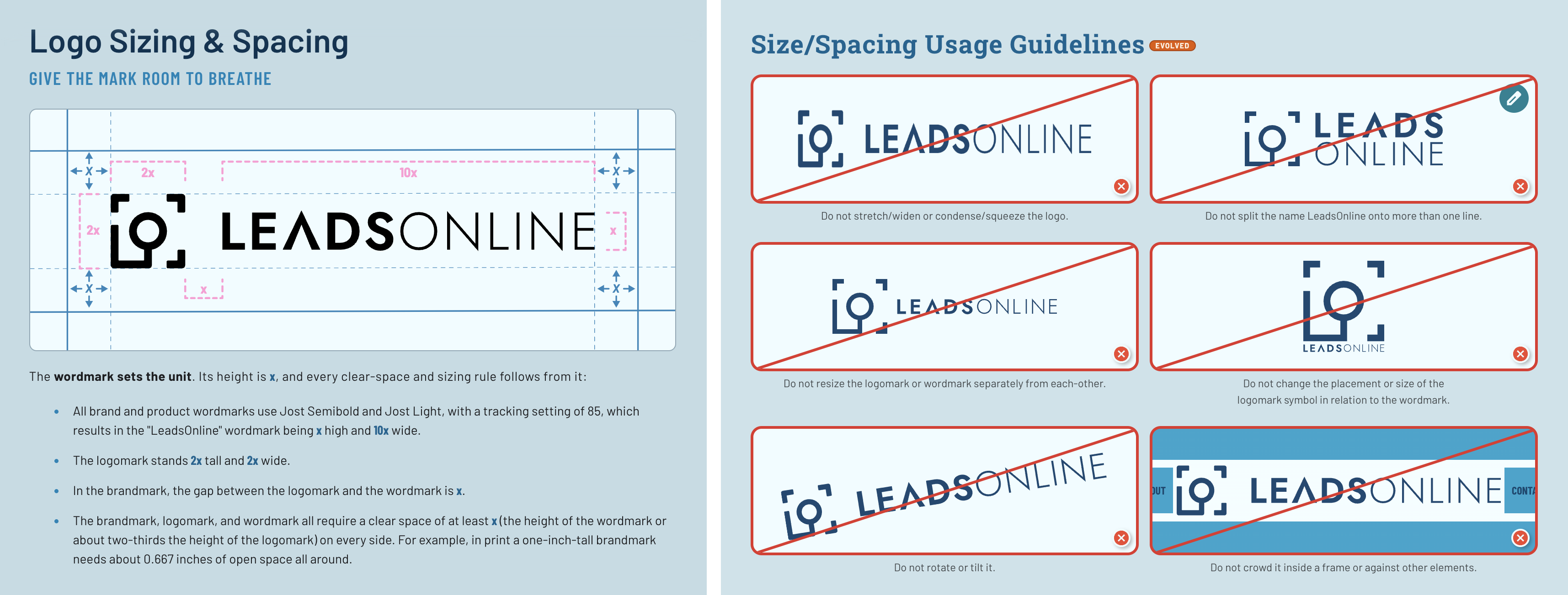
The core mark stays. The real work was defining clear-space, sizing, color, trademark, product-name, and misuse rules so small deviations stop accumulating into brand drift.
Making the Voice Feel Like the Same Brand
The visual system only solves half the problem. I also defined a voice that is confident, clear, purpose-led, and human. The goal is to sound like an experienced partner who understands the stakes, not a technology company trying to impress people with technology-company language.
Headline
Best-in-Class Forensic Technology Solutions for the Modern Agency
Case closed. Faster.
The revised version gets to the outcome quickly and allows a little personality without making the message less clear.
Body Copy
Our platform leverages a comprehensive suite of integrated data solutions and advanced correlation algorithms to facilitate the optimization of investigative workflows across the enterprise.
We bring your data, intelligence, and forensic tools into one place, so leads connect faster and nothing slips through the cracks.
Less abstraction, less jargon, and a benefit the reader can immediately understand.
Designing the Review Experience
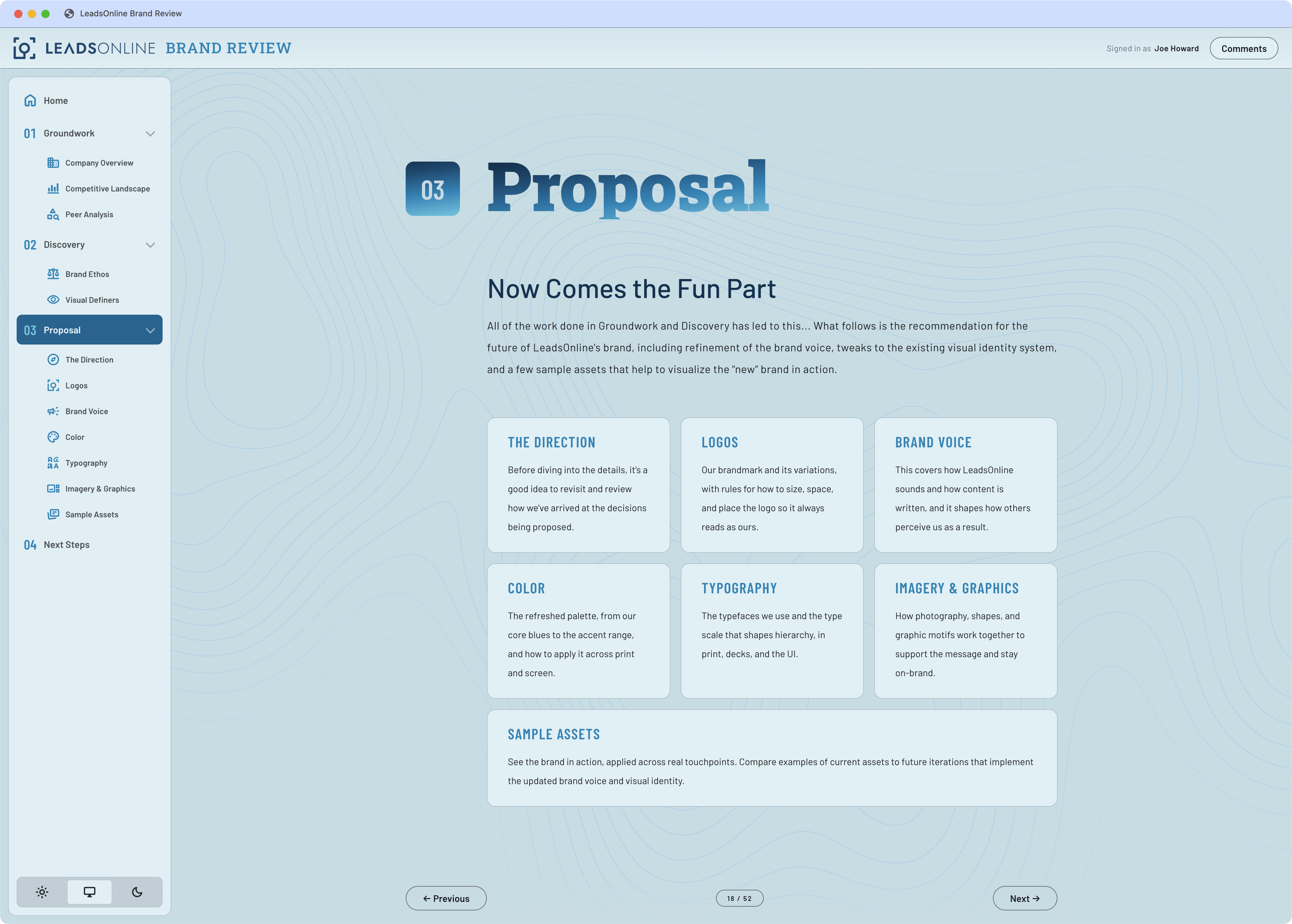
As the research and recommendations became more interconnected, a conventional slide deck started to feel like the wrong format. I built an interactive review site instead, organized into Groundwork, Discovery, and Proposal sections. Stakeholders can move through the reasoning at their own pace and comment directly on individual decisions rather than reacting to a single static presentation.
That format also forced me to make the logic of the system visible. Every recommendation is labeled as something we are keeping, evolving, or adding, and each one can be traced back to a finding from the earlier research.
A Brand Built to Keep Evolving
The proposed revisions have now been put into practice across LeadsOnline’s brand standards and the work we create. The goal was never to freeze the brand in place, though. As the company continues to grow, launch new products, and reach new audiences, I regularly revisit the system to make sure its visual language, messaging, and individual touchpoints still feel accurate and connected.
The most important decision in this project was not visual. It was recognizing that LeadsOnline did not need another reinvention. The research gave me a way to separate preference from purpose and make decisions based on what the brand actually needed rather than what simply felt new.
That is what I want a brand system to do: create enough consistency to be recognizable, and enough clarity to keep evolving without losing itself.