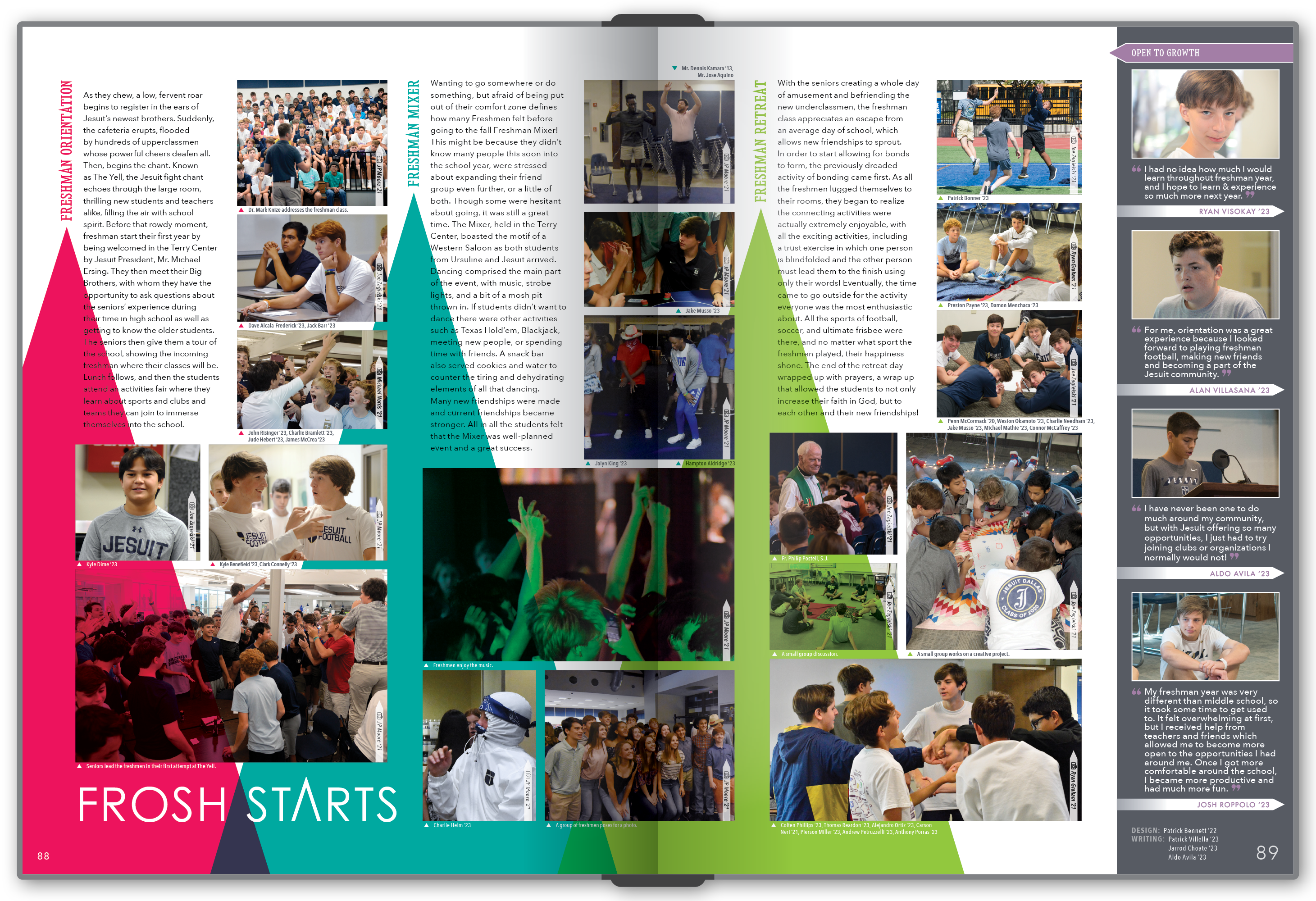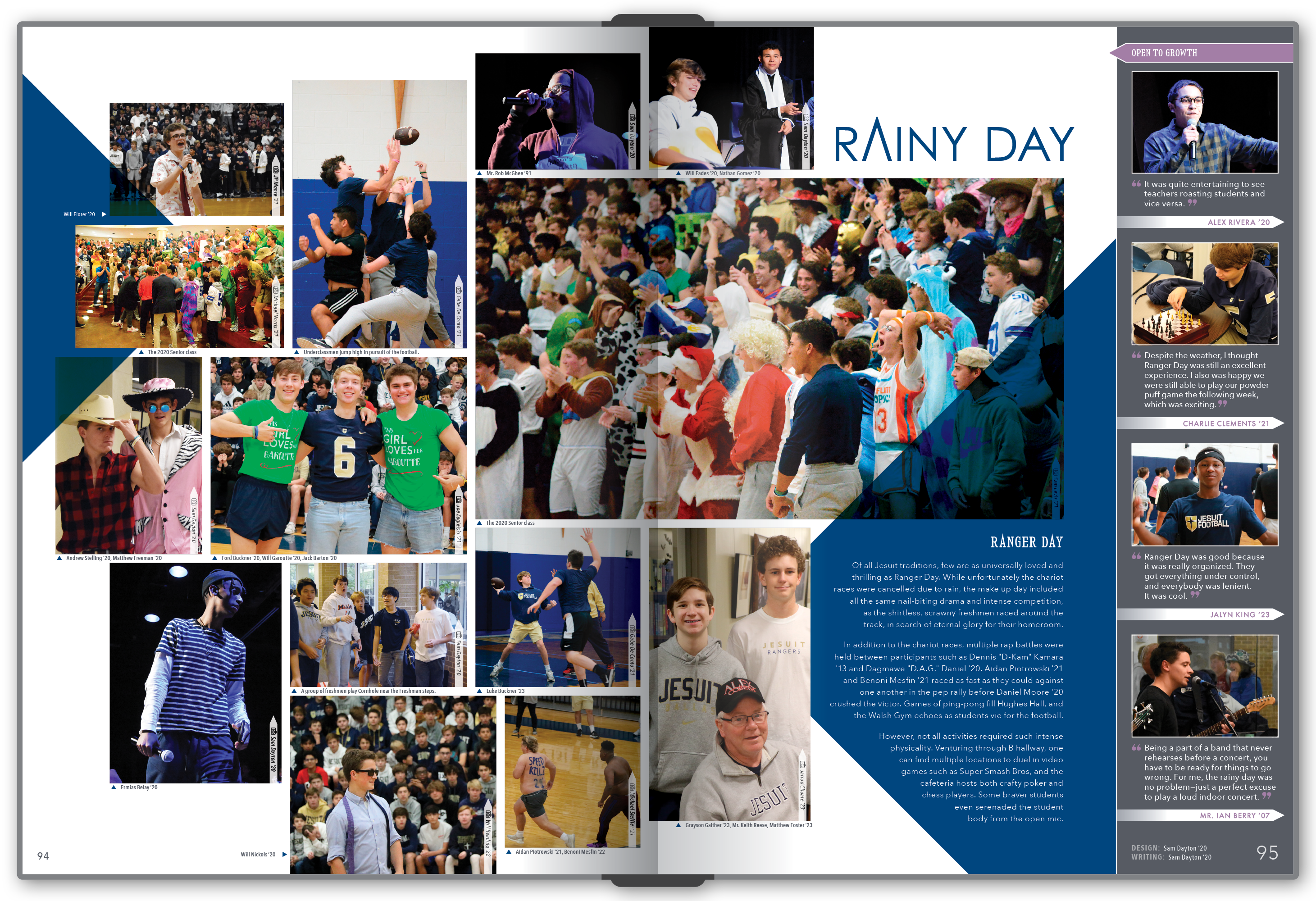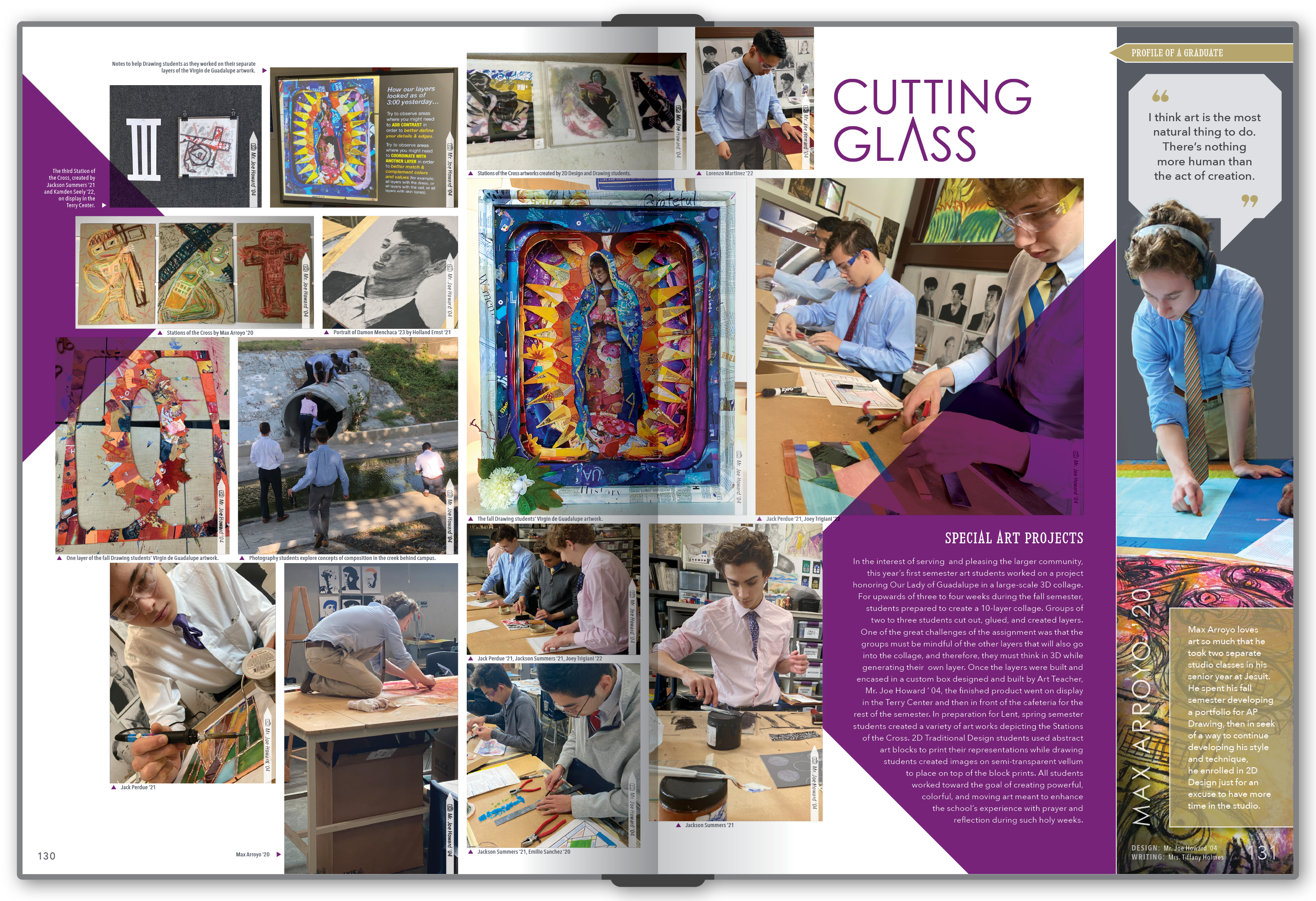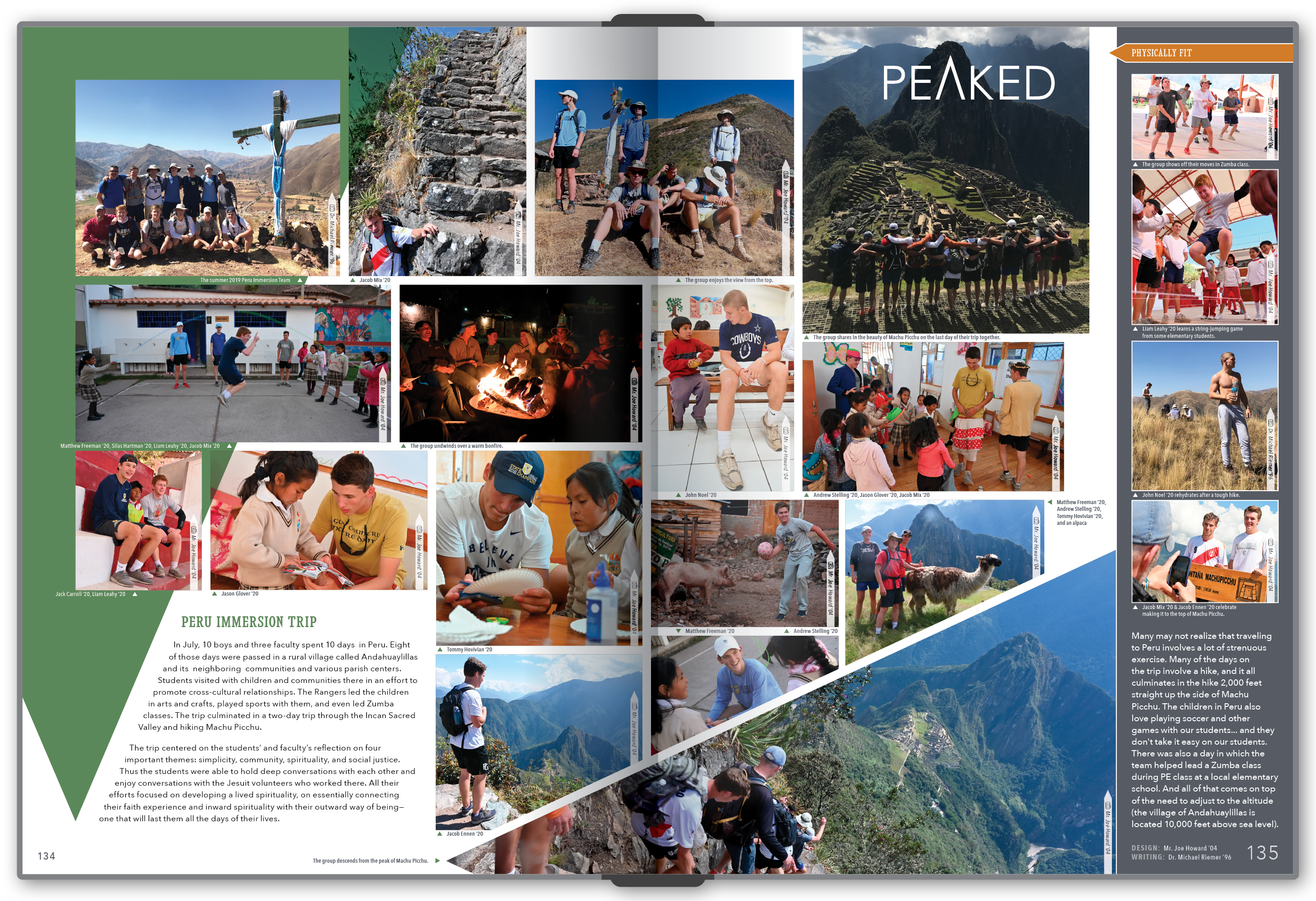
Eight Years of Yearbook Creative Direction

  • Case Study / Retrospective
  • Creative Direction
  • Publication Design
  • Team Leadership
  • Visual Storytelling

Employer

Jesuit College Preparatory School
Dallas, TX

Timeline

Fall 2016 to Spring 2024

Scope

Creative direction, publication design, student mentorship, visual systems, and production workflows.

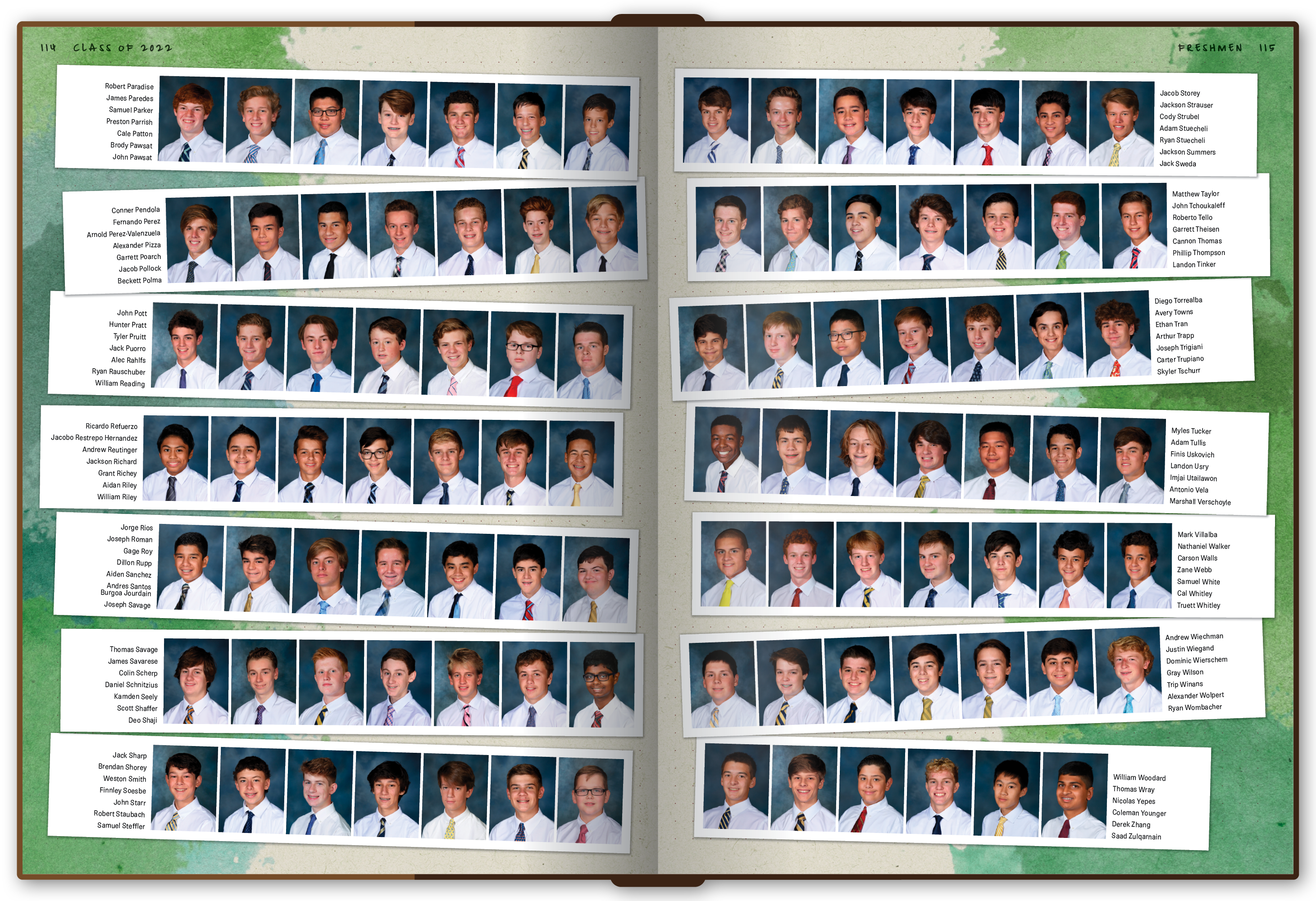
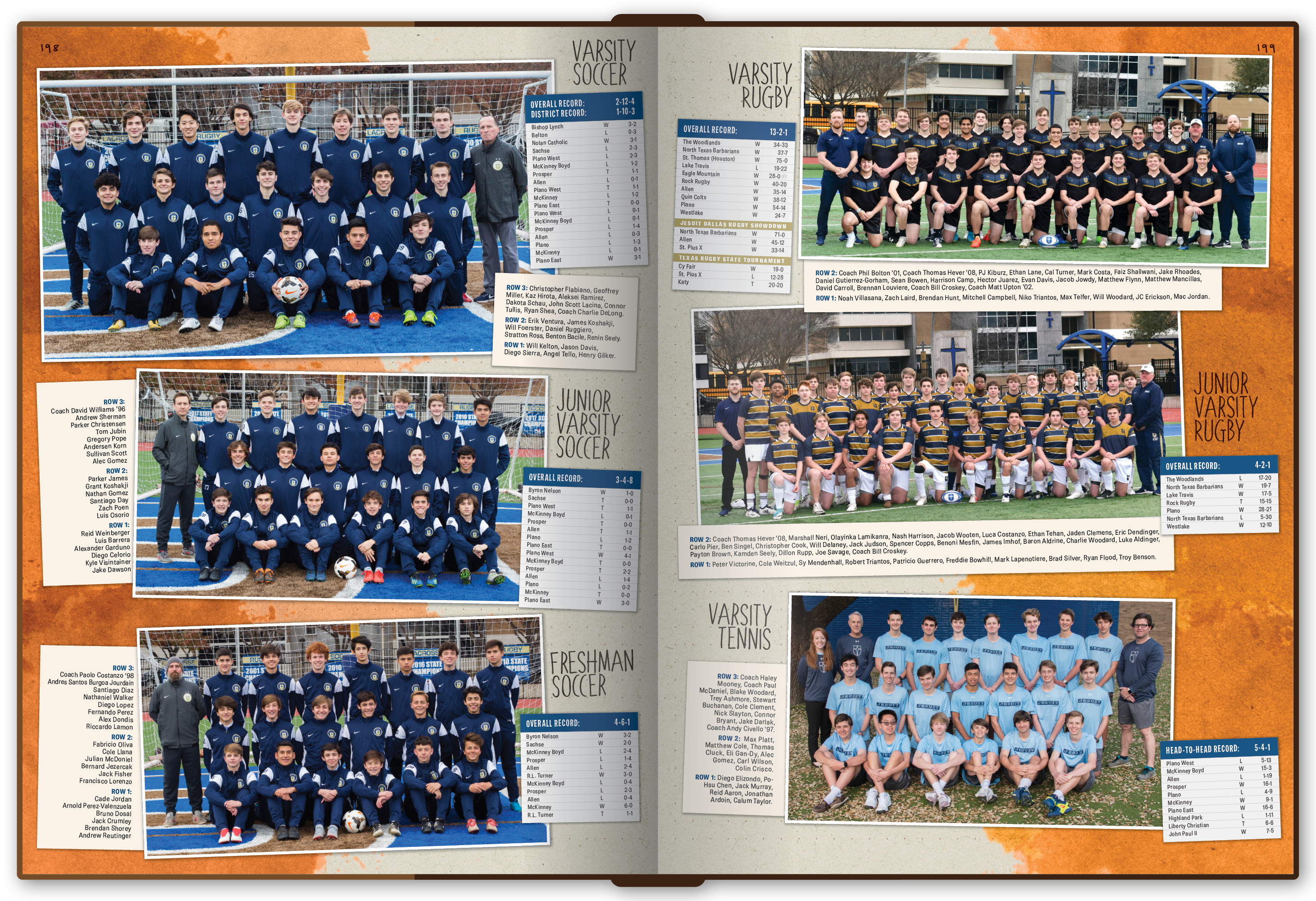
For eight years, I served as the primary yearbook adviser and creative director for Jesuit Dallas. Each fall meant starting again with a new group of student designers, writers, photographers, and editors, then guiding them toward a finished publication of more than 300 pages by the end of the school year.

The challenge was bigger than making a good-looking book. Every year needed its own concept and visual language, but dozens of people still had to be able to contribute without the publication feeling fragmented. My role was to help the staff find an idea worth building around, turn that idea into a usable system, and give students enough structure to make confident creative decisions of their own.

Every book began with conversation rather than design. I facilitated brainstorming sessions that pushed the staff to think about what felt distinctive about that particular year, what ideas could become meaningful visual metaphors, and whether a concept had enough range to carry sports, academics, clubs, student life, and everything in between.

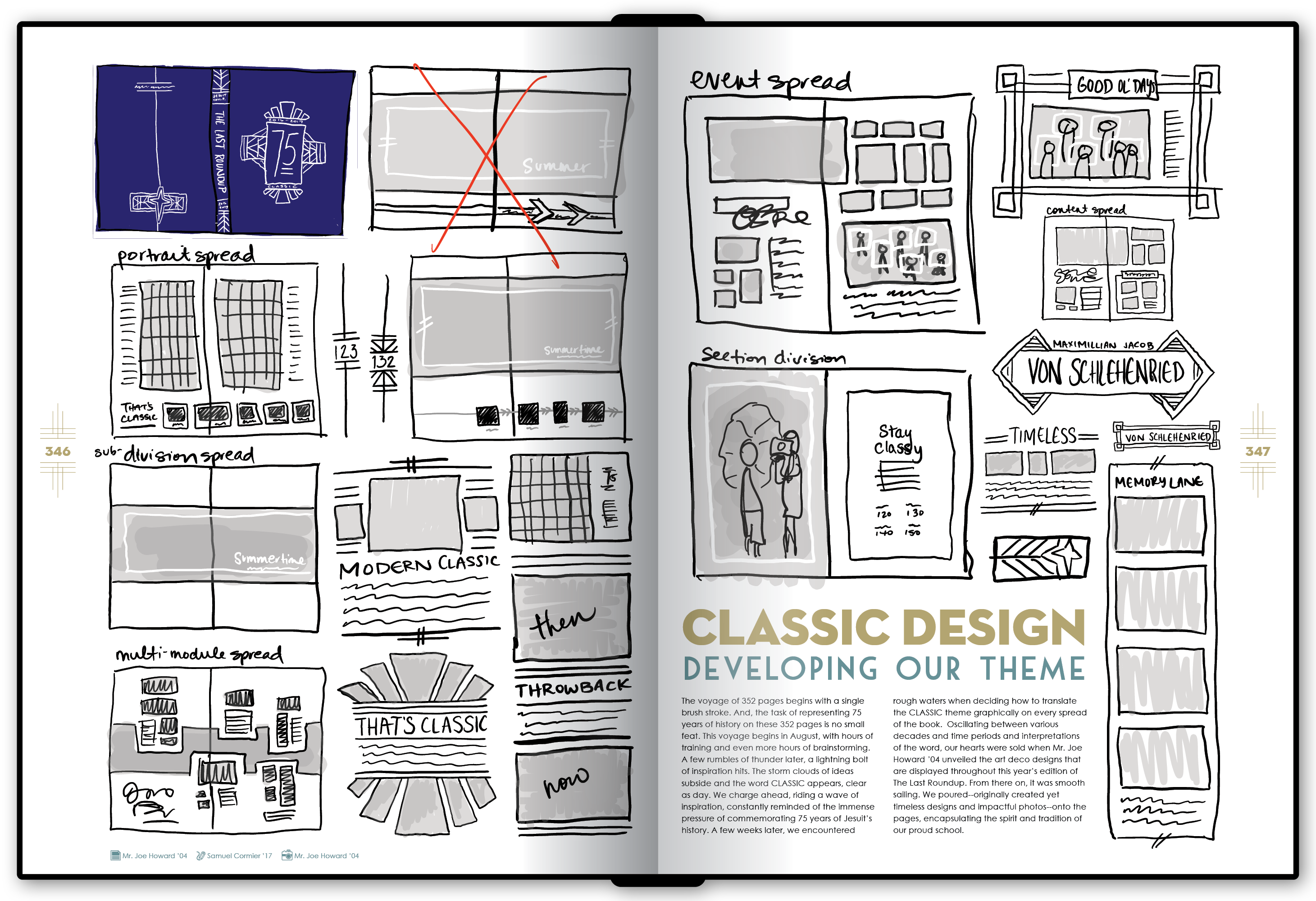
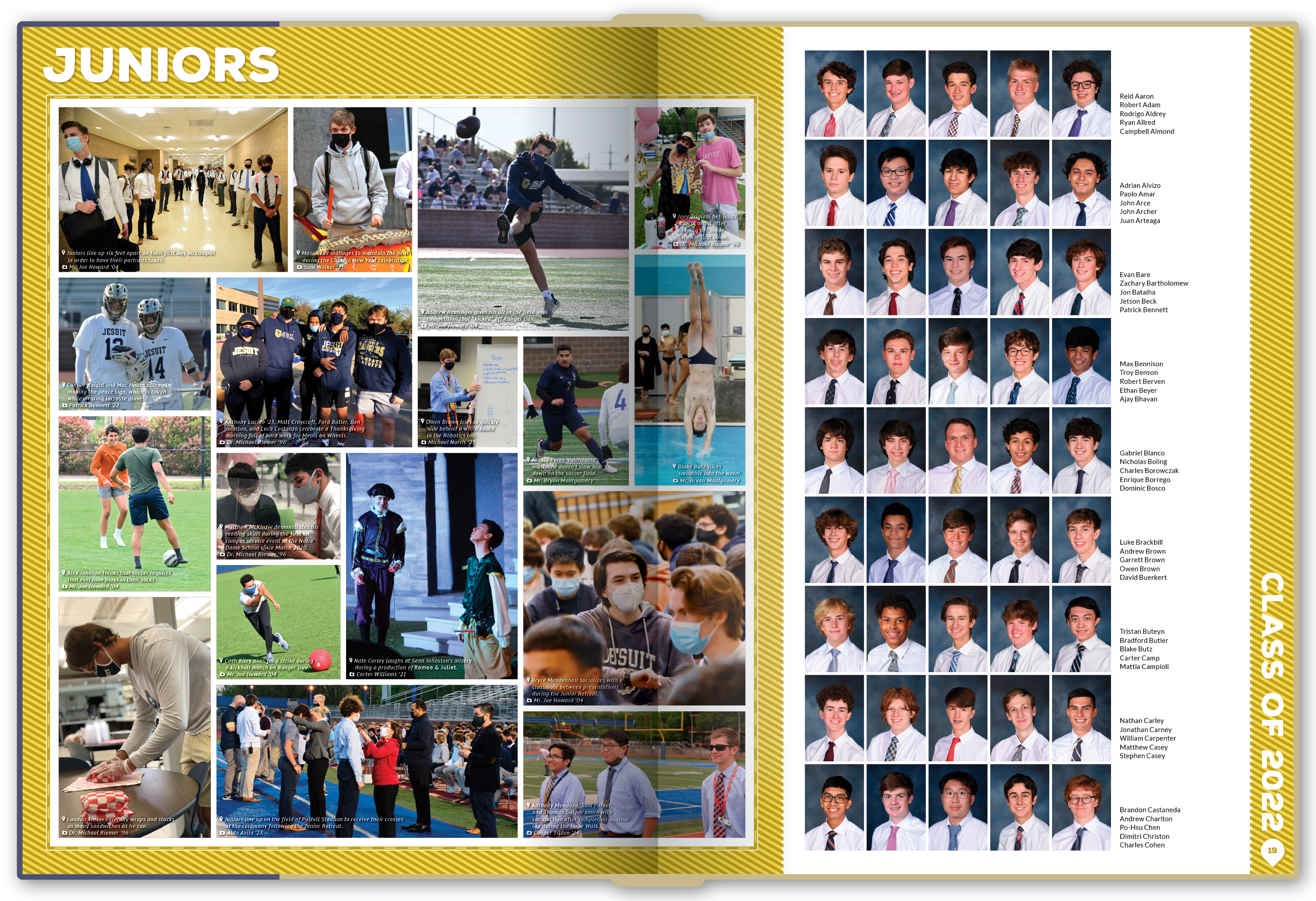
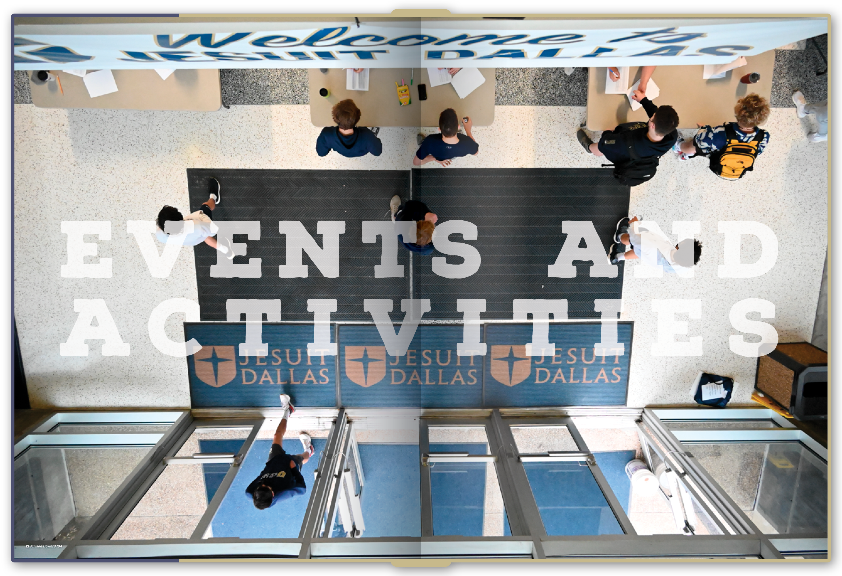
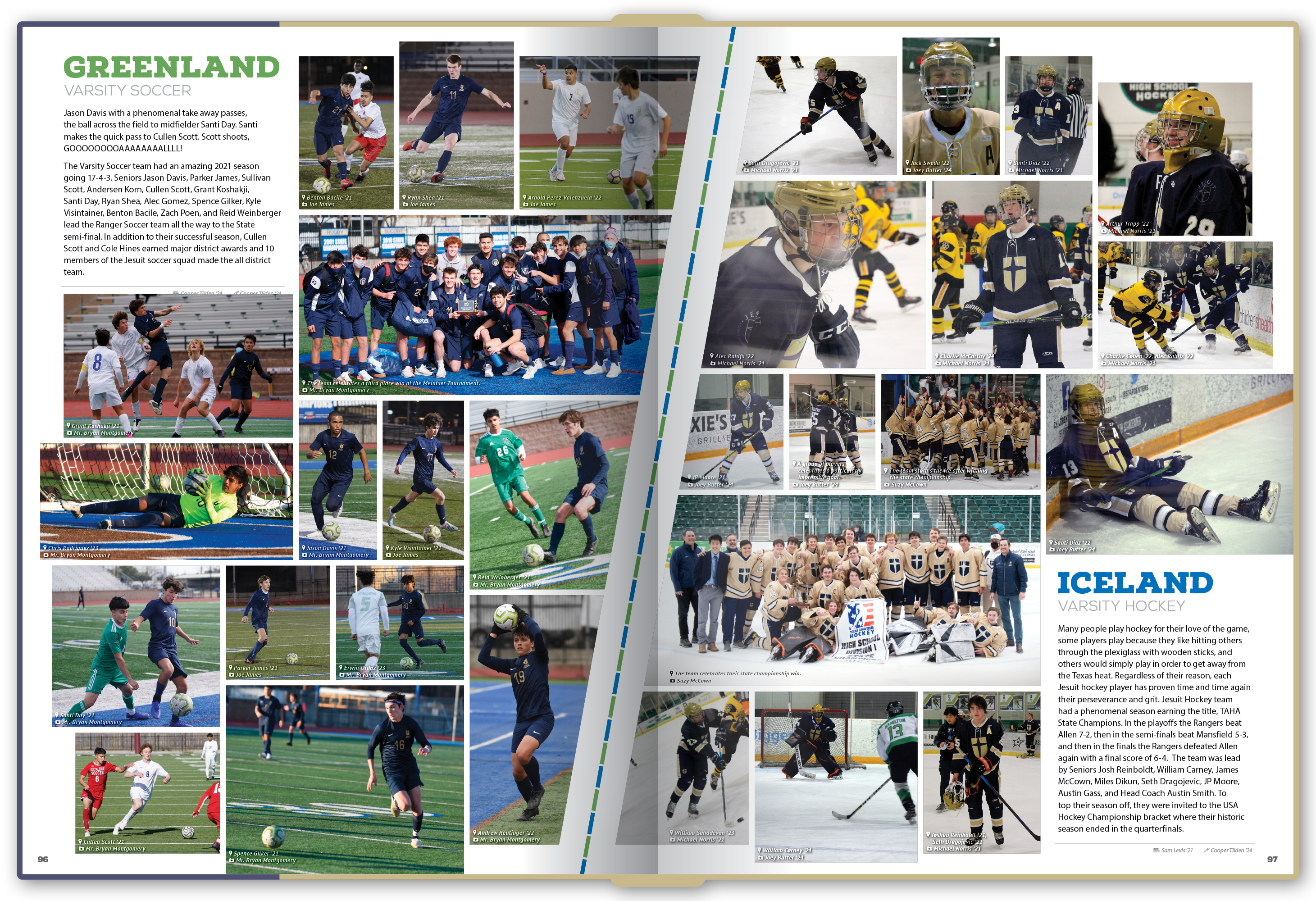
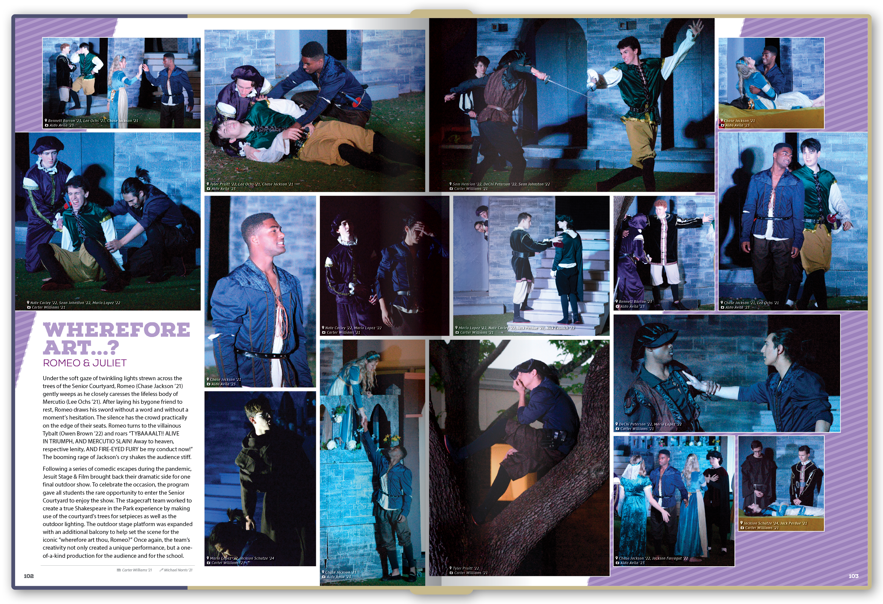
Once we selected a theme, we translated it into a small visual system: typography, color, recurring graphic devices, page modules, section openers, photography treatments, and templates for the different kinds of spreads the staff would need. I designed the final cover artwork each year and often created the more technically demanding illustrations or graphics, while coaching students through the rest of the system and refining their work when consistency started to drift.

That balance mattered. I wanted the books to feel cohesive and professionally produced, but I never wanted the students to feel like they were simply executing my design. The goal was to give them a framework they understood well enough to make it their own.

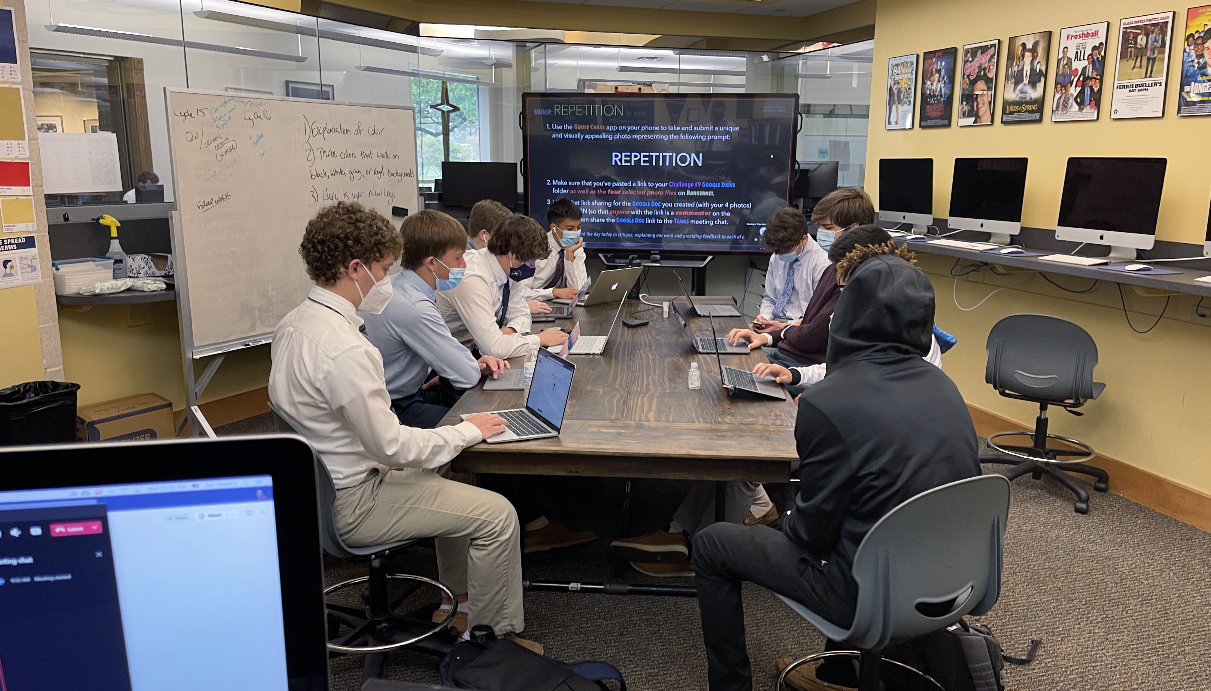
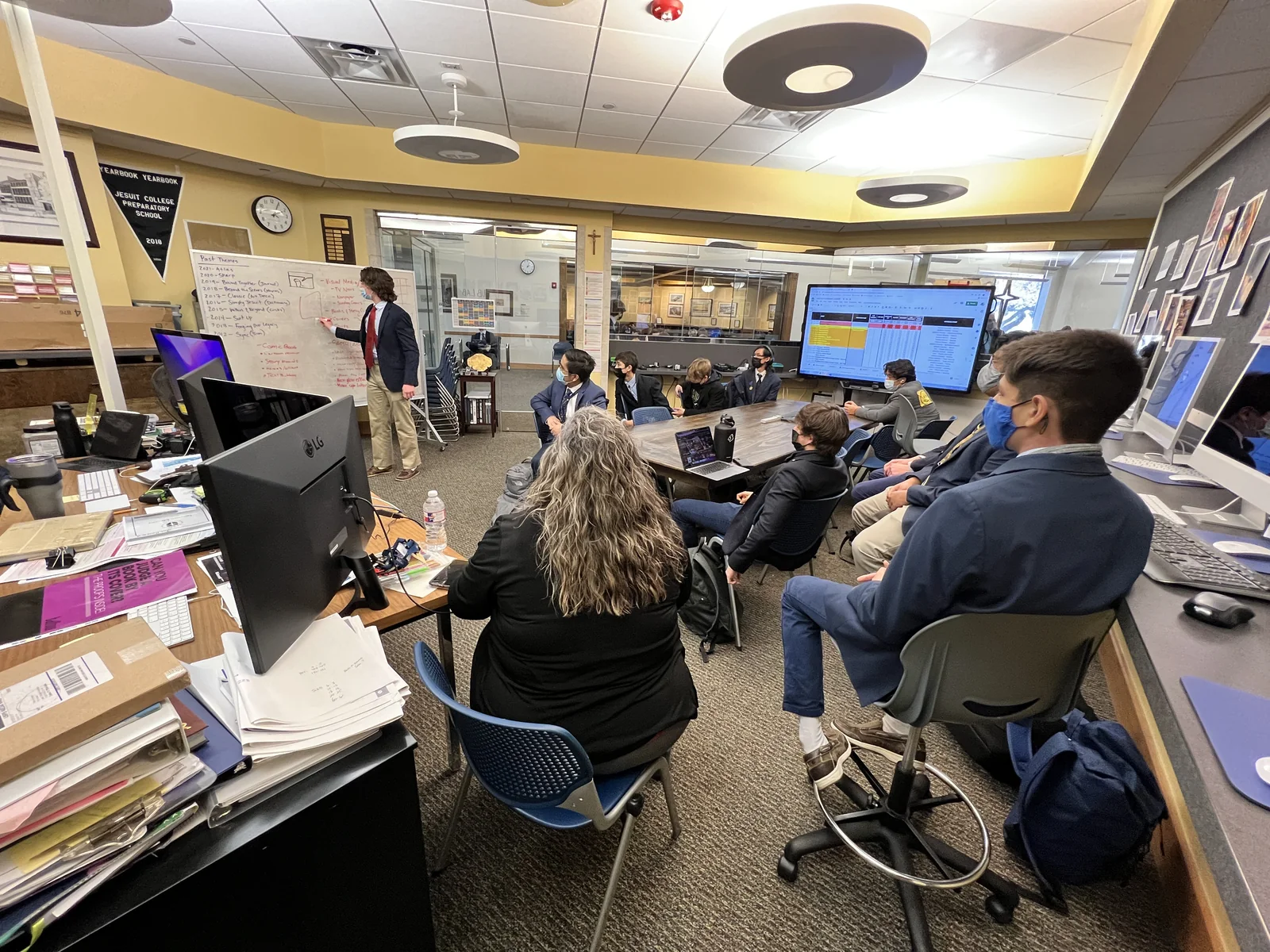
Jesuit Dallas yearbook students brainstorming together in the publications lab. Each year's theme began collaboratively, with student editors exploring concepts before anyone opened a design file.
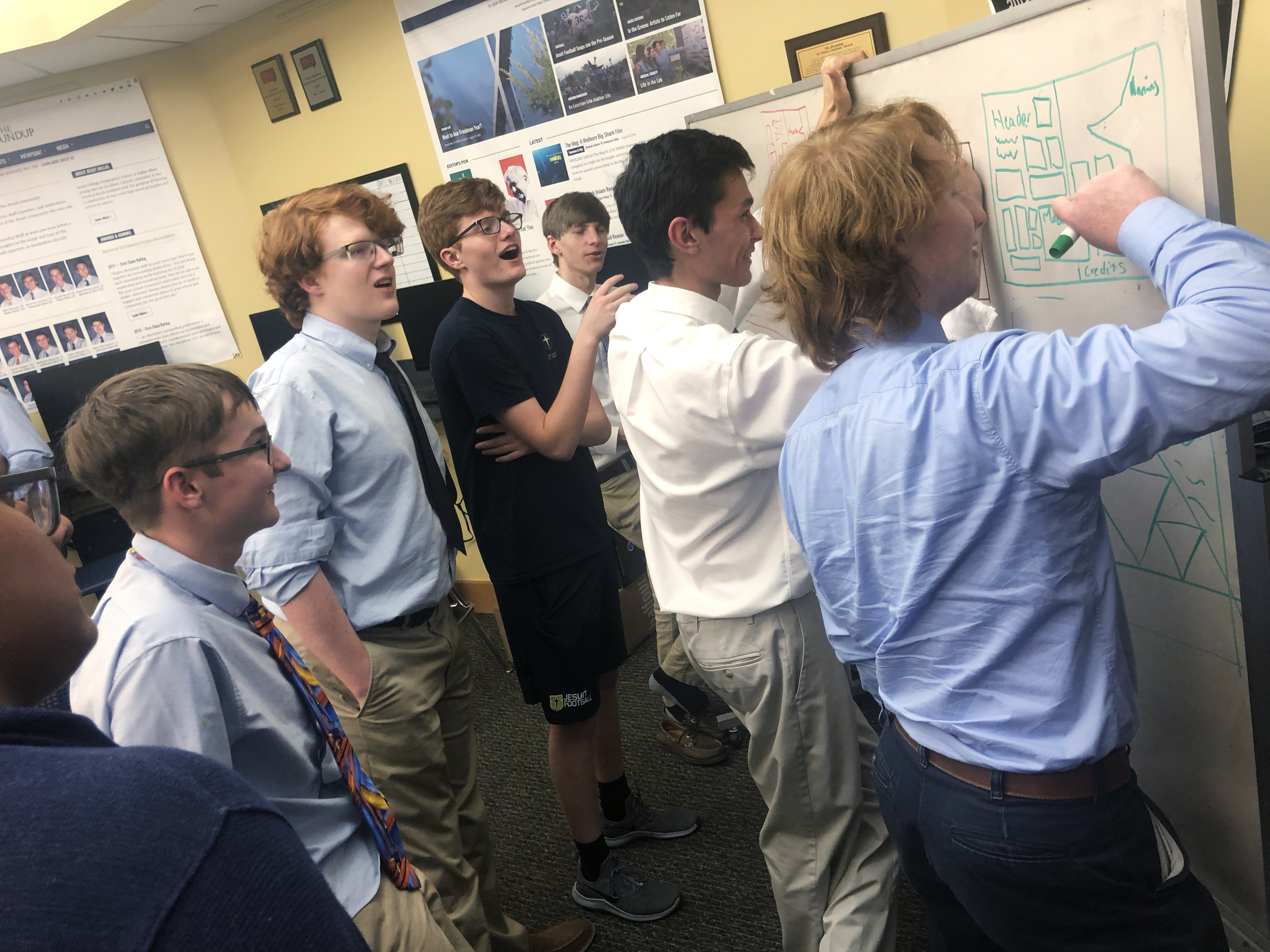
Students sketching ideas together on a whiteboard.
Working through visual directions as a team.
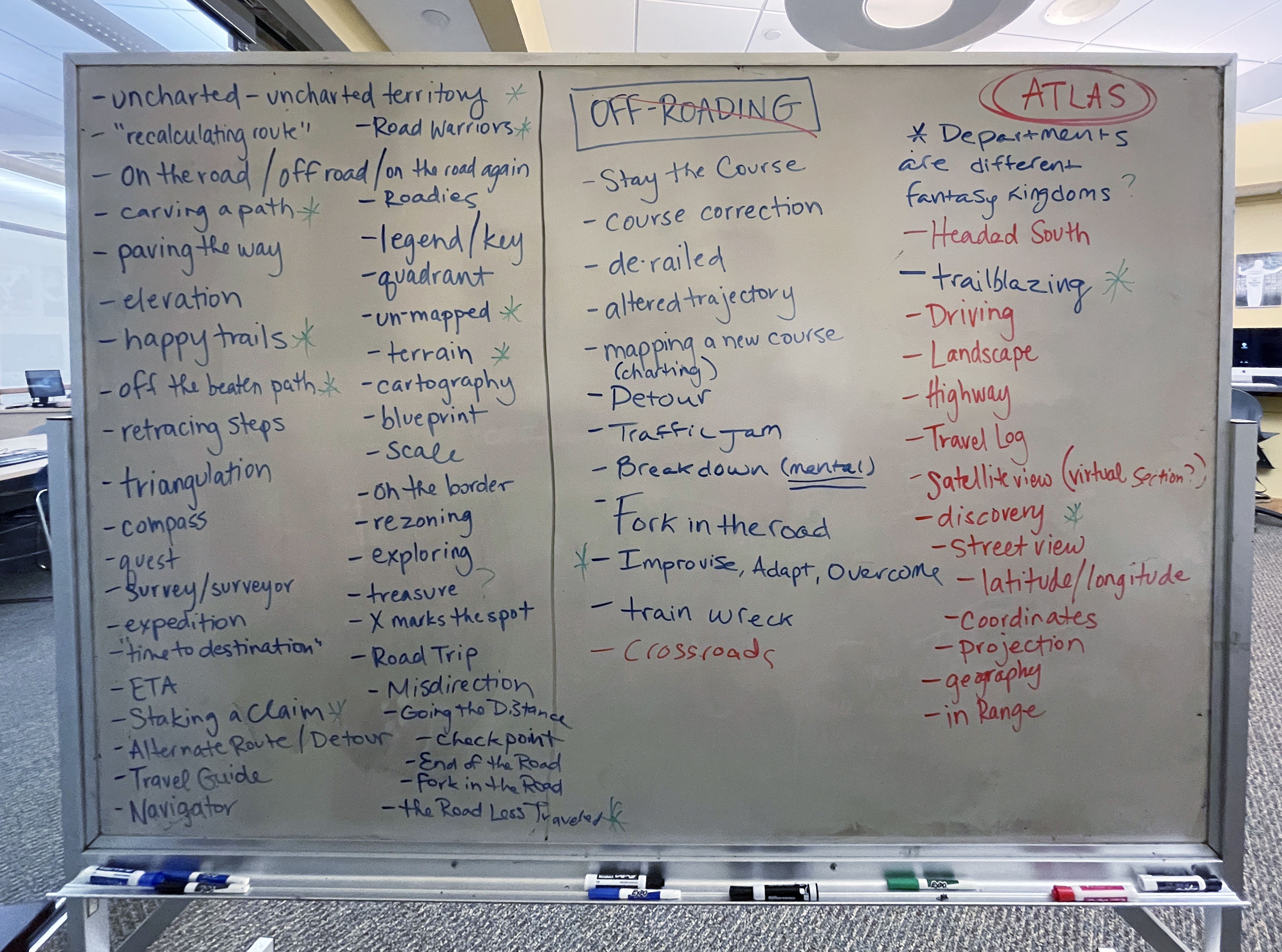
A whiteboard filled with brainstorming notes for the Atlas yearbook theme.
Developing language and visual cues for the 2020-21 Atlas theme.
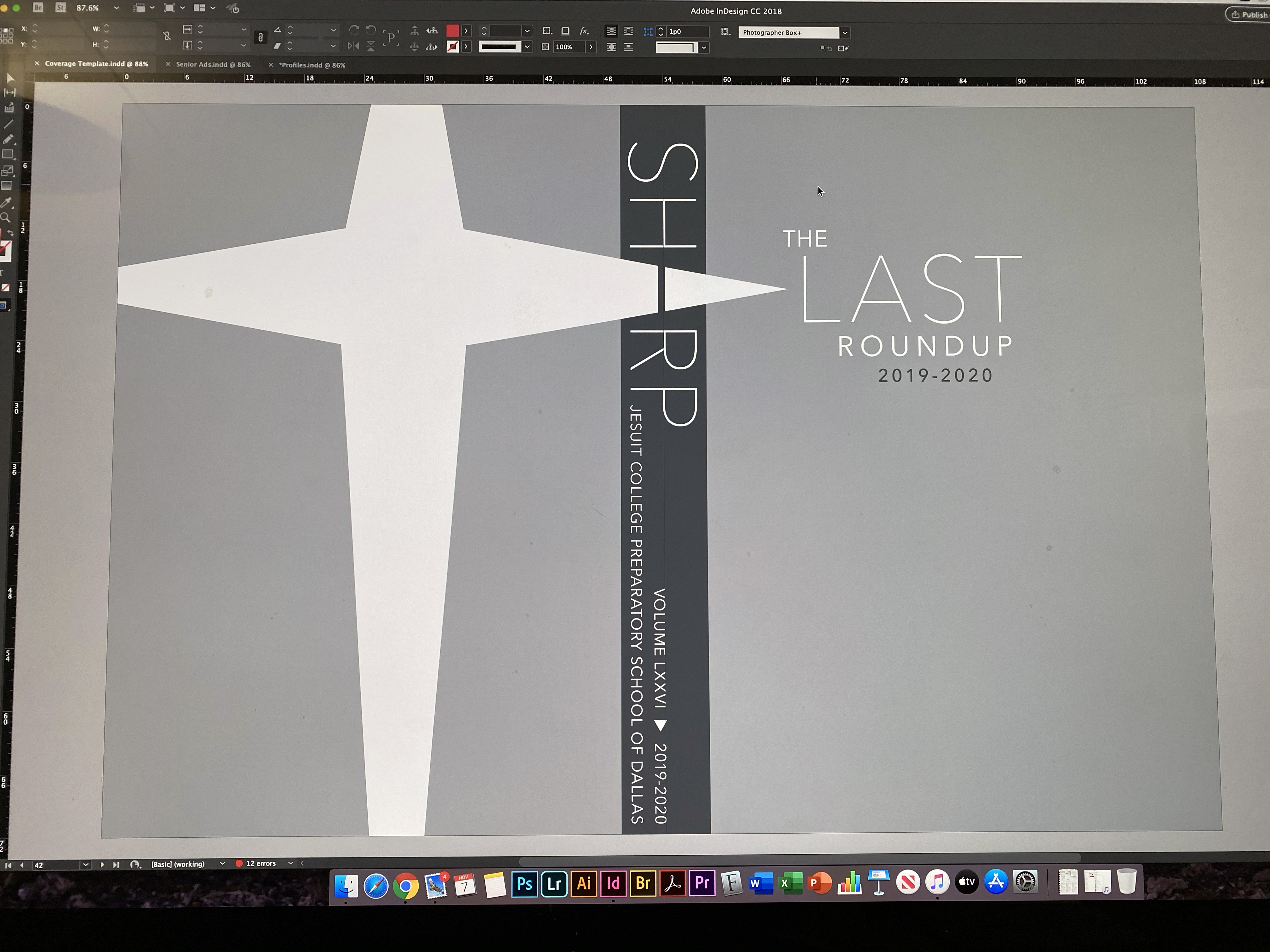
The Sharp yearbook cover and layout system being refined in Adobe InDesign.
Refining student concepts into a consistent publication system.

The best part was never any one book we made. It was watching students learn to make creative decisions together, then seeing them leave with a process they could use long after the book was finished.

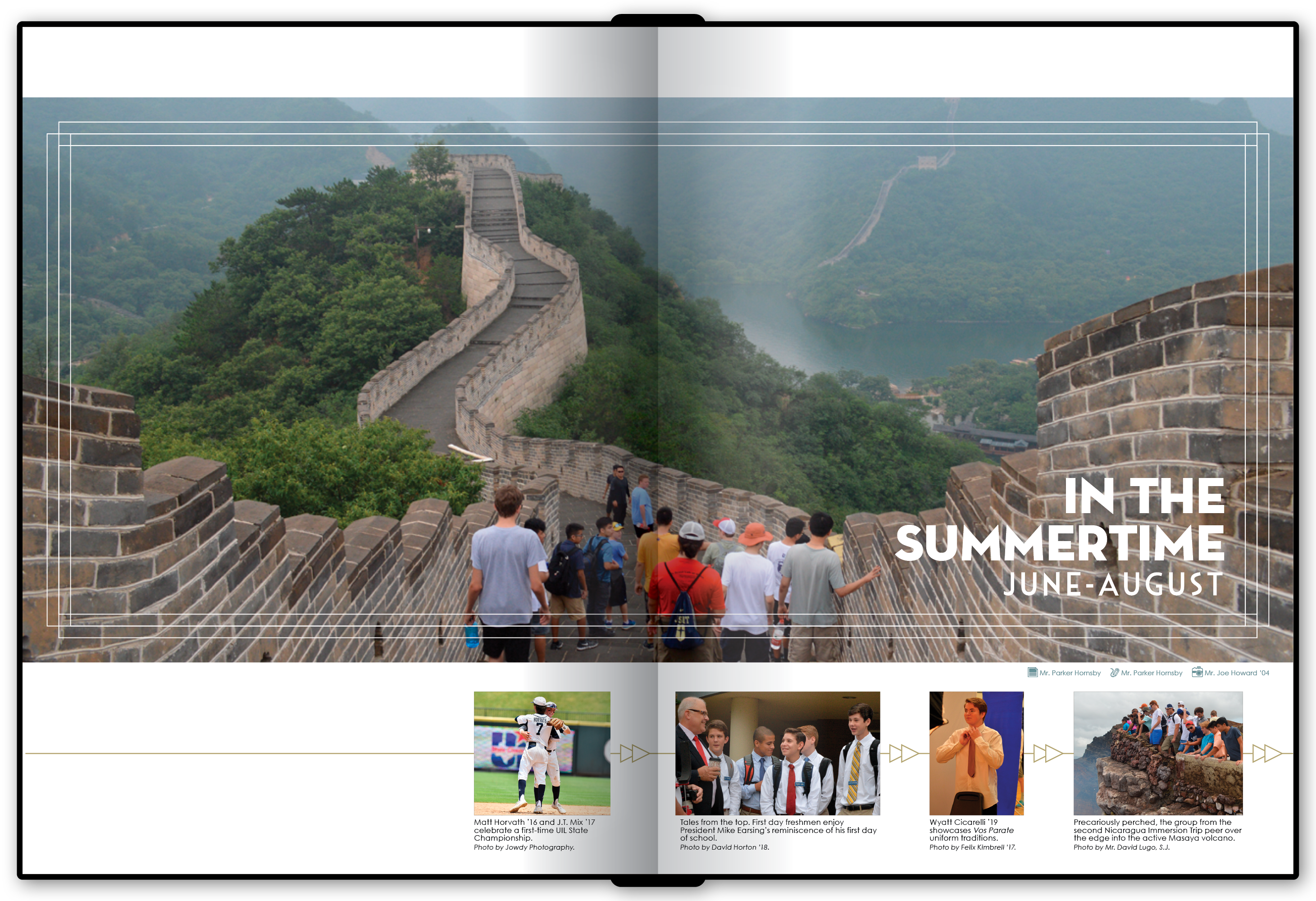
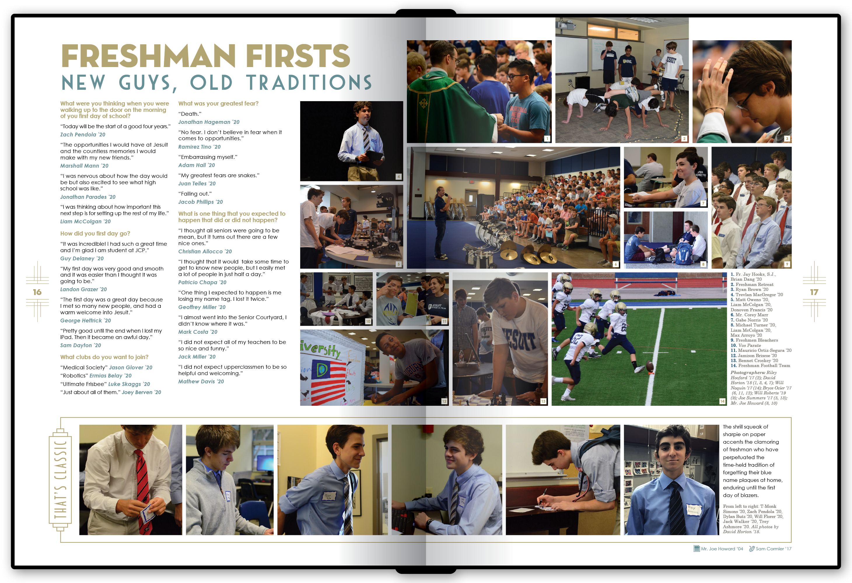
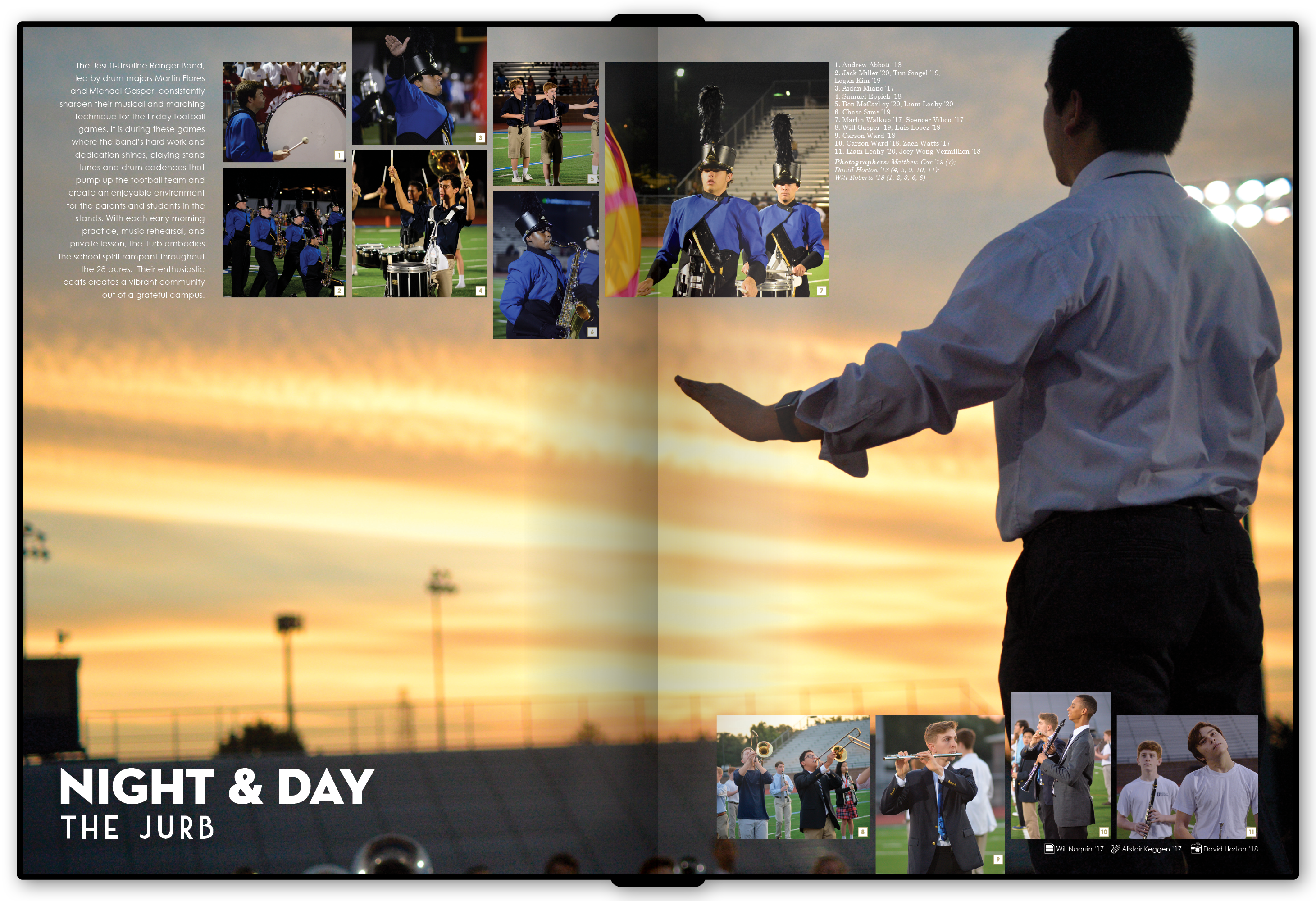
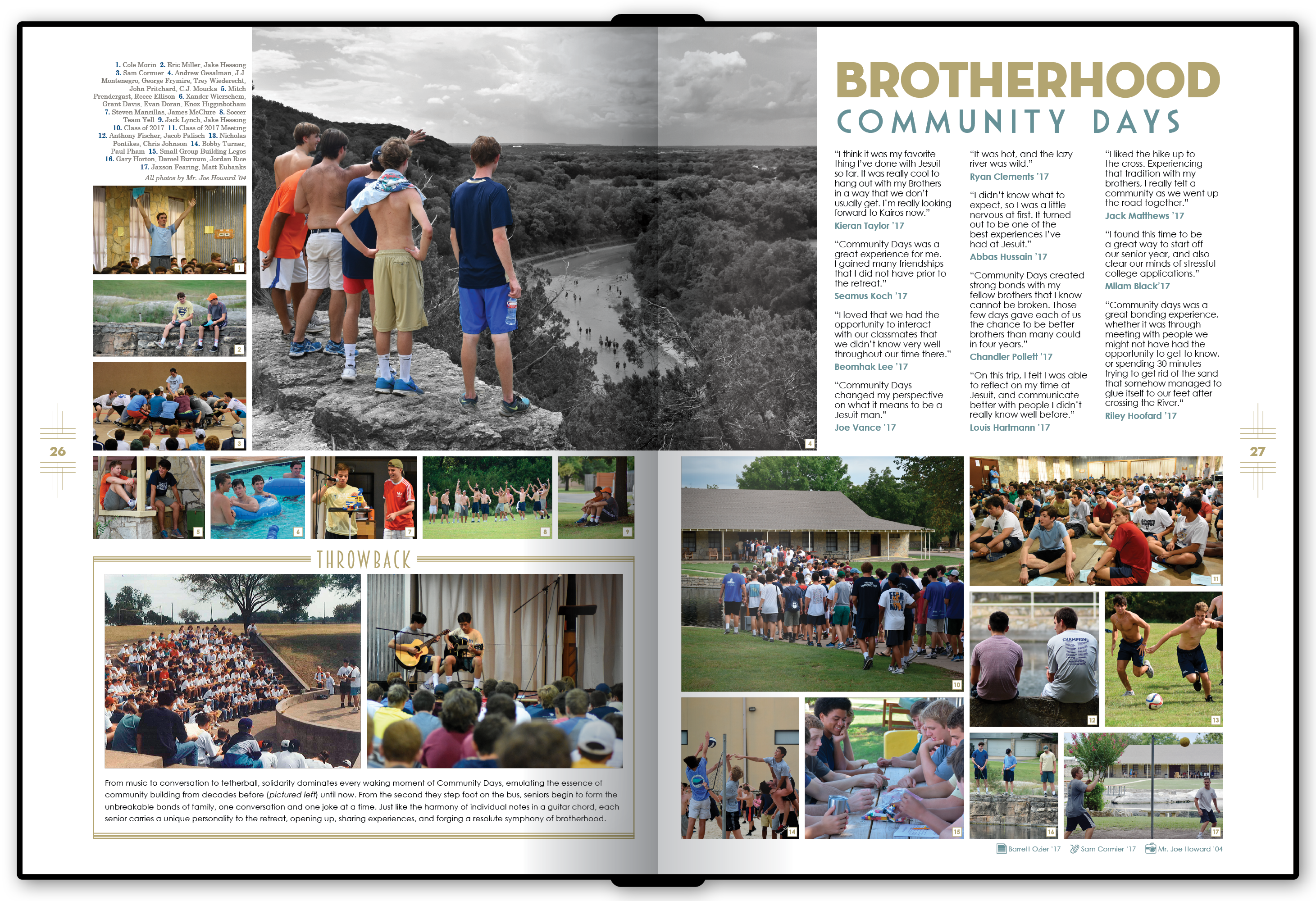
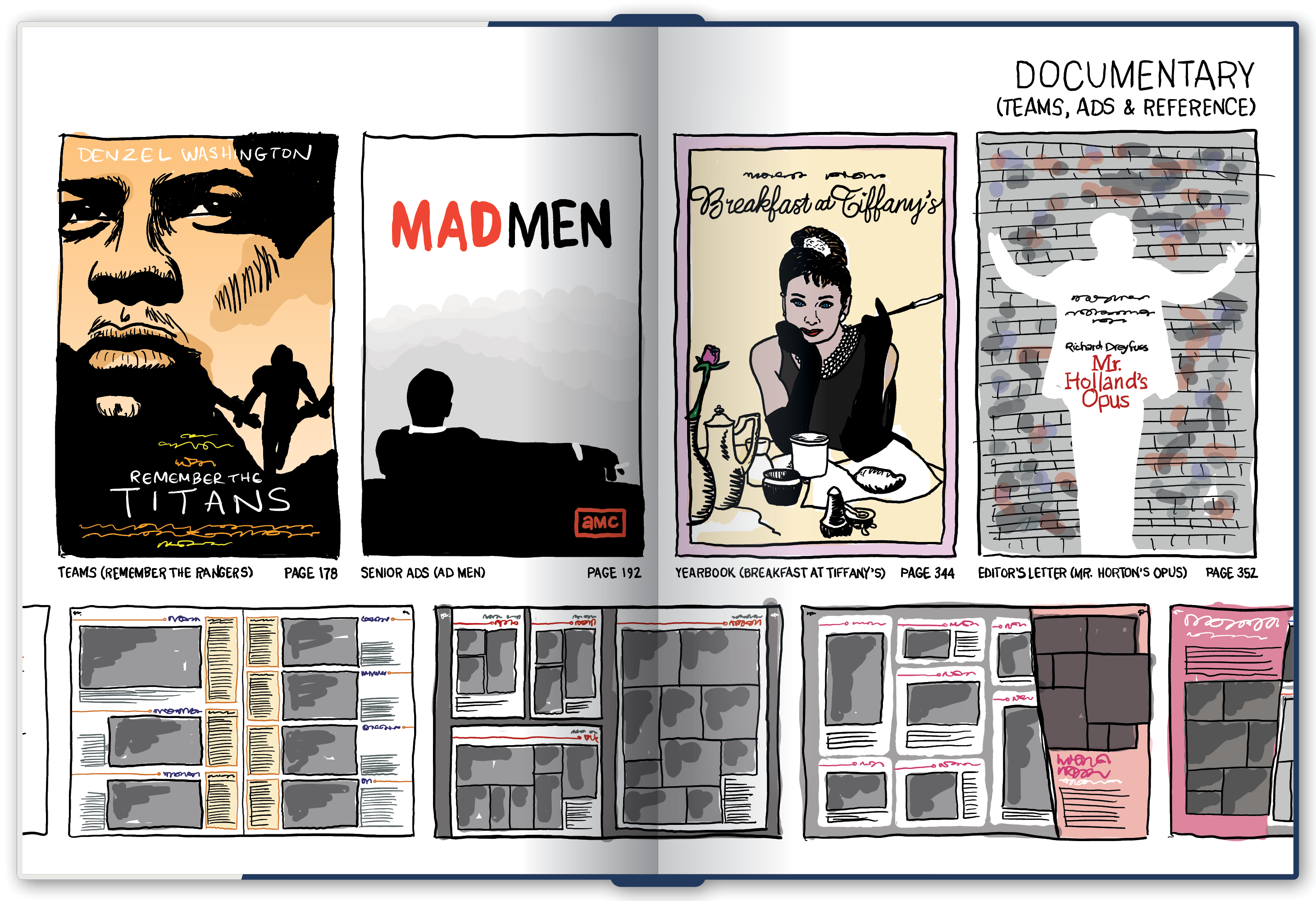
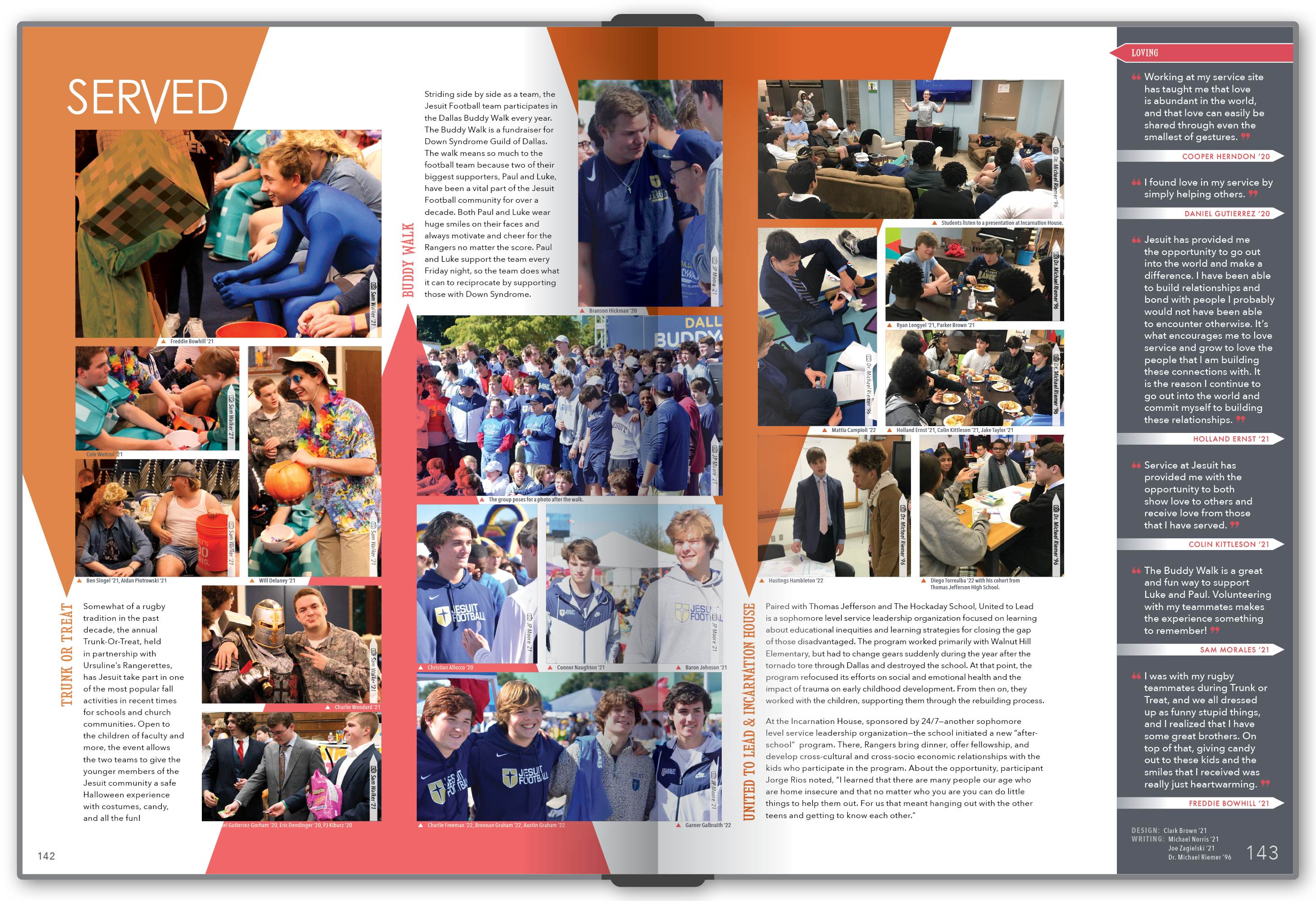
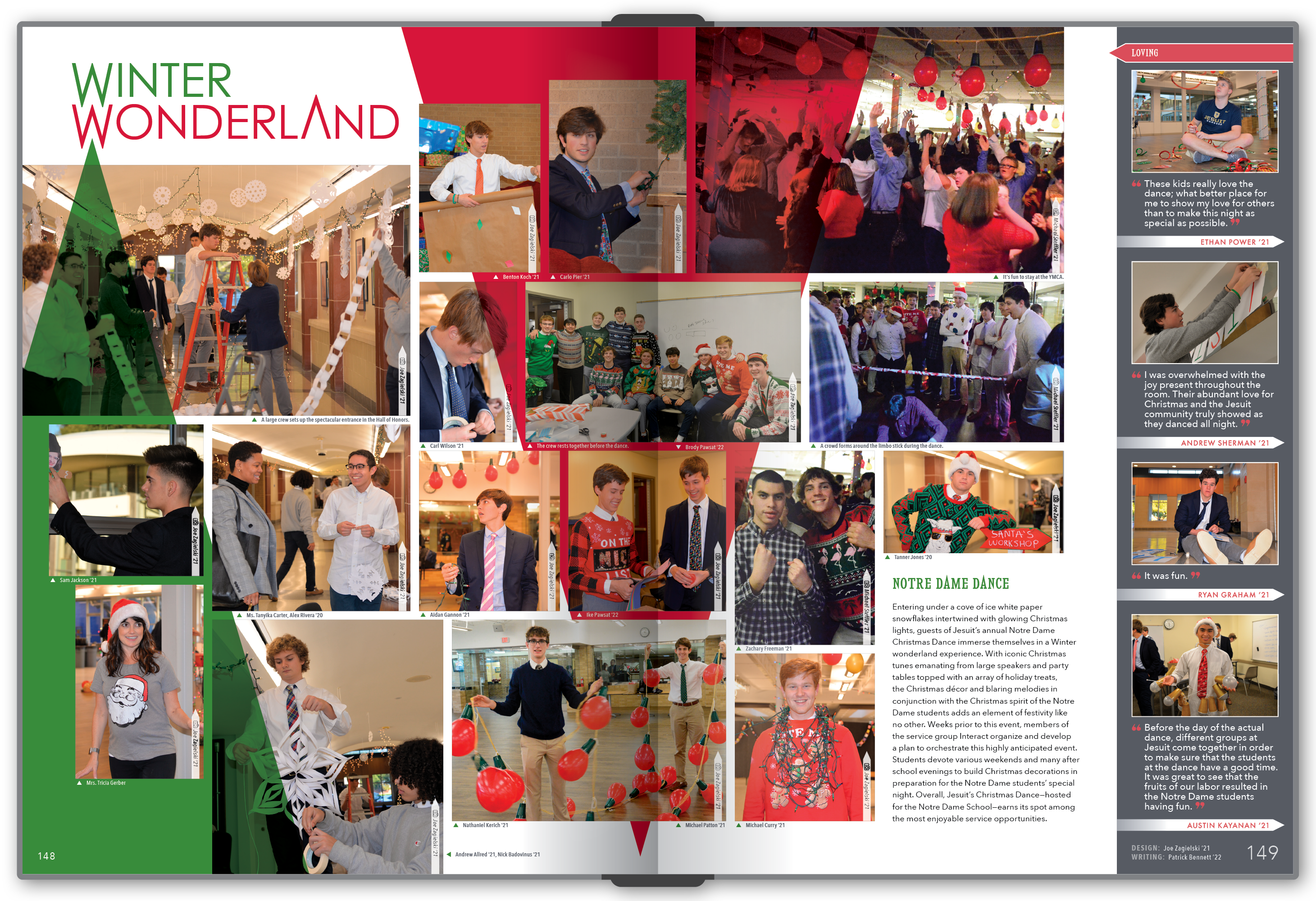
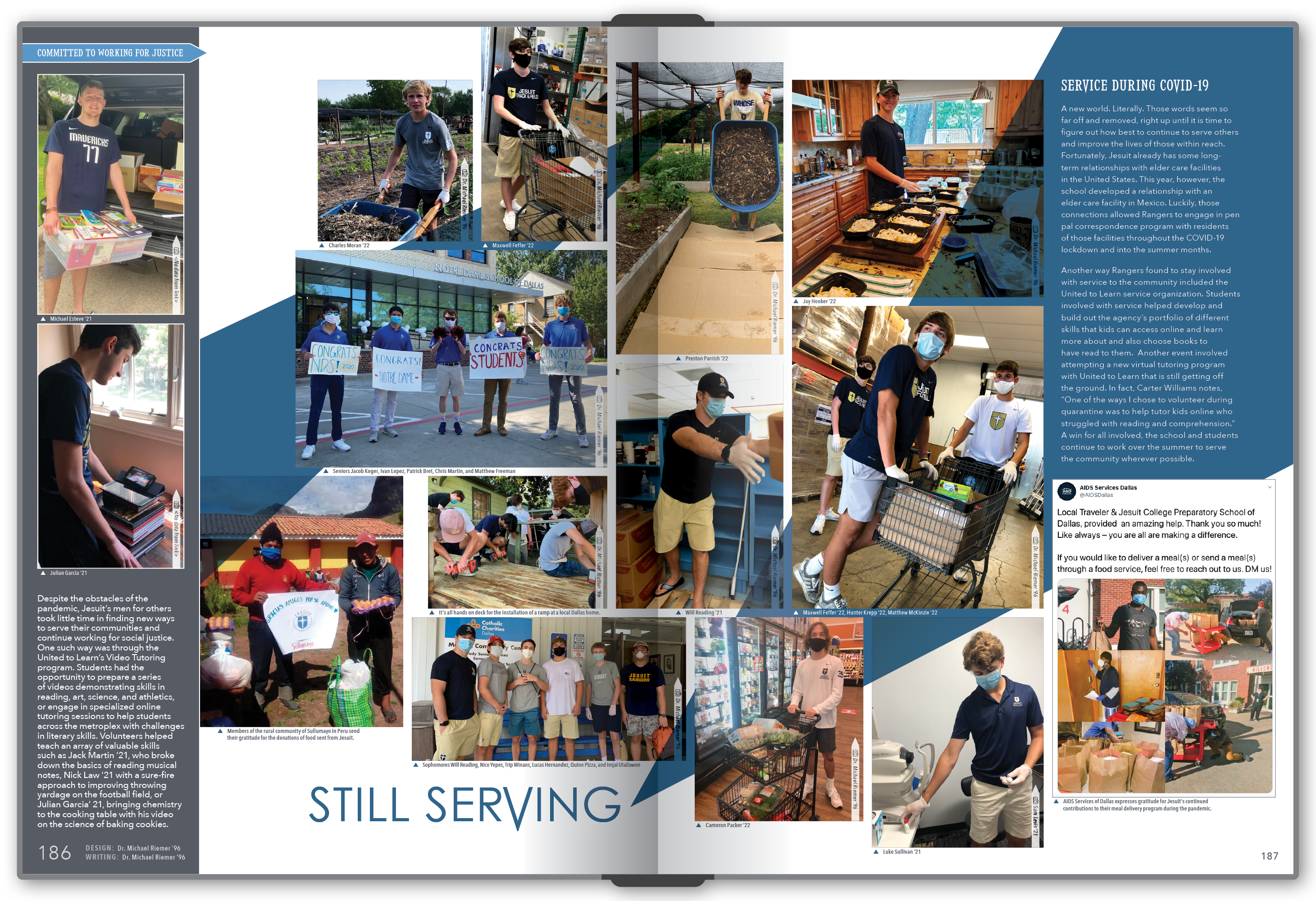
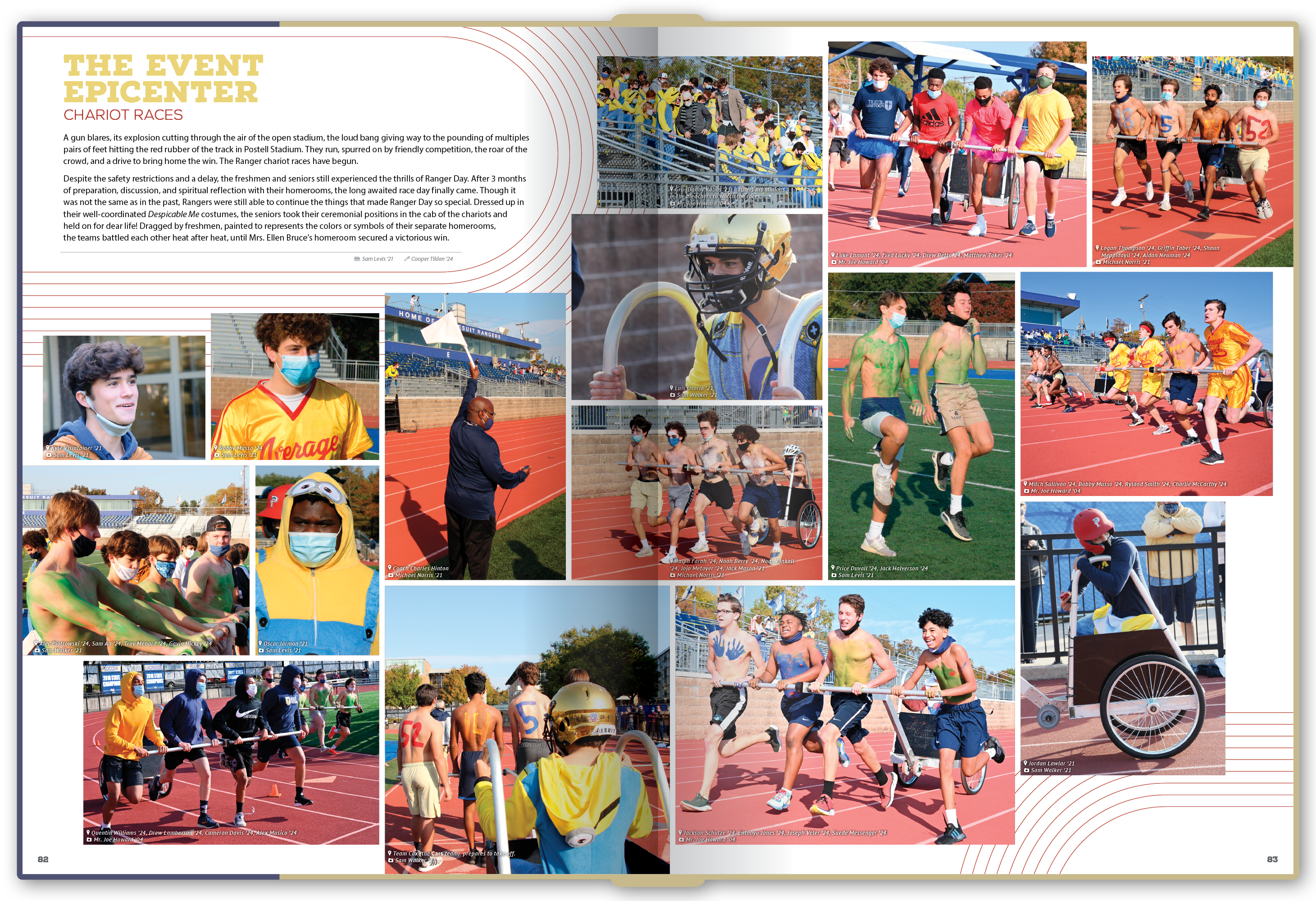
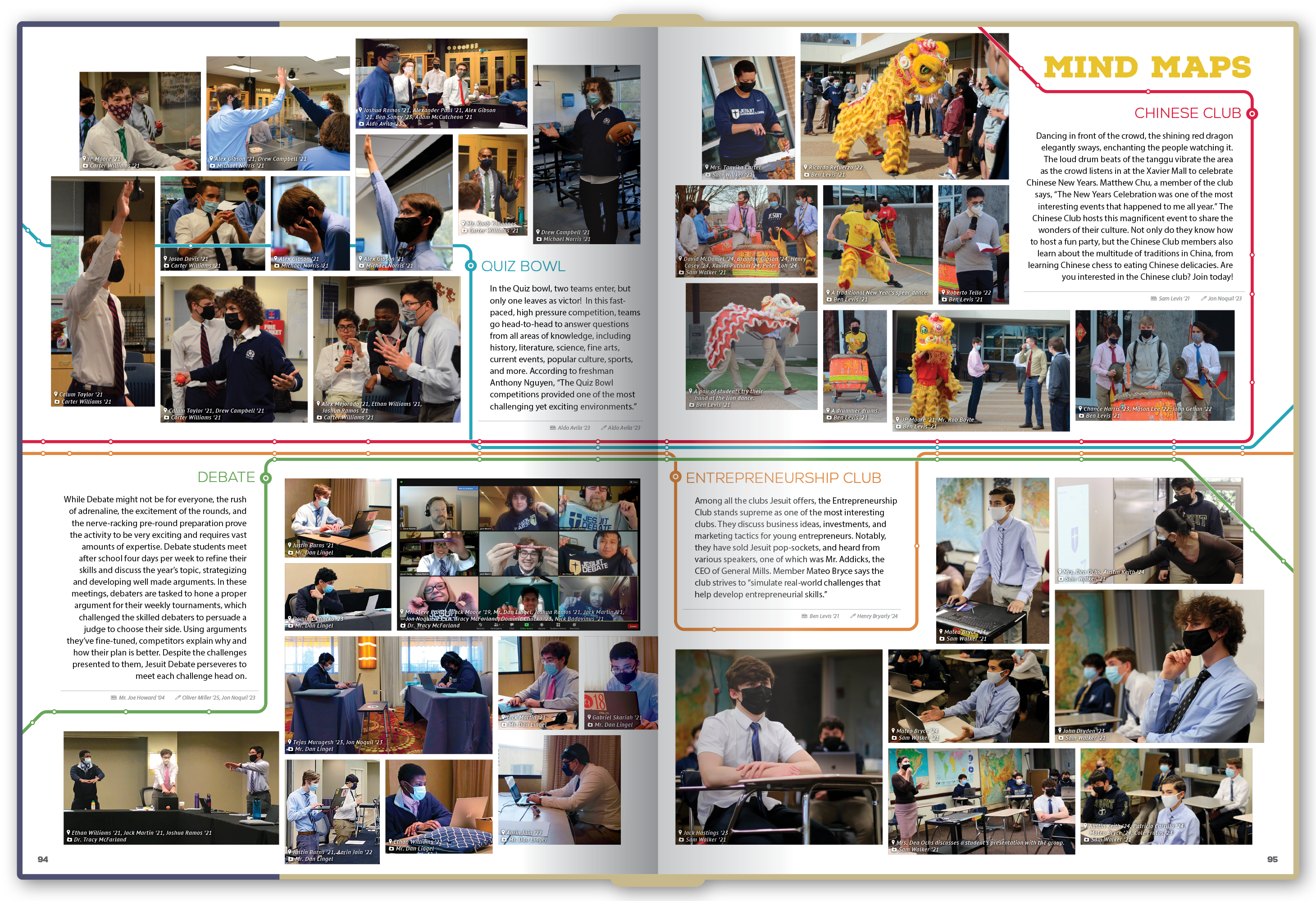
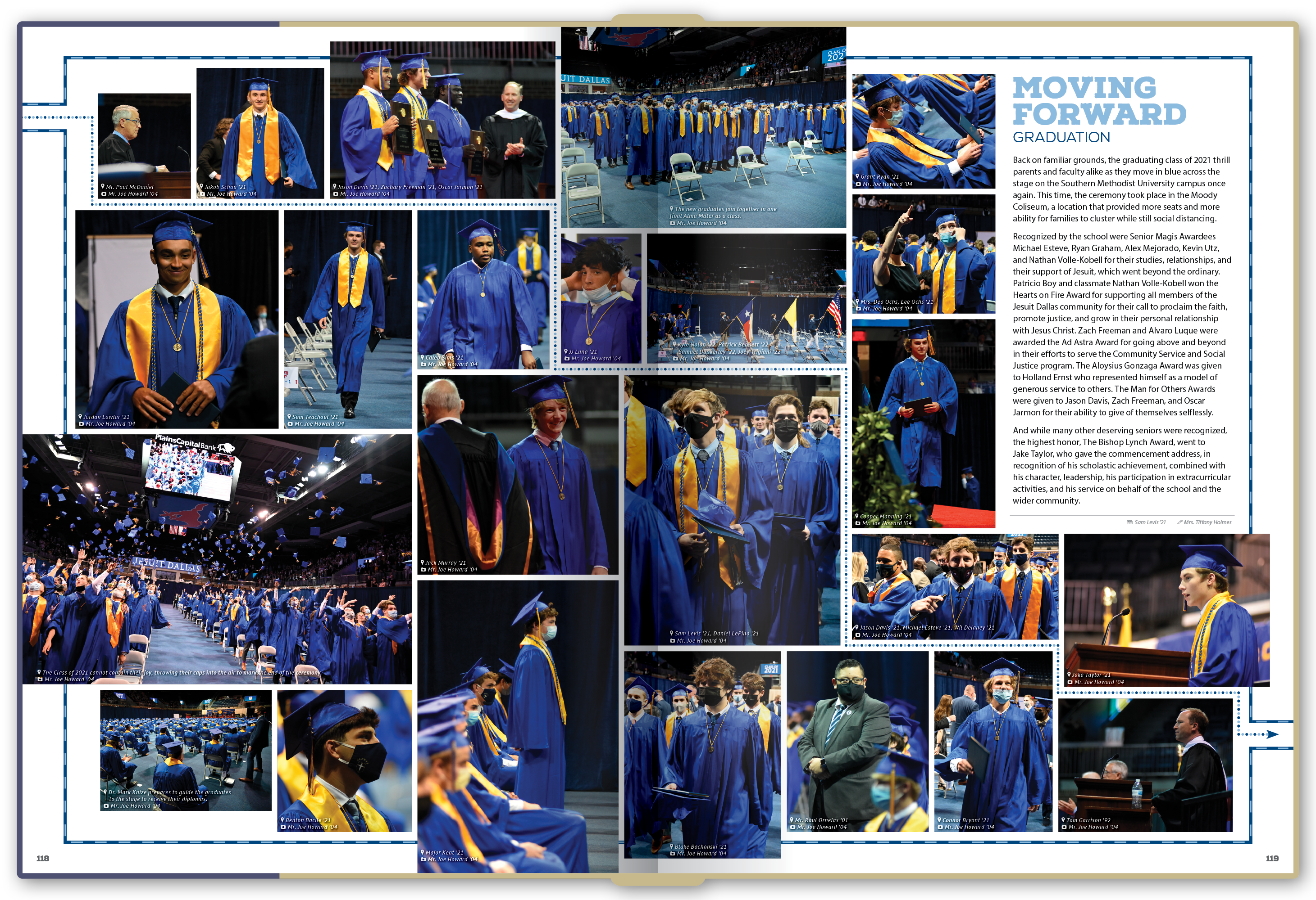
While the core process stayed consistent over the years, the visual answer changed completely from year to year. These six books are a cross-section of the different systems we built together, from Art Deco and bullet journals to maps, geometry, and neon signs.

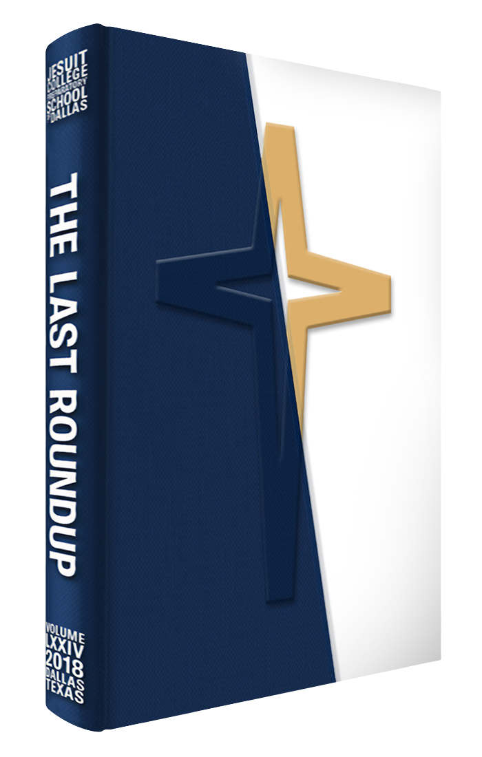
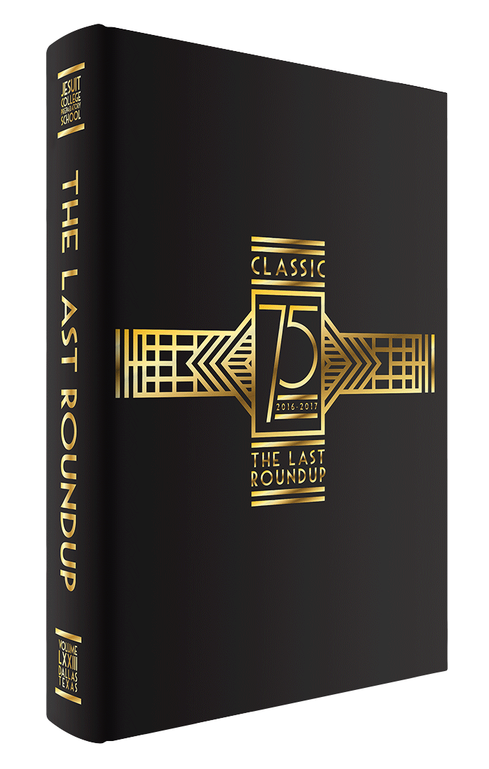
Cover of the 2016-17 yearbook.

2016-17

Classic

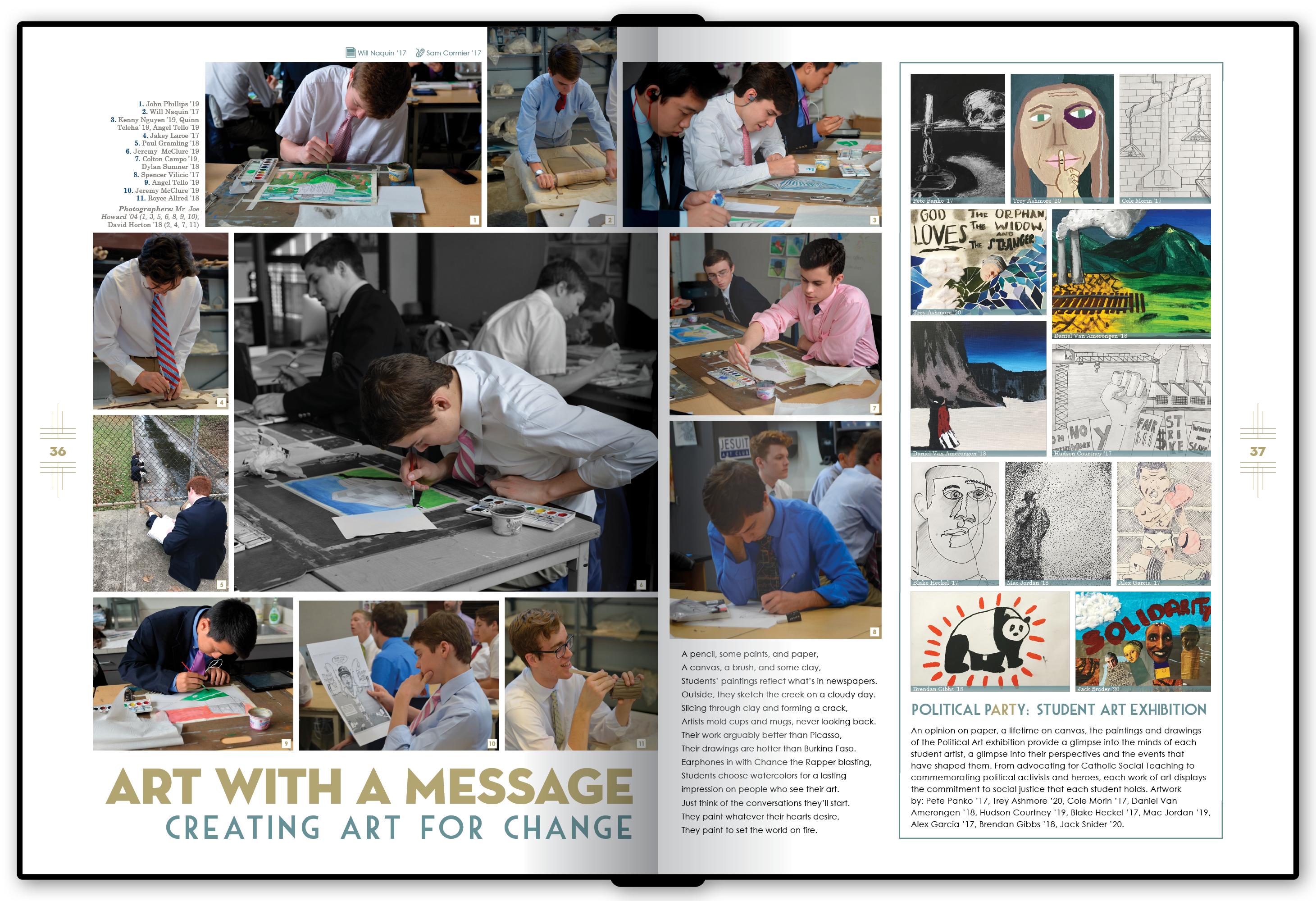
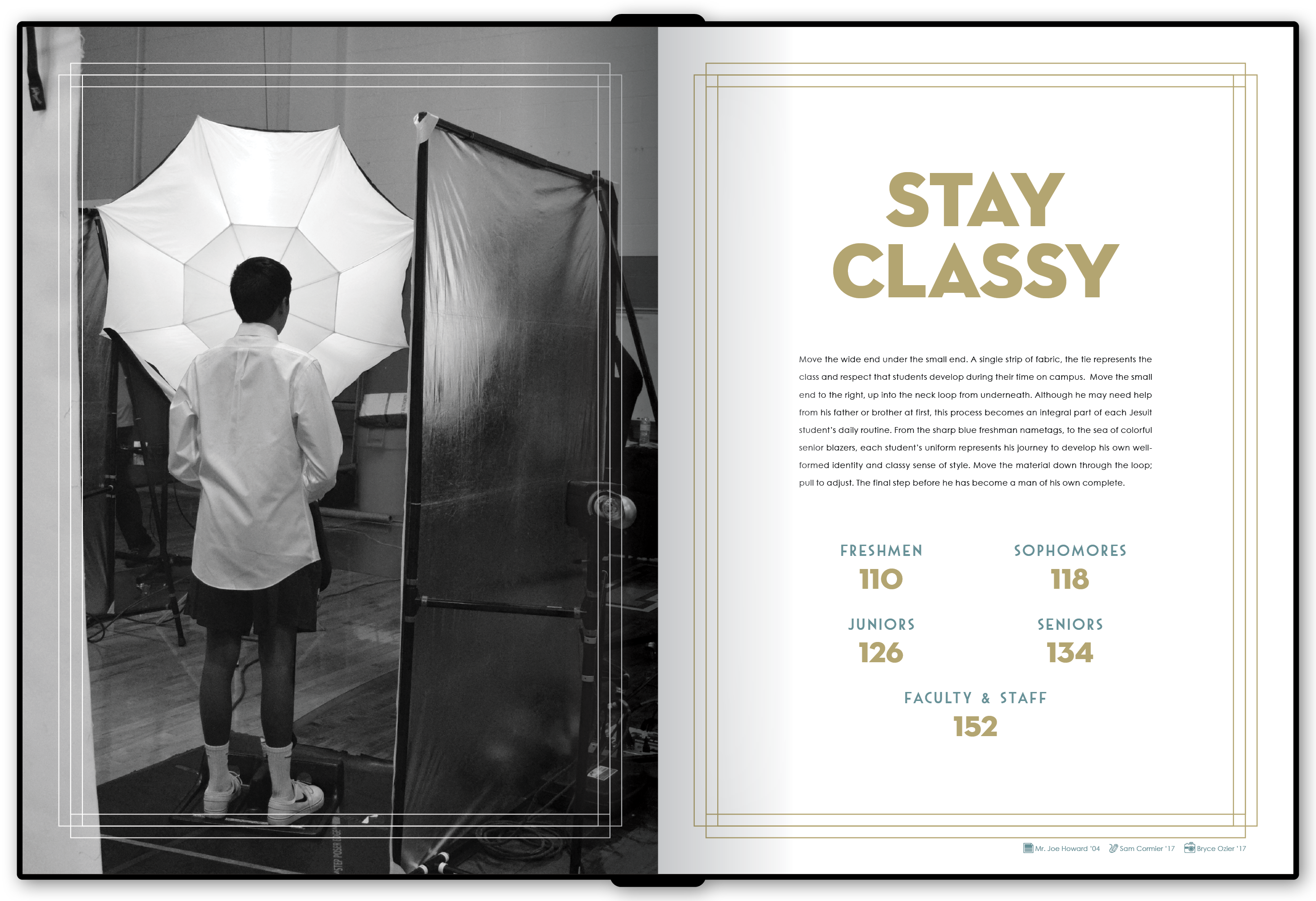
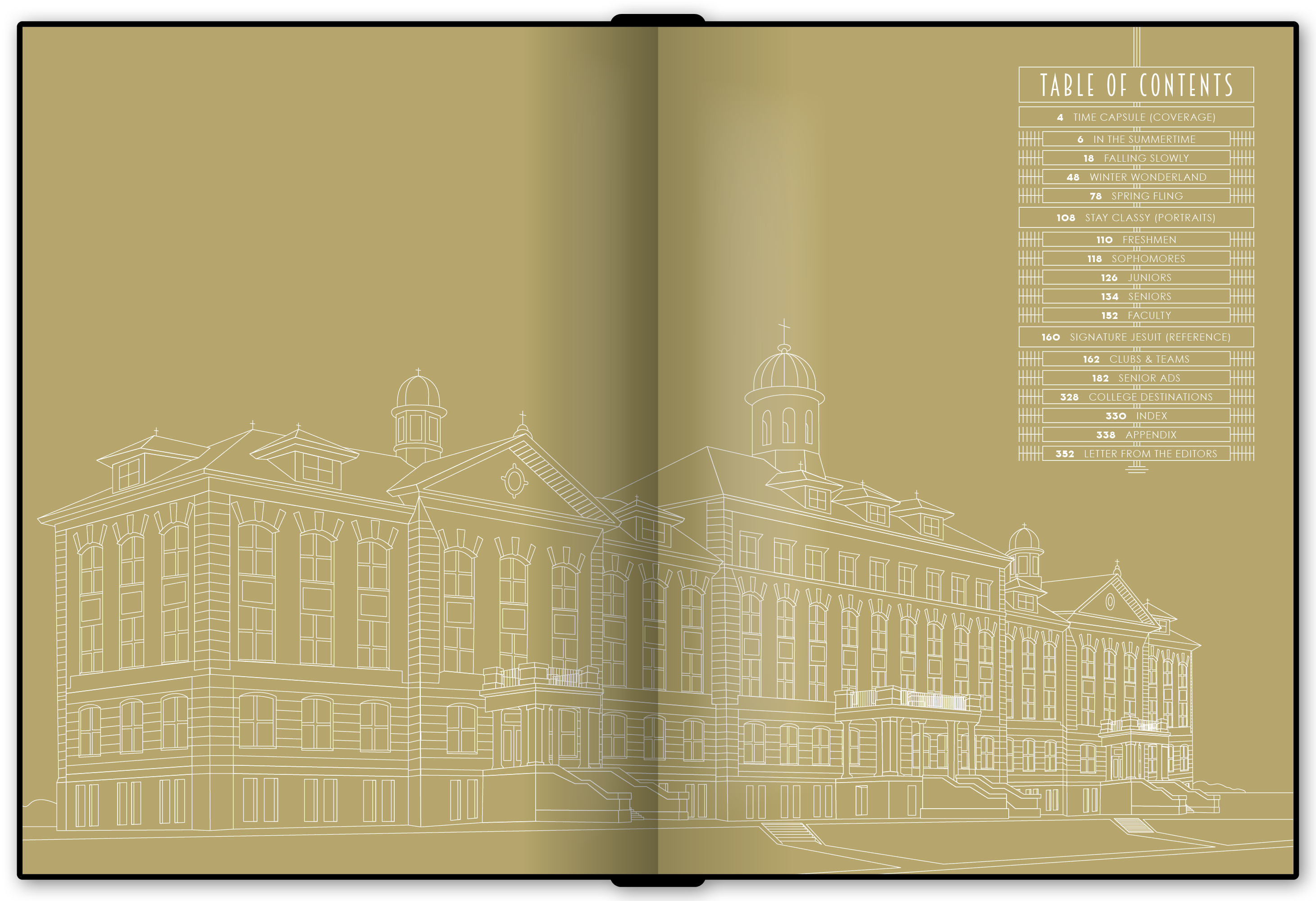
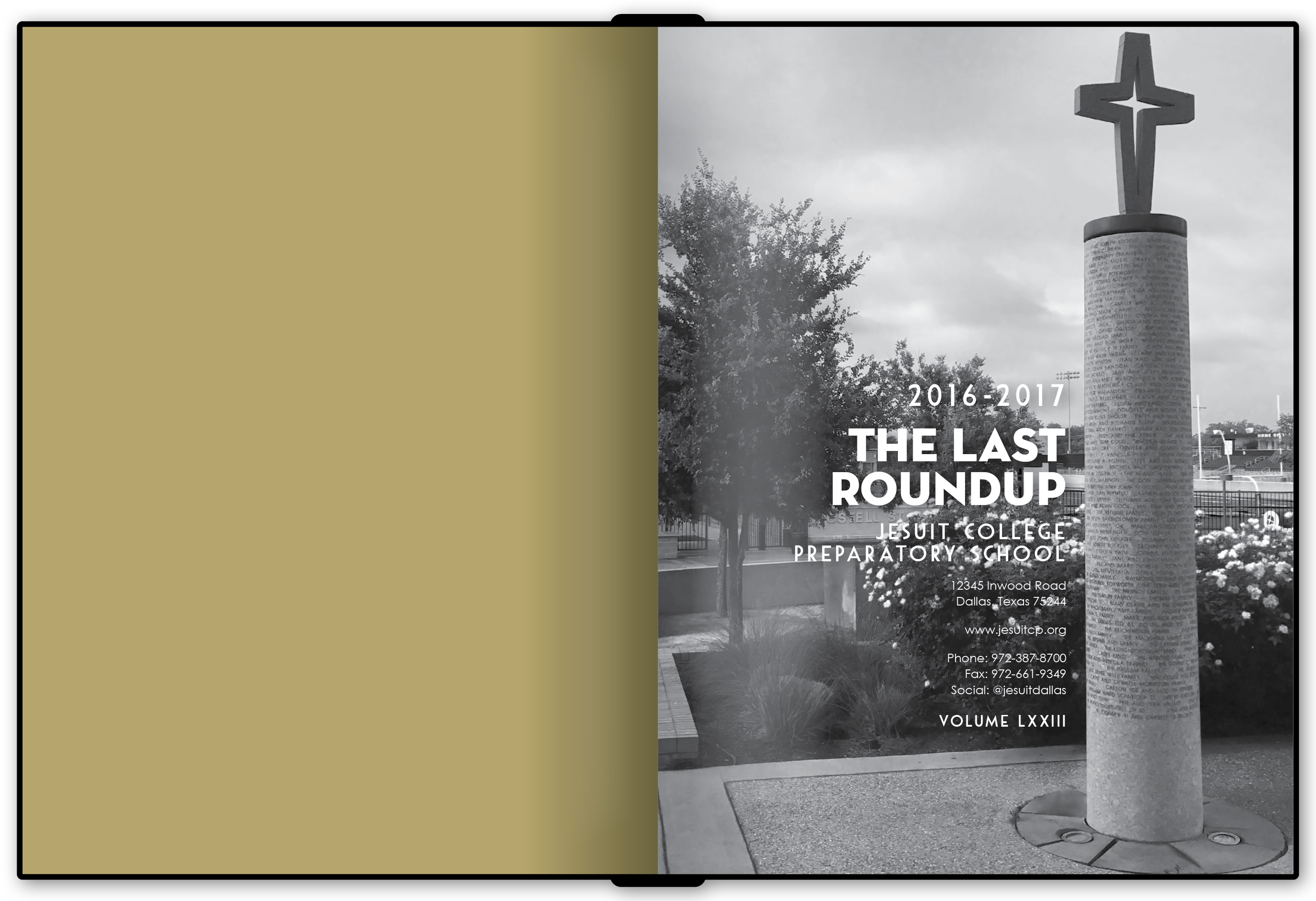
My first year as adviser coincided with Jesuit's 75th anniversary, so the staff wanted a book that felt celebratory without feeling trendy. We built the system around an Art Deco influence, using gold, turquoise, geometric patterns, archival imagery, and comparisons between the school's past and present.

The physical production became part of the concept. Metallic gold ink carried through the endpages, while the black cover used a thermochromic UV coating that revealed imagery of the original and current campuses when exposed to sunlight.
Cover of the 2017-18 yearbook.

2017-18

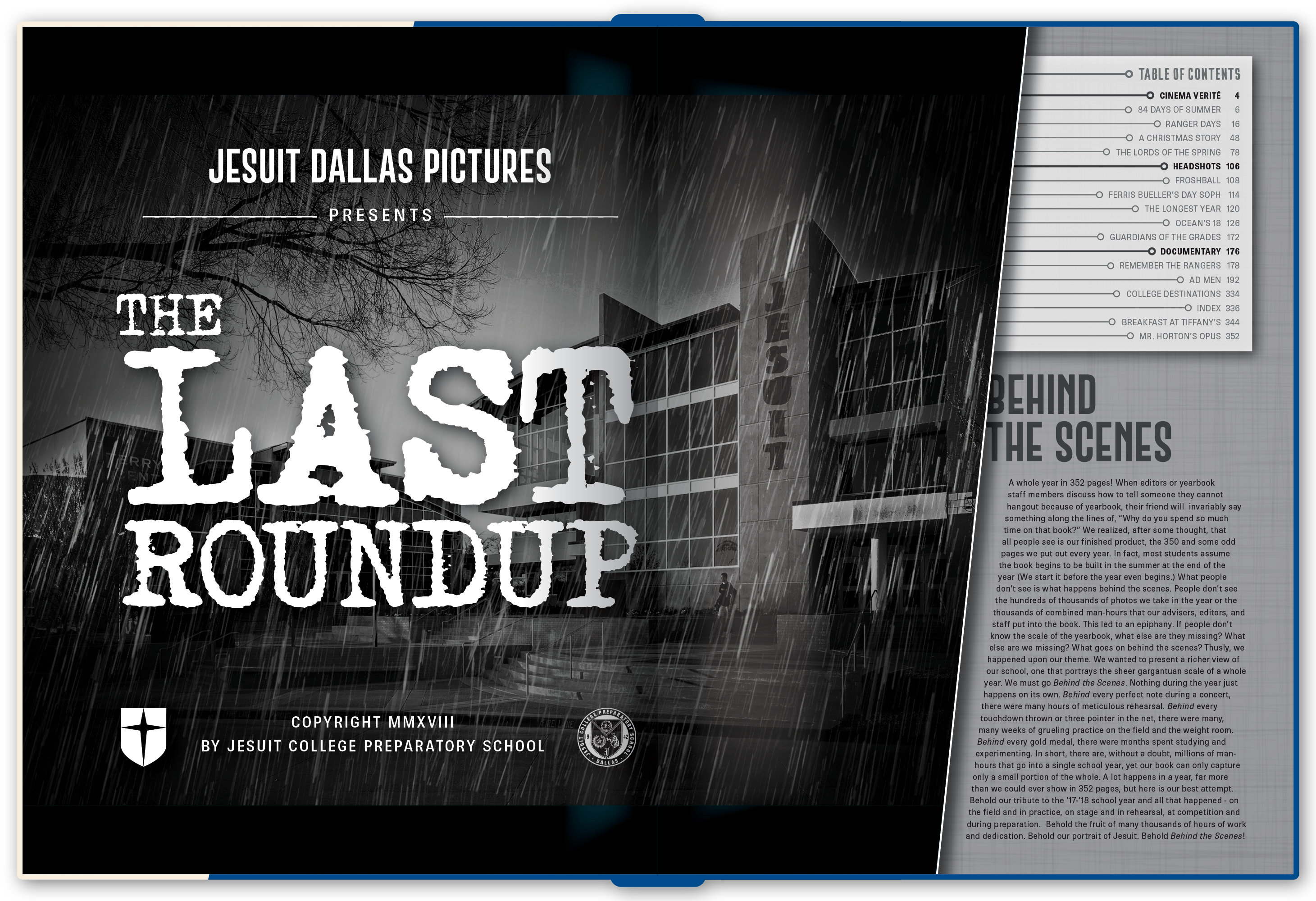
Behind the Scenes

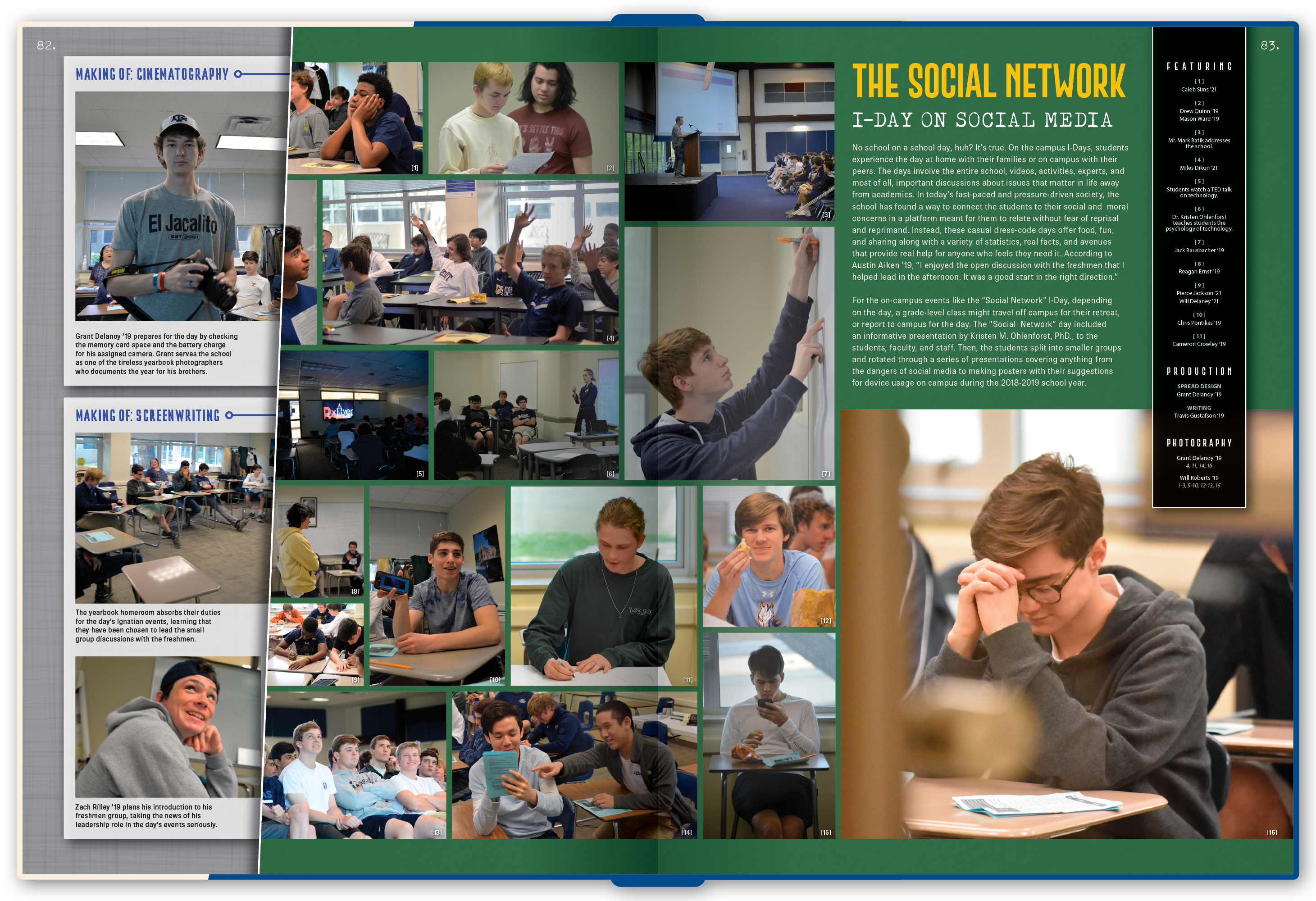
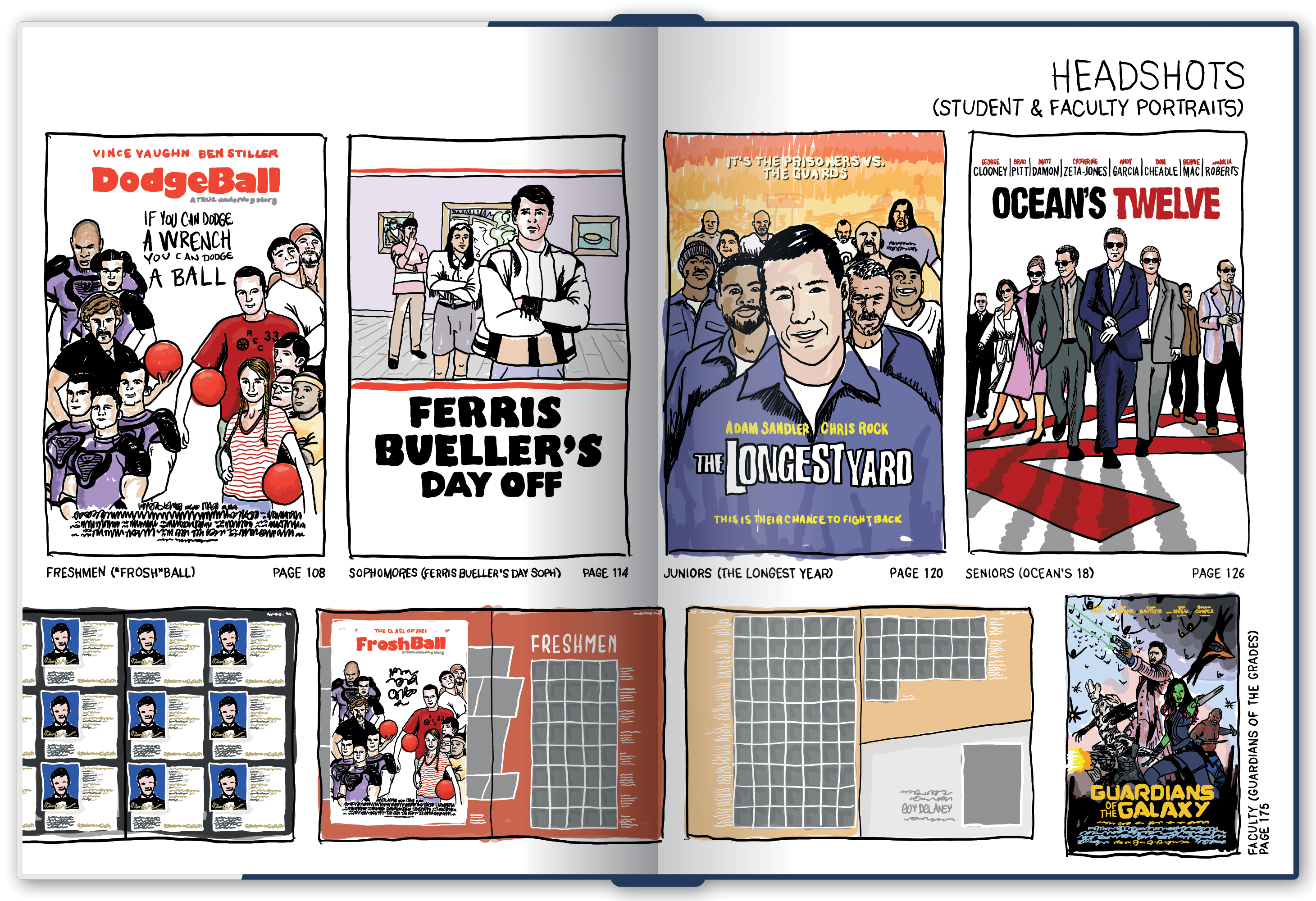
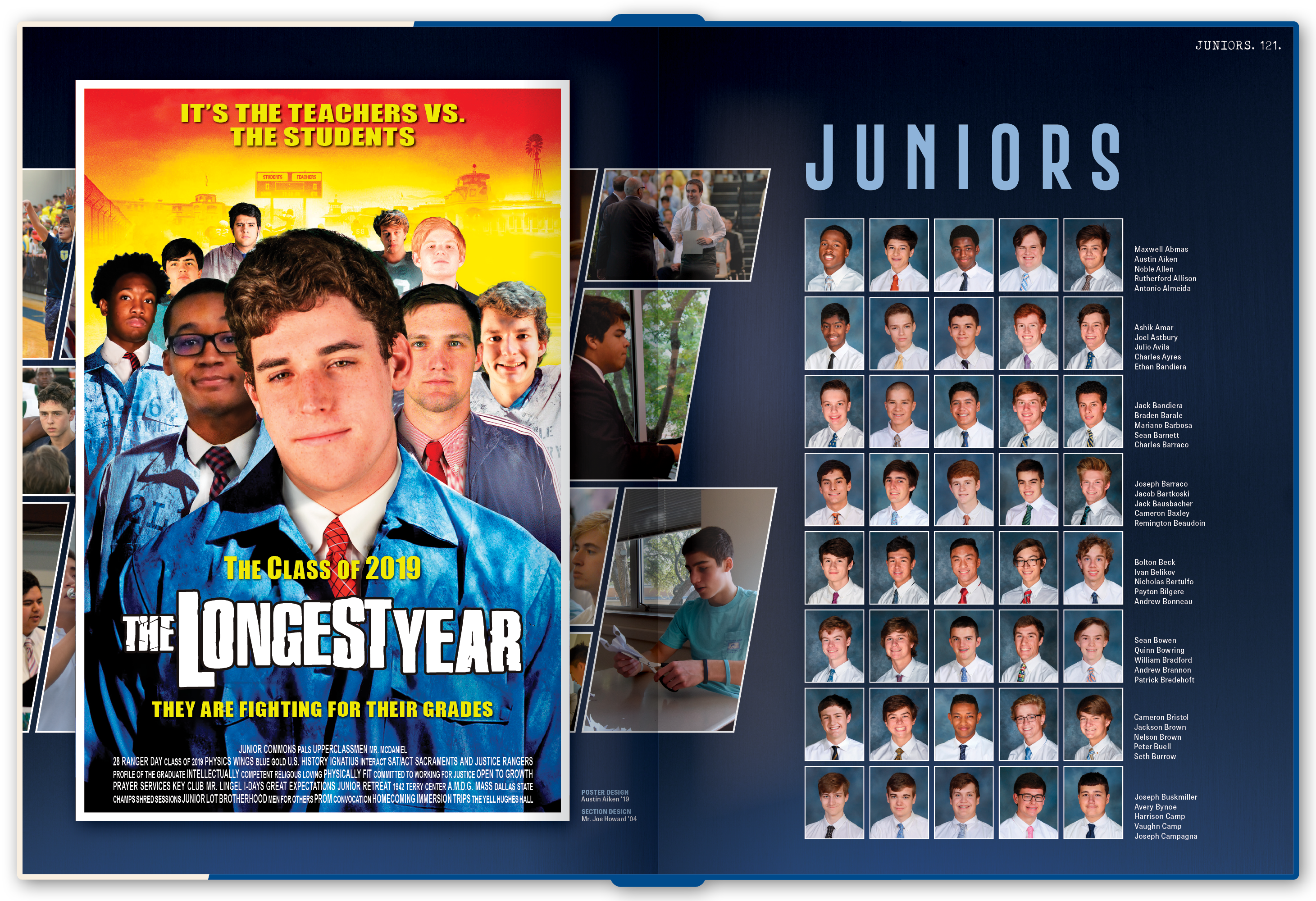
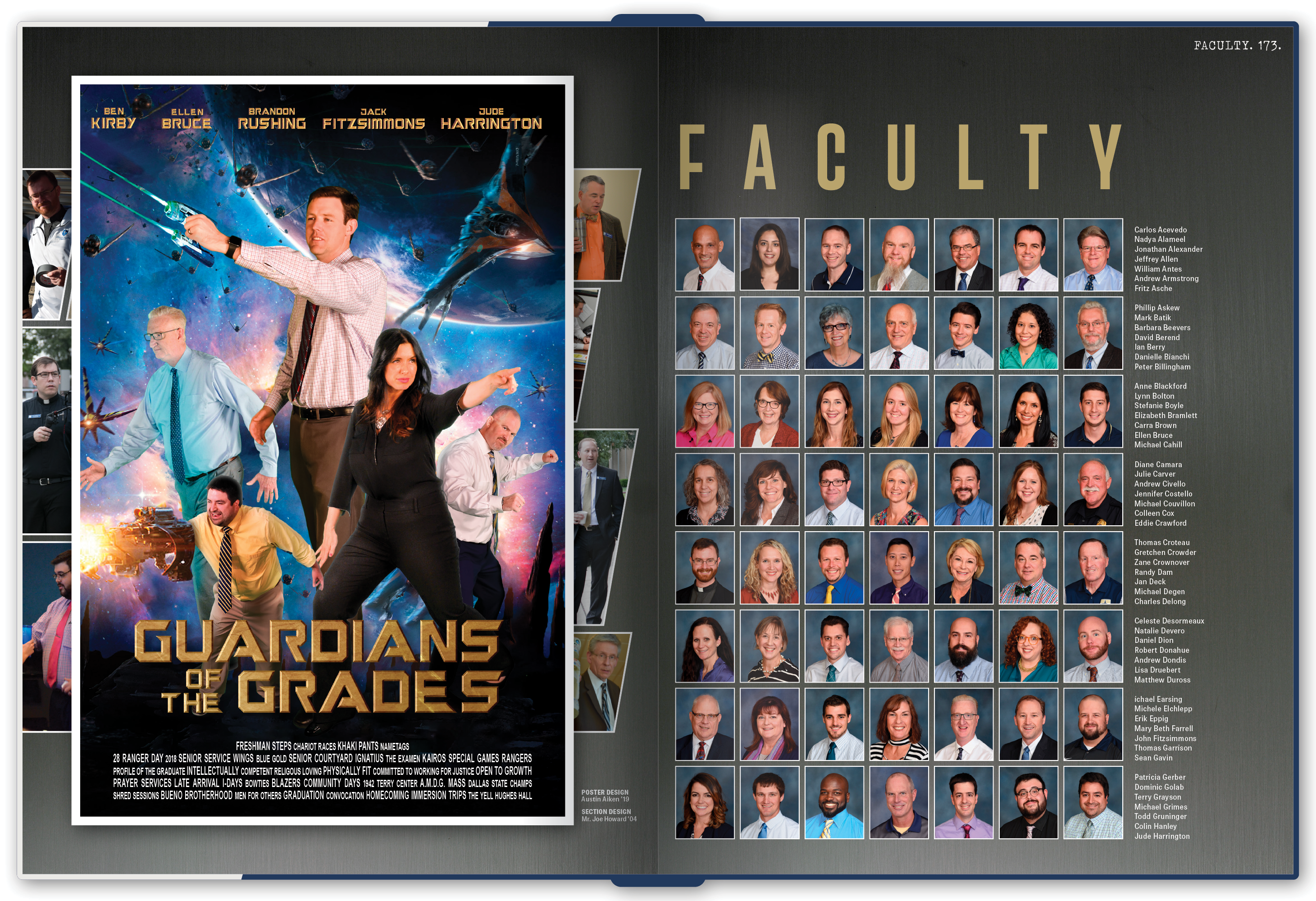
The idea started with something yearbooks usually leave out: the practices, preparations, rehearsals, and work that happen before the finished event. That became "Behind the Scenes," a movie-inspired concept that deliberately avoided relying on the most obvious film clichés.
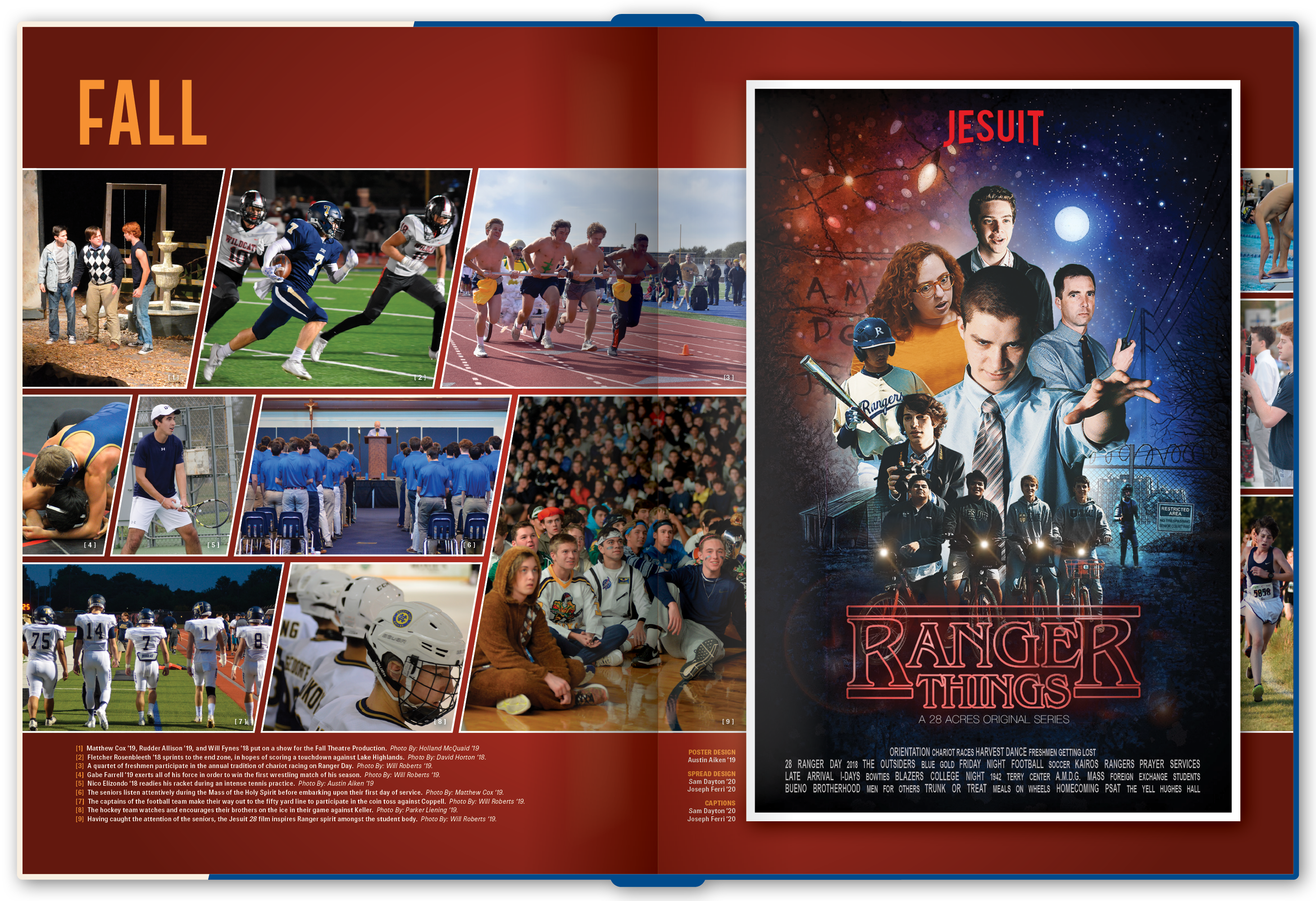
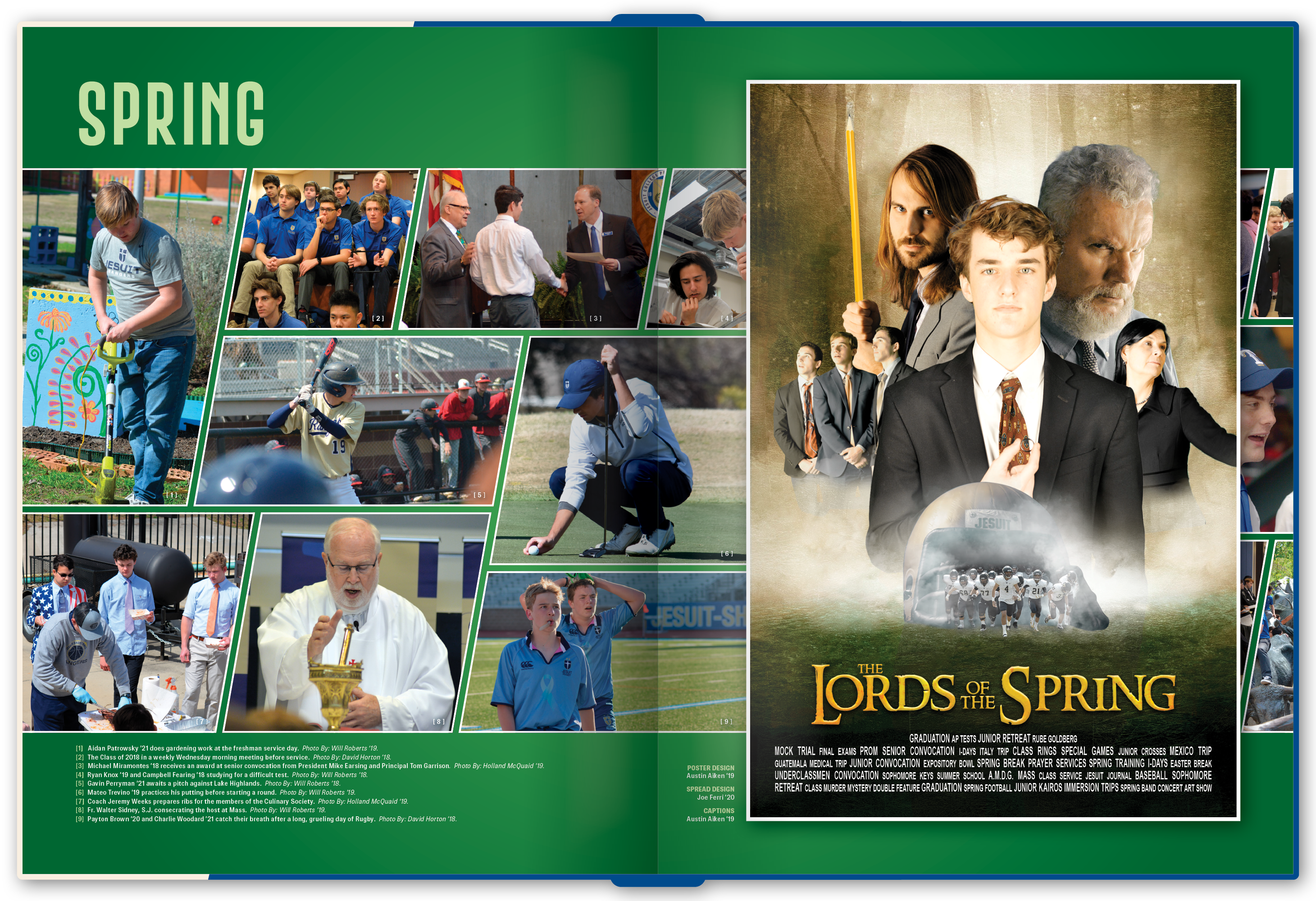
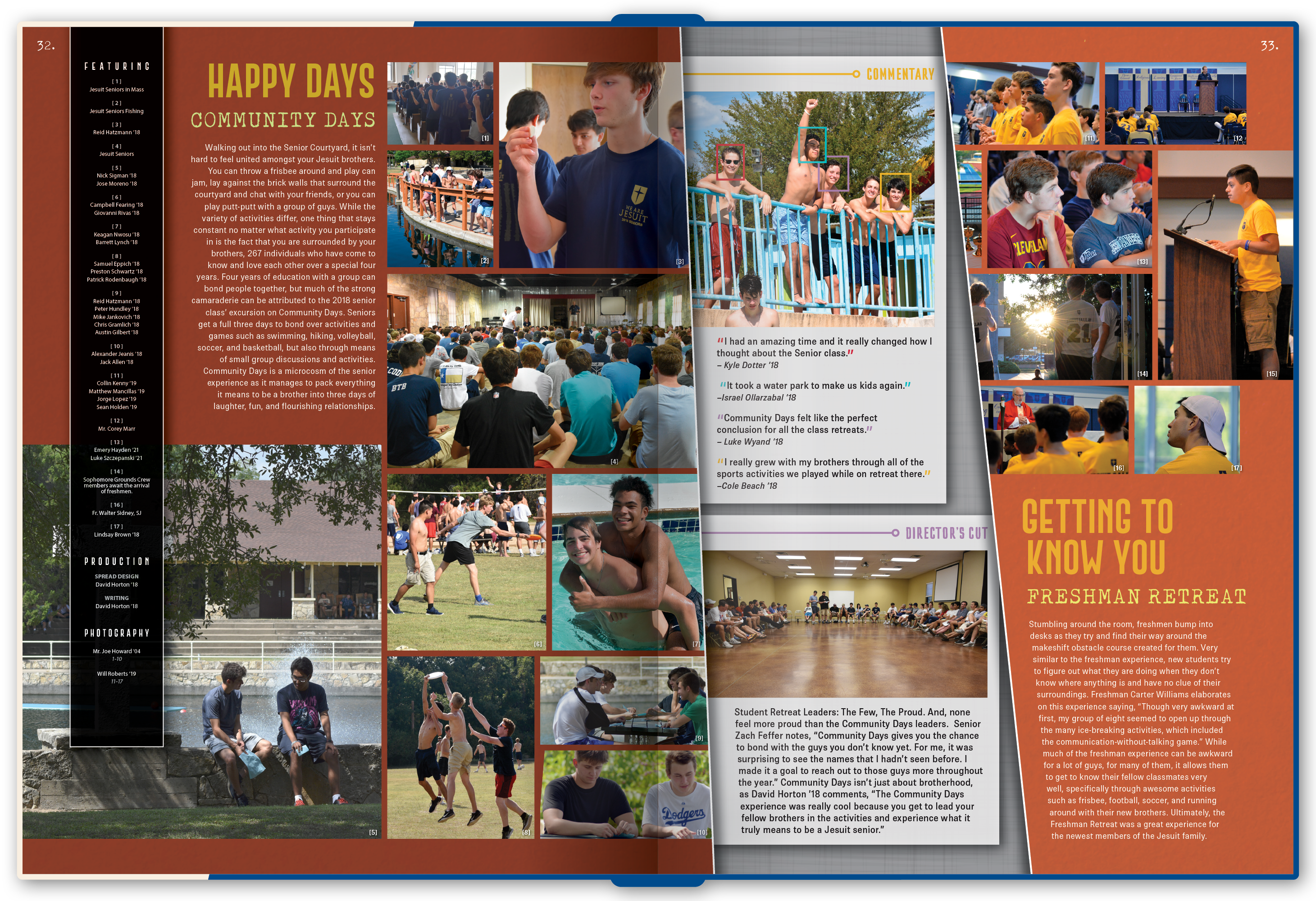
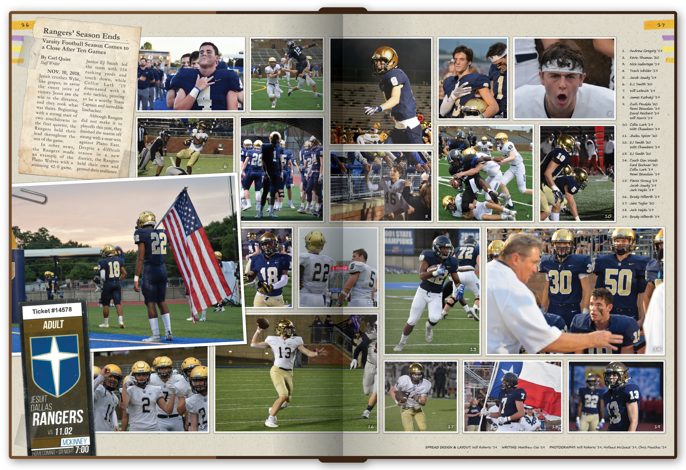
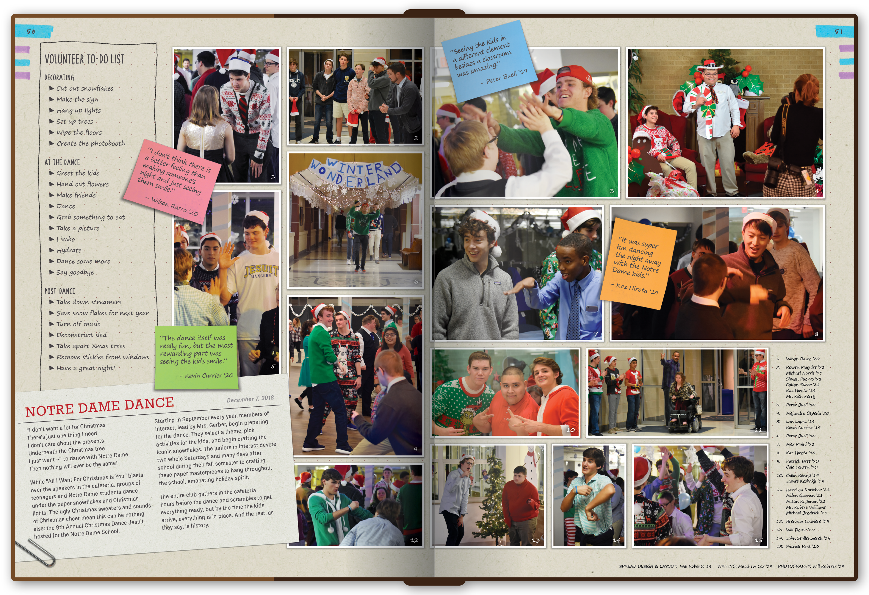
We used reveal-style graphics, DVD bonus-feature references, and a running credits system that acknowledged both the people pictured and the students who photographed, wrote, and designed each spread. Section dividers became parody movie posters, giving the staff room to have fun without losing the larger system.

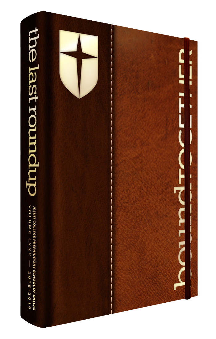
Cover of the 2018-19 yearbook.

2018-19

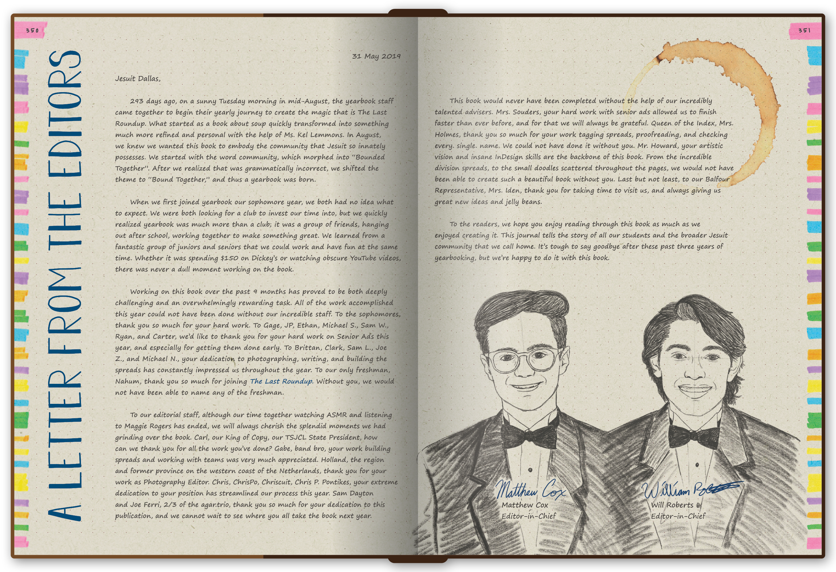
Bound Together

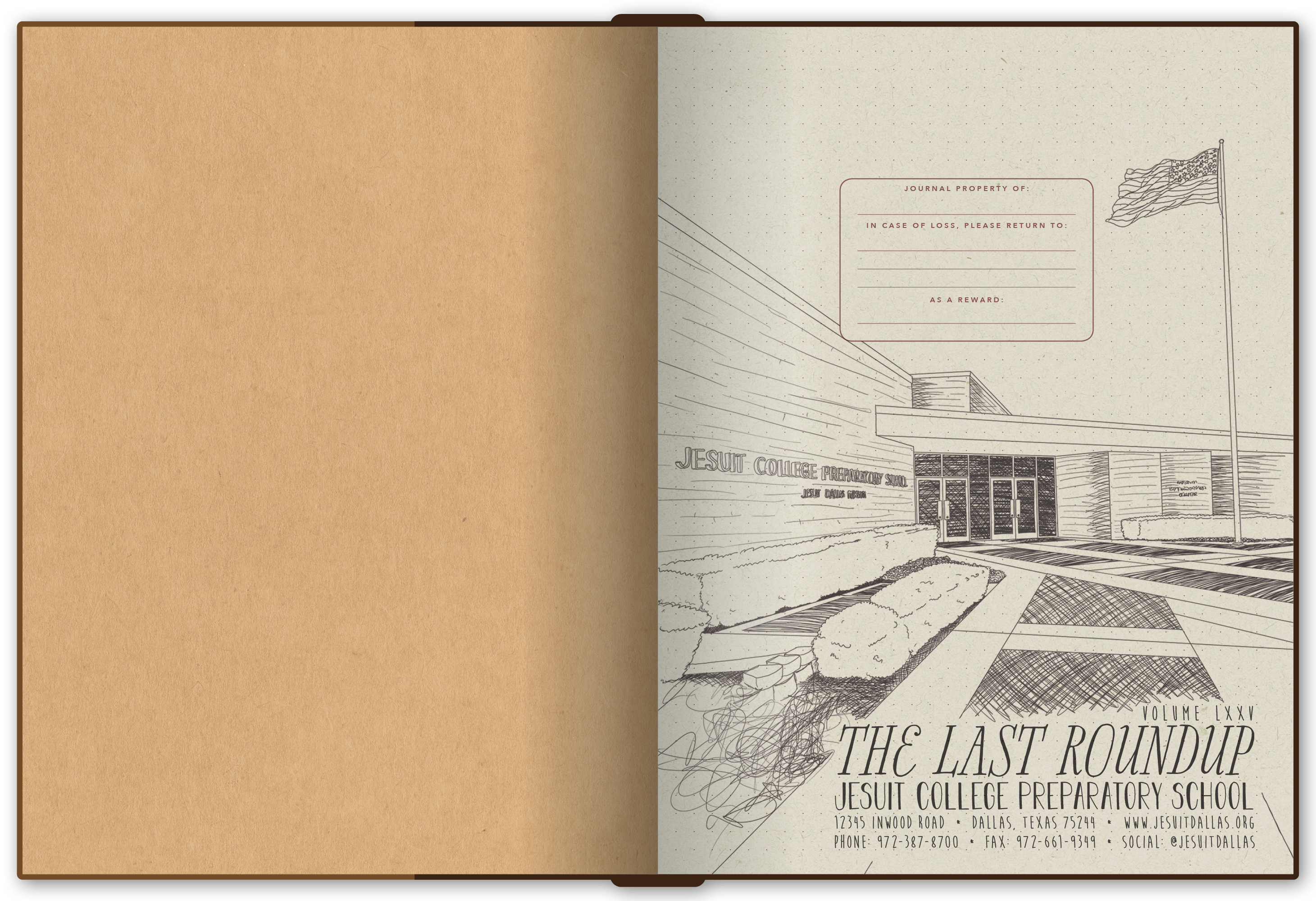
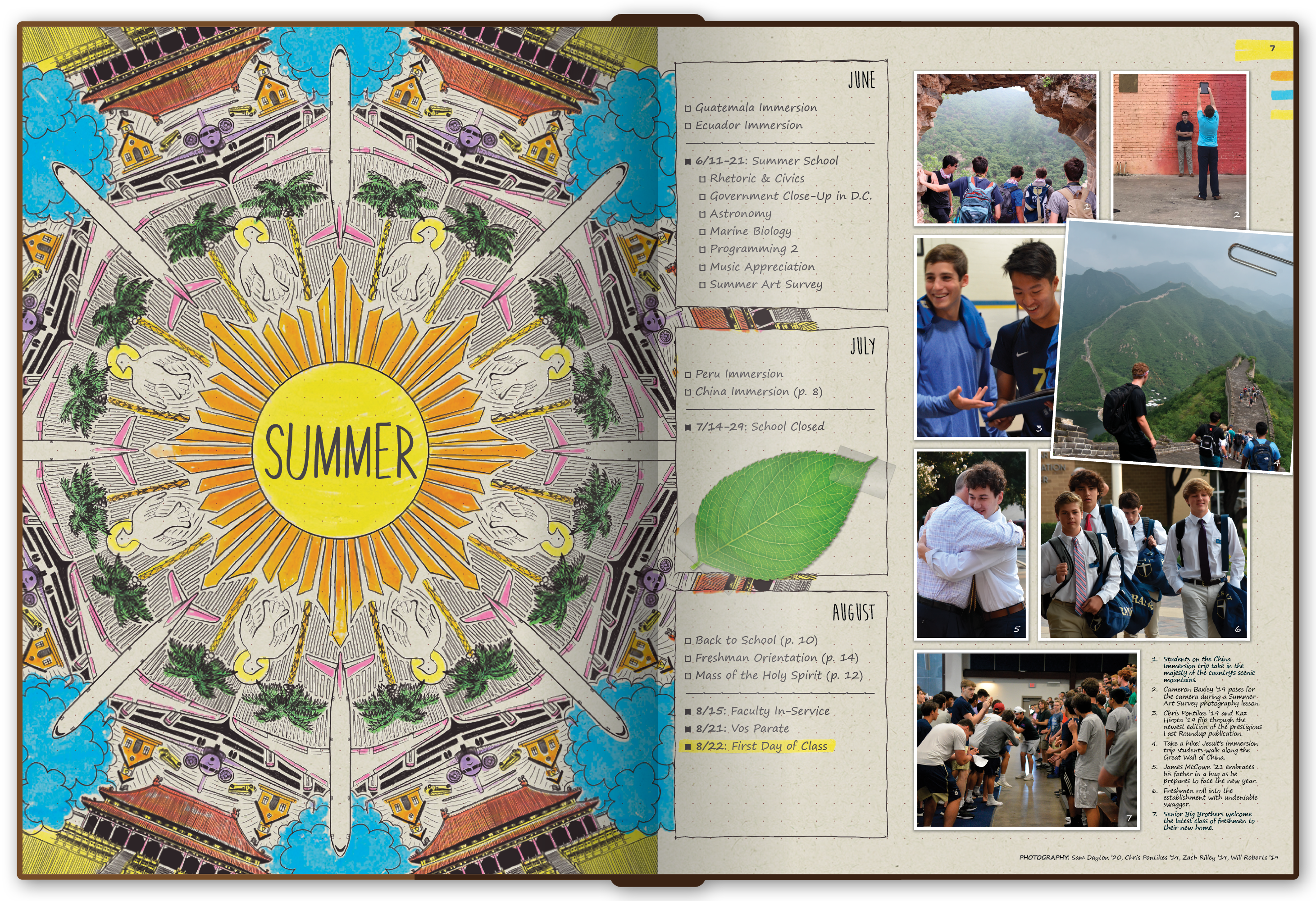
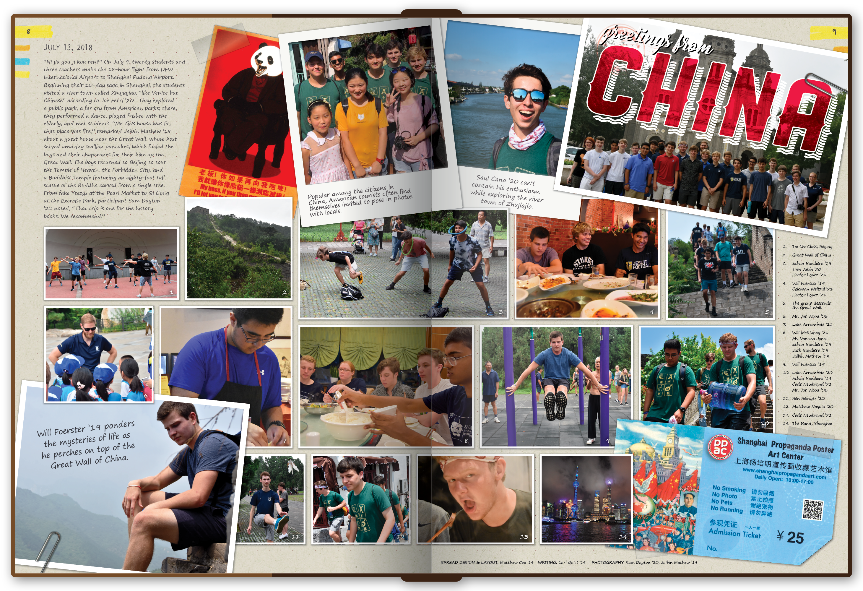
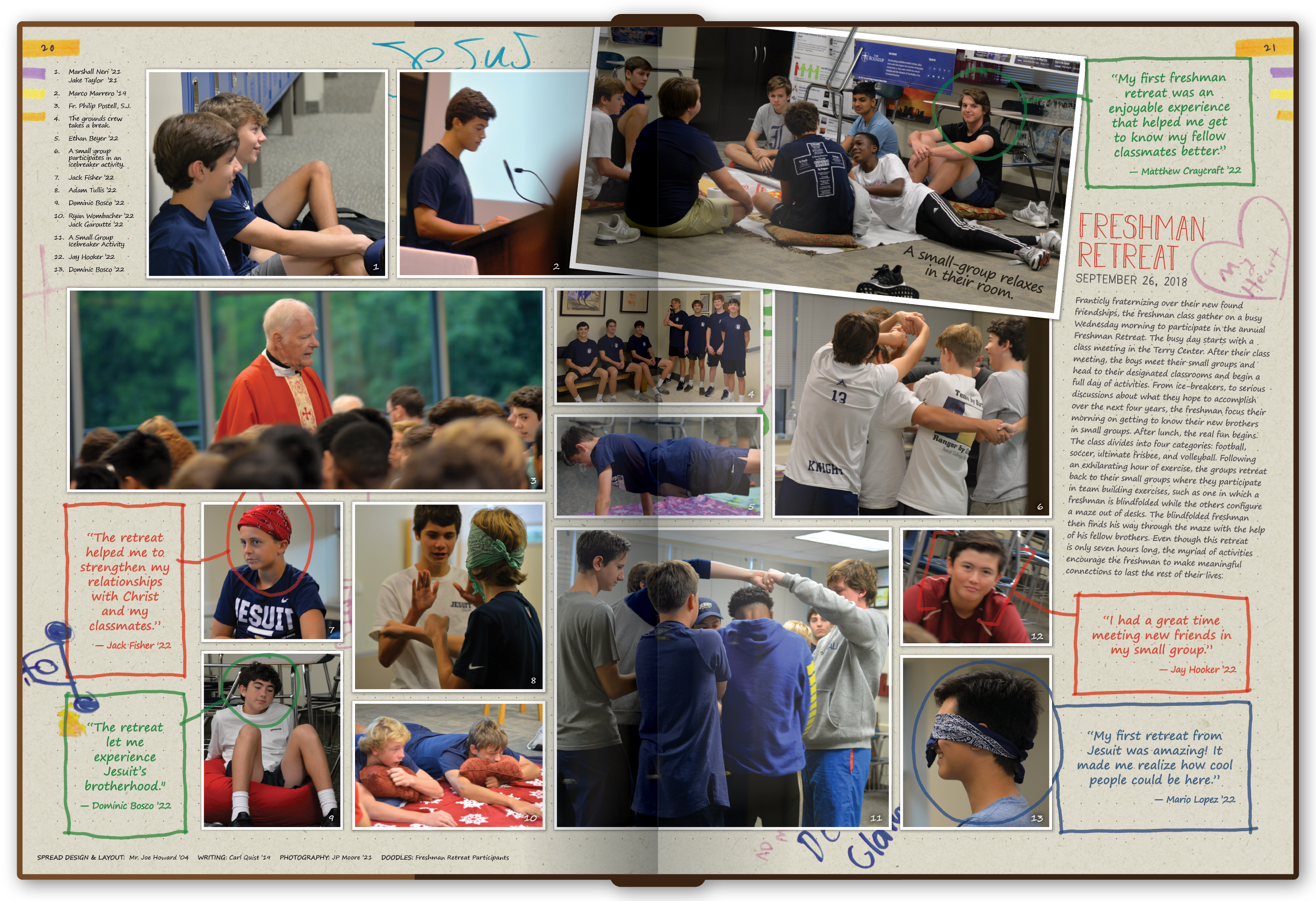
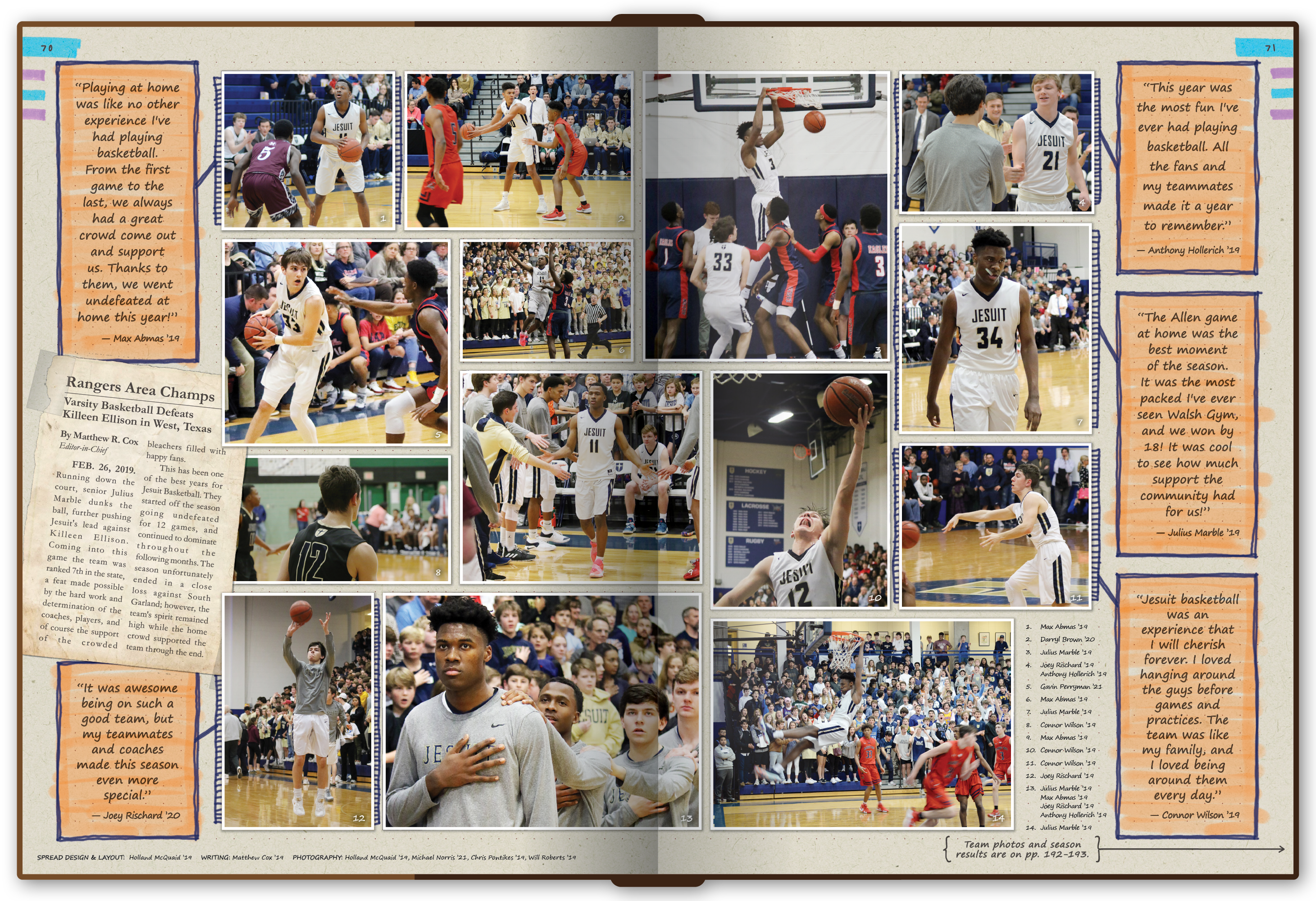
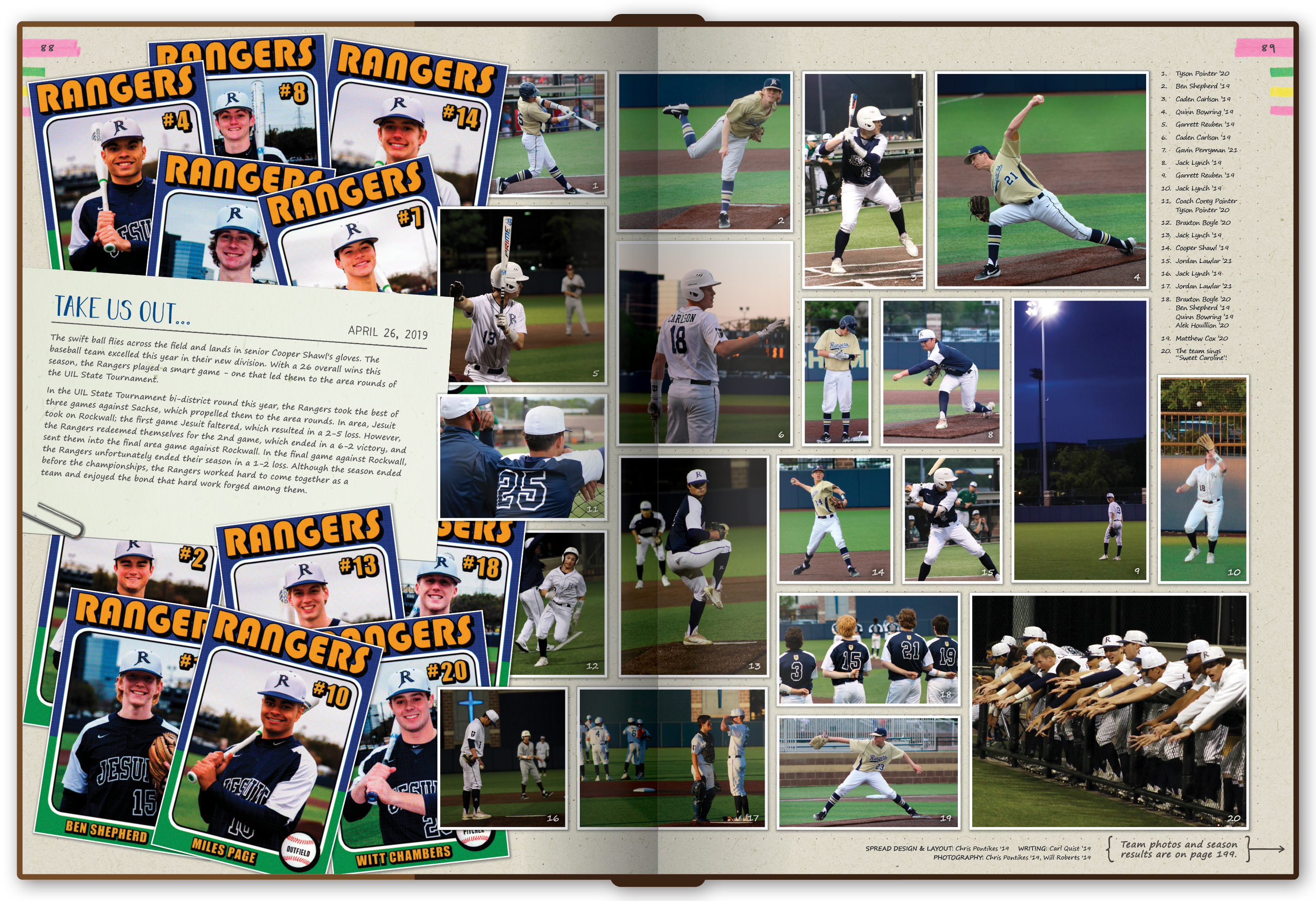
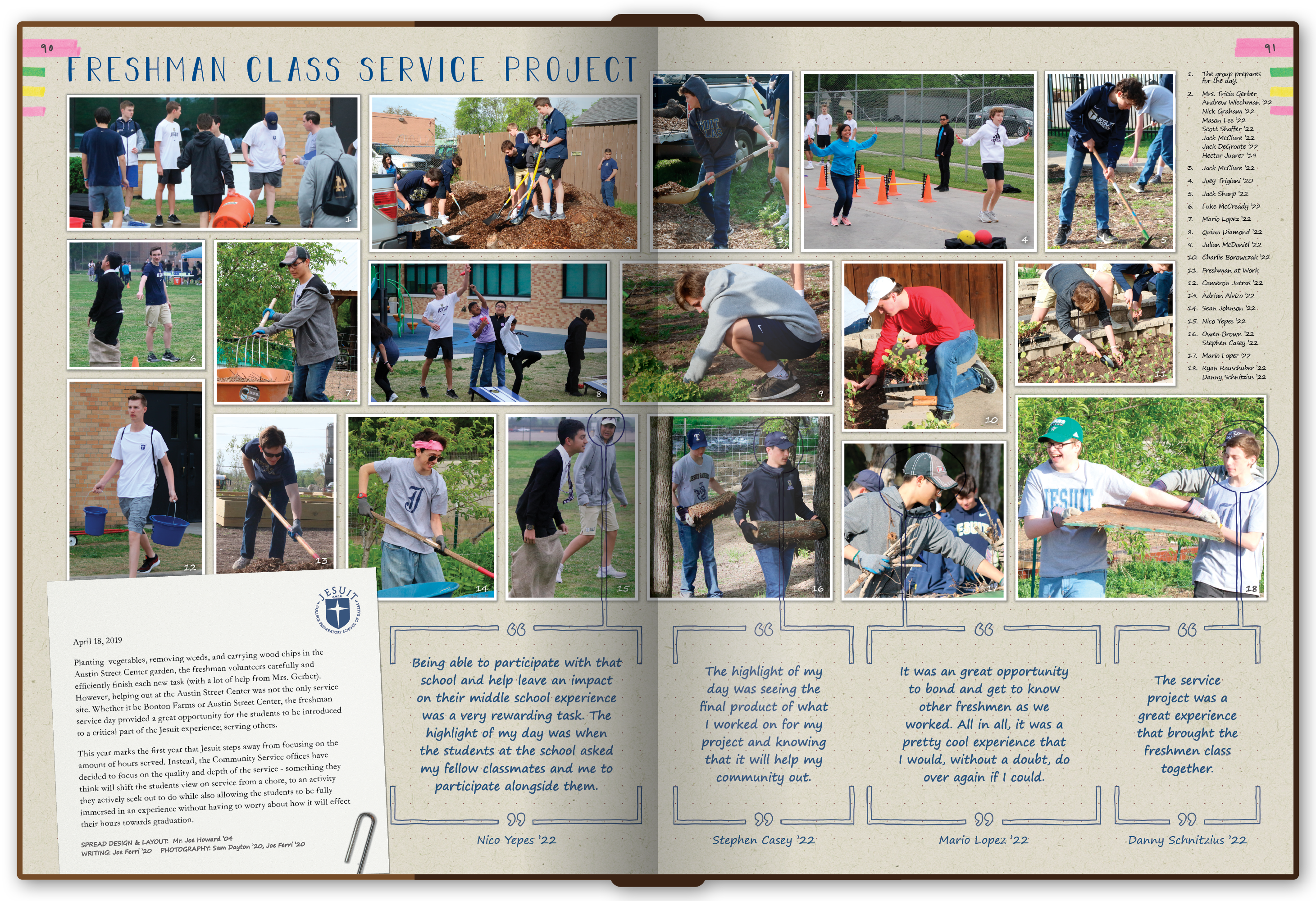
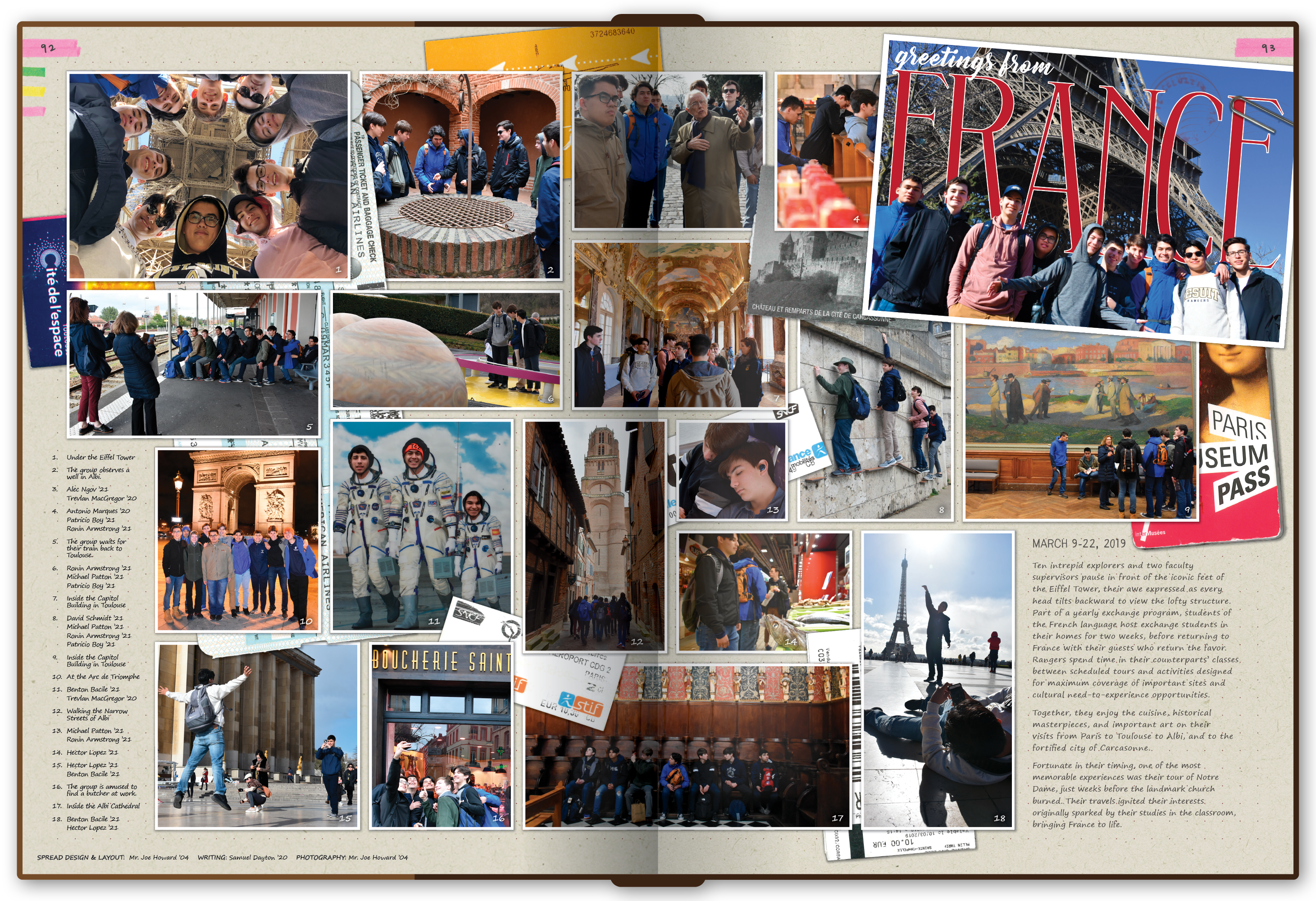
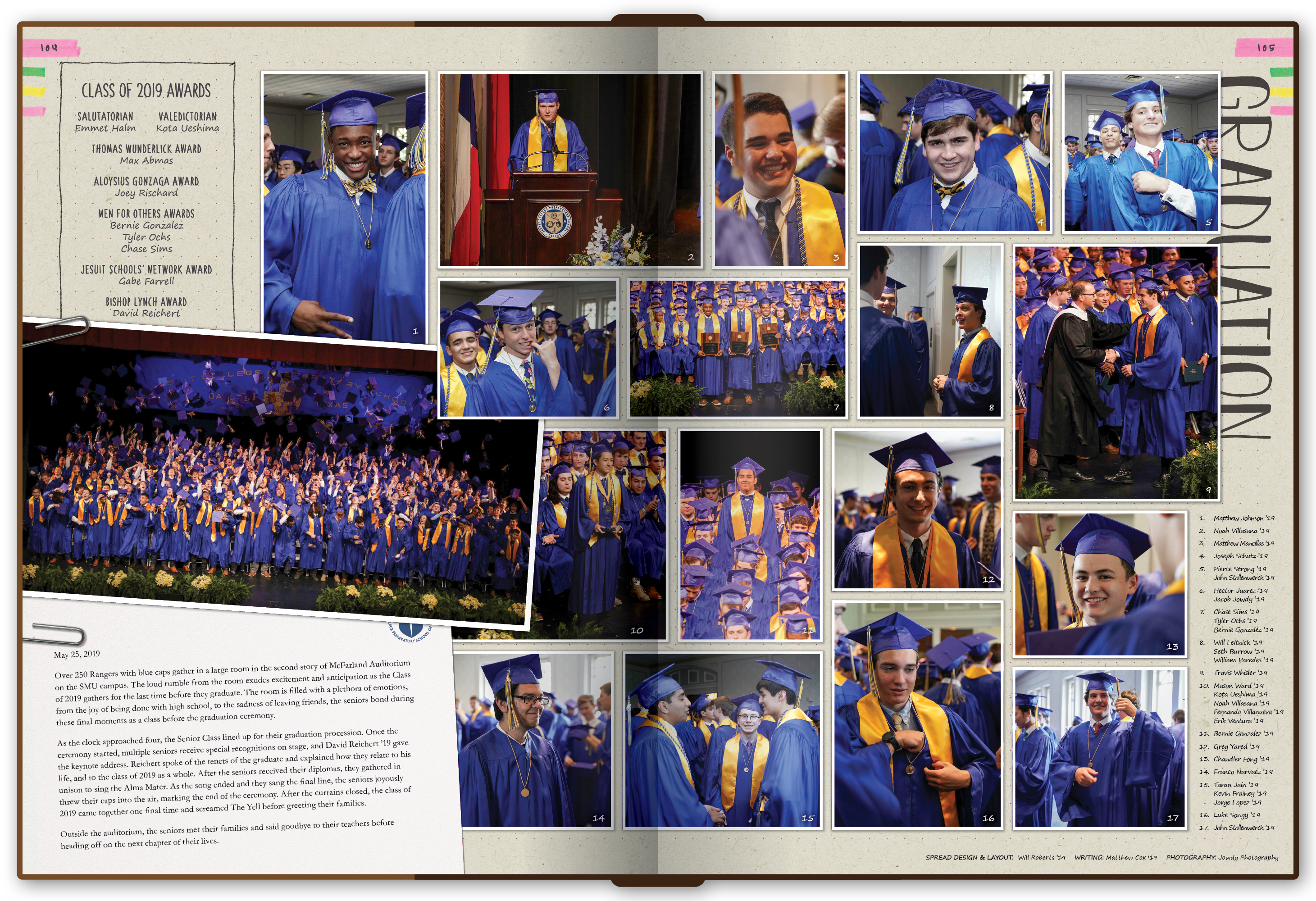
"Bound Together" borrowed from bullet journals and handmade notebooks. The entire book was produced digitally, but the design language was intentionally tactile: taped photos, paper clips, ticket stubs, highlighter marks, handwritten notes, doodles, and other artifacts made the pages feel assembled by hand.

That freedom created the year's biggest design challenge. We wanted the book to feel messy without actually becoming inconsistent. I created illustrations throughout the book, including a family of full-page mandalas for the section dividers, while the broader template system kept the controlled chaos recognizable from spread to spread.

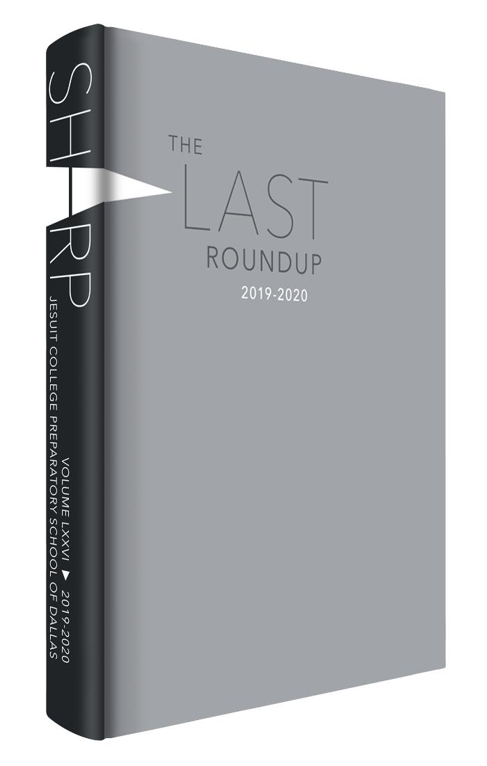
Cover of the 2019-20 yearbook.

2019-20

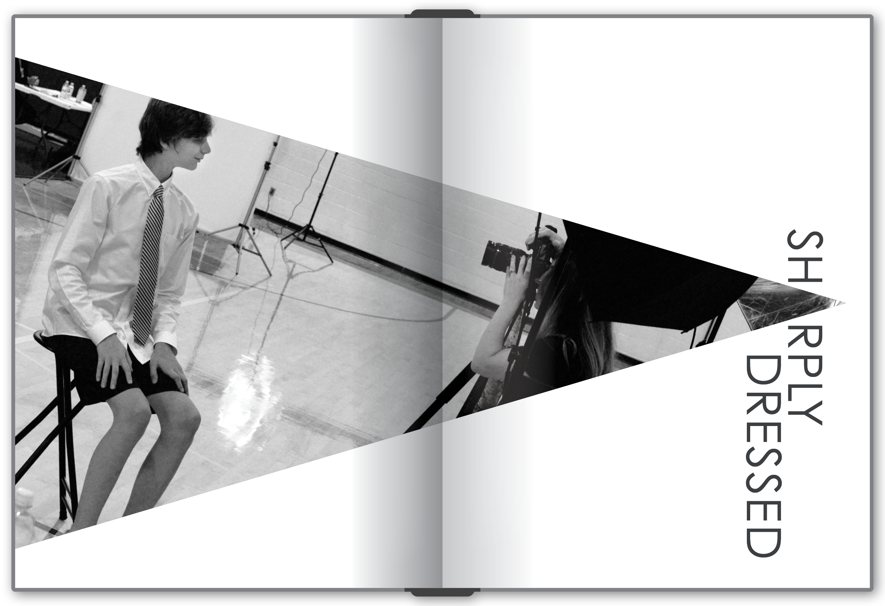
Sharp

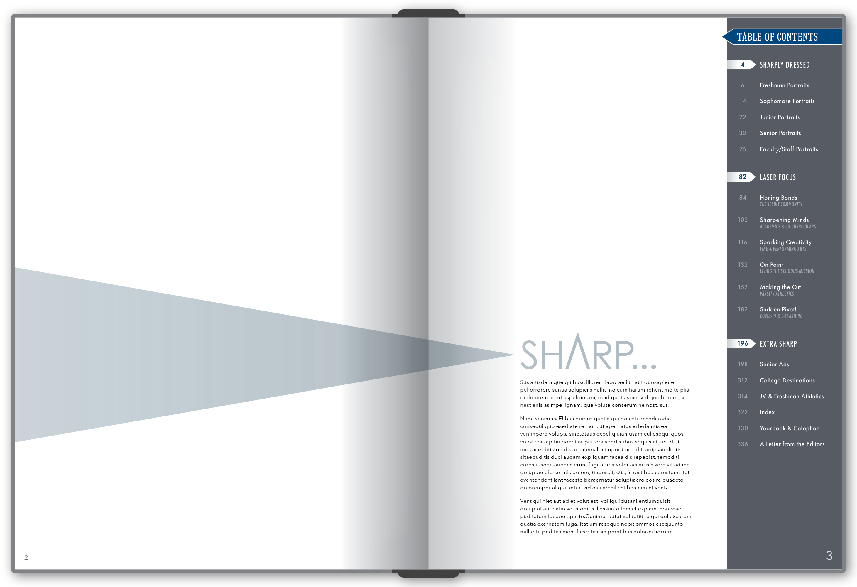
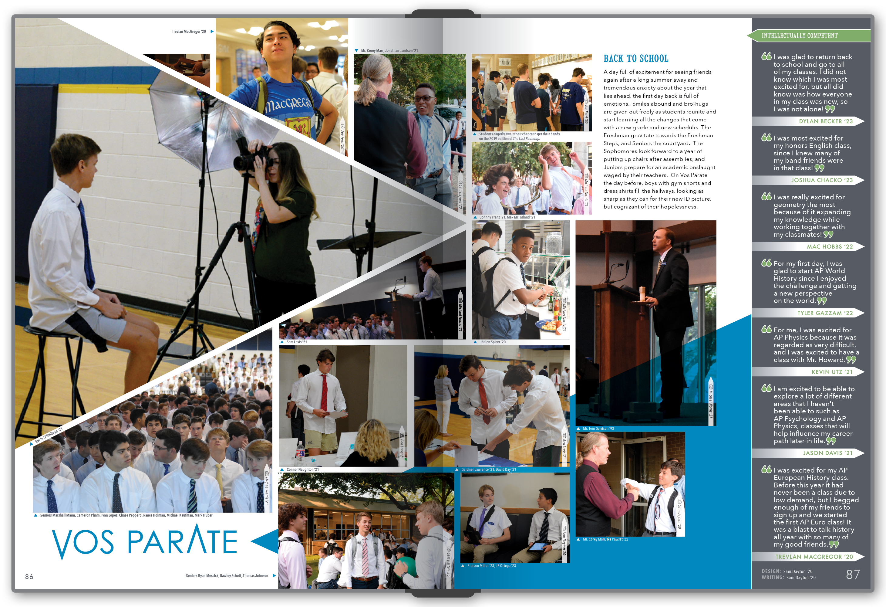
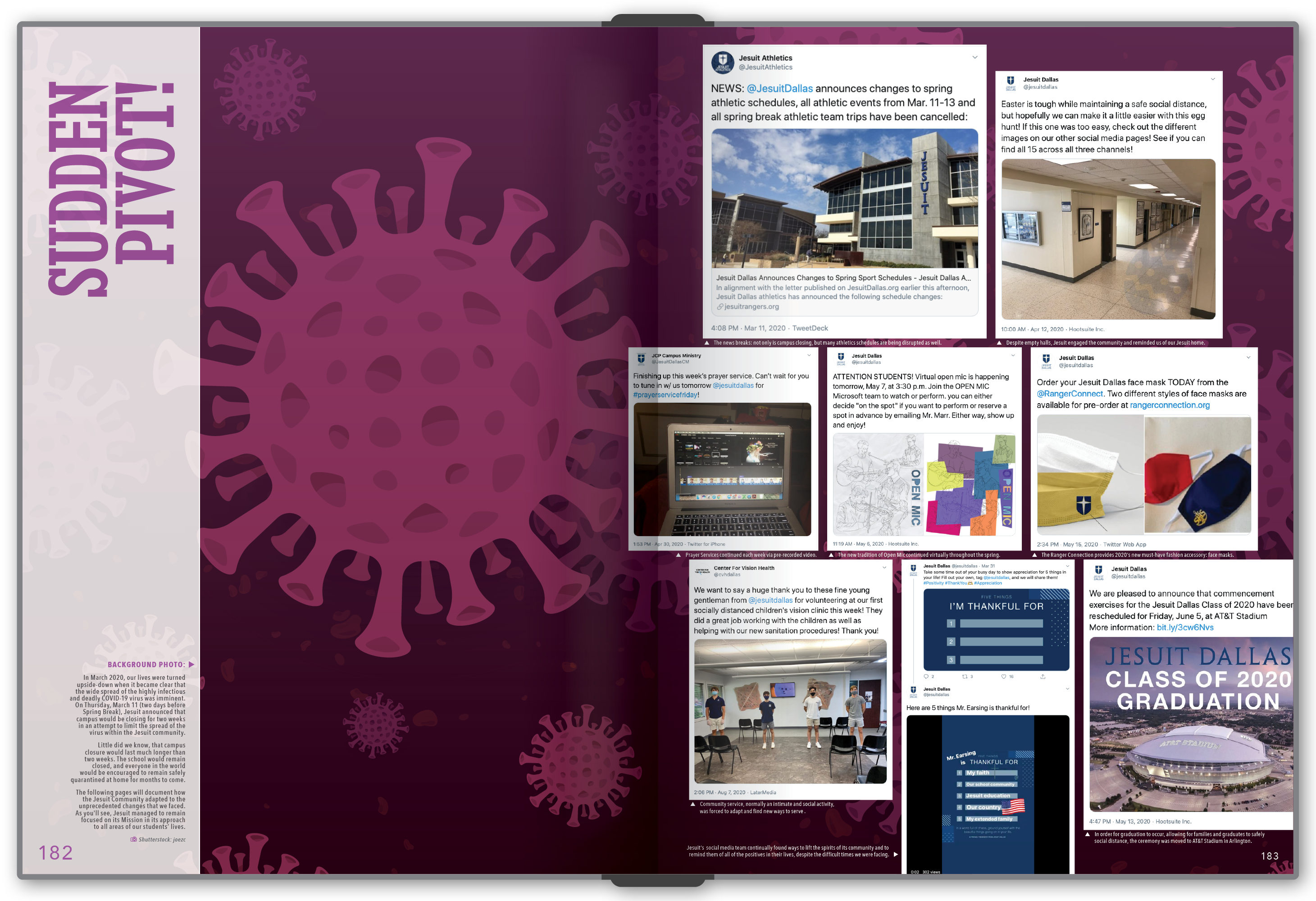
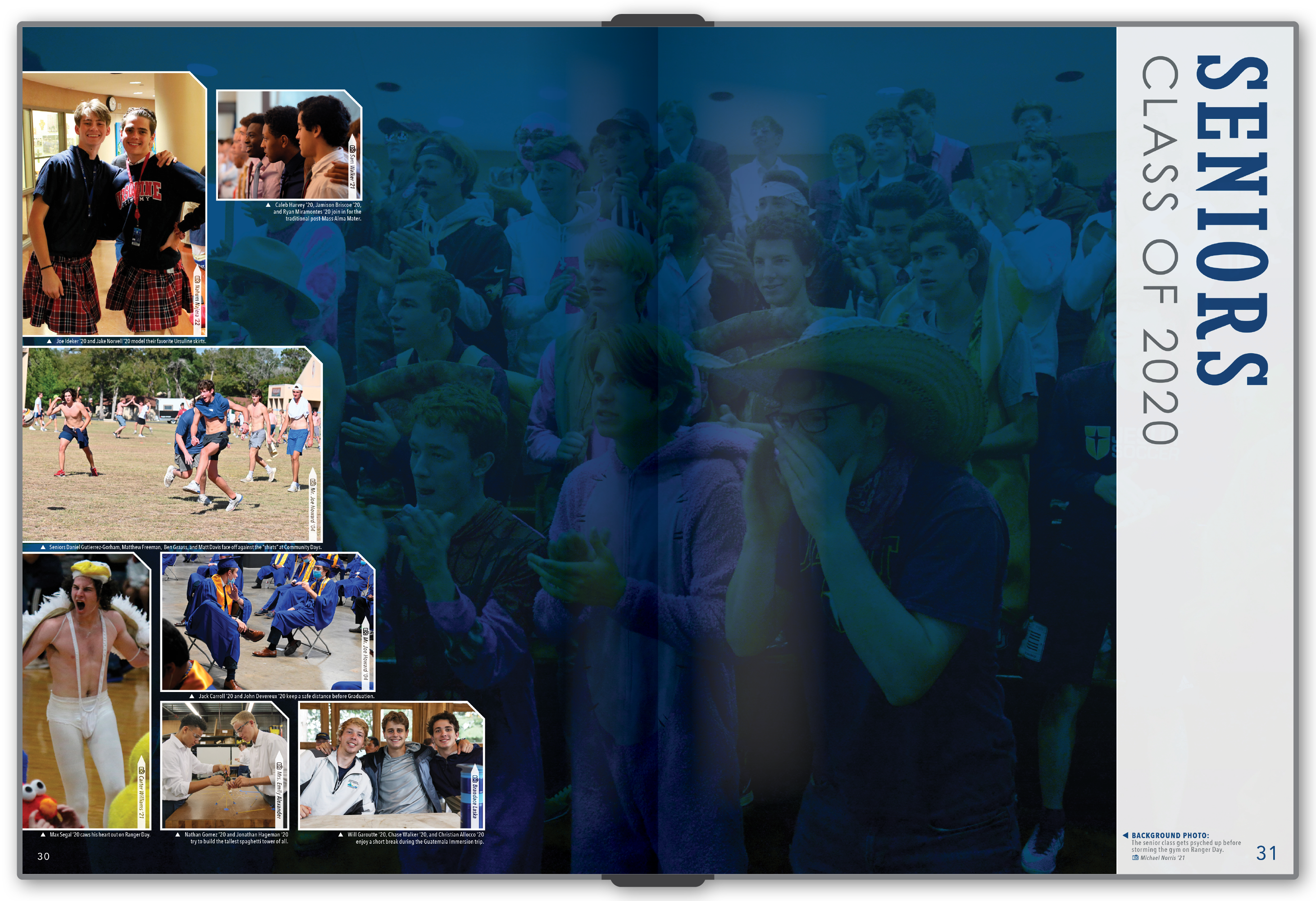
After the visual density of Bound Together, the staff deliberately moved in the opposite direction. "Sharp" was cleaner, more geometric, and more restrained, built around angular forms, triangular details, and a narrow sidebar that appeared consistently along the right edge of every spread.

That consistency gave us an unexpected tool when COVID disrupted the spring semester. For the pages documenting the shutdown and its effects on the school, we moved the sidebar to the left. The change was small, but because the system had been so consistent, breaking the rule immediately signaled that something had changed.

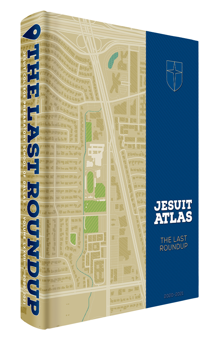
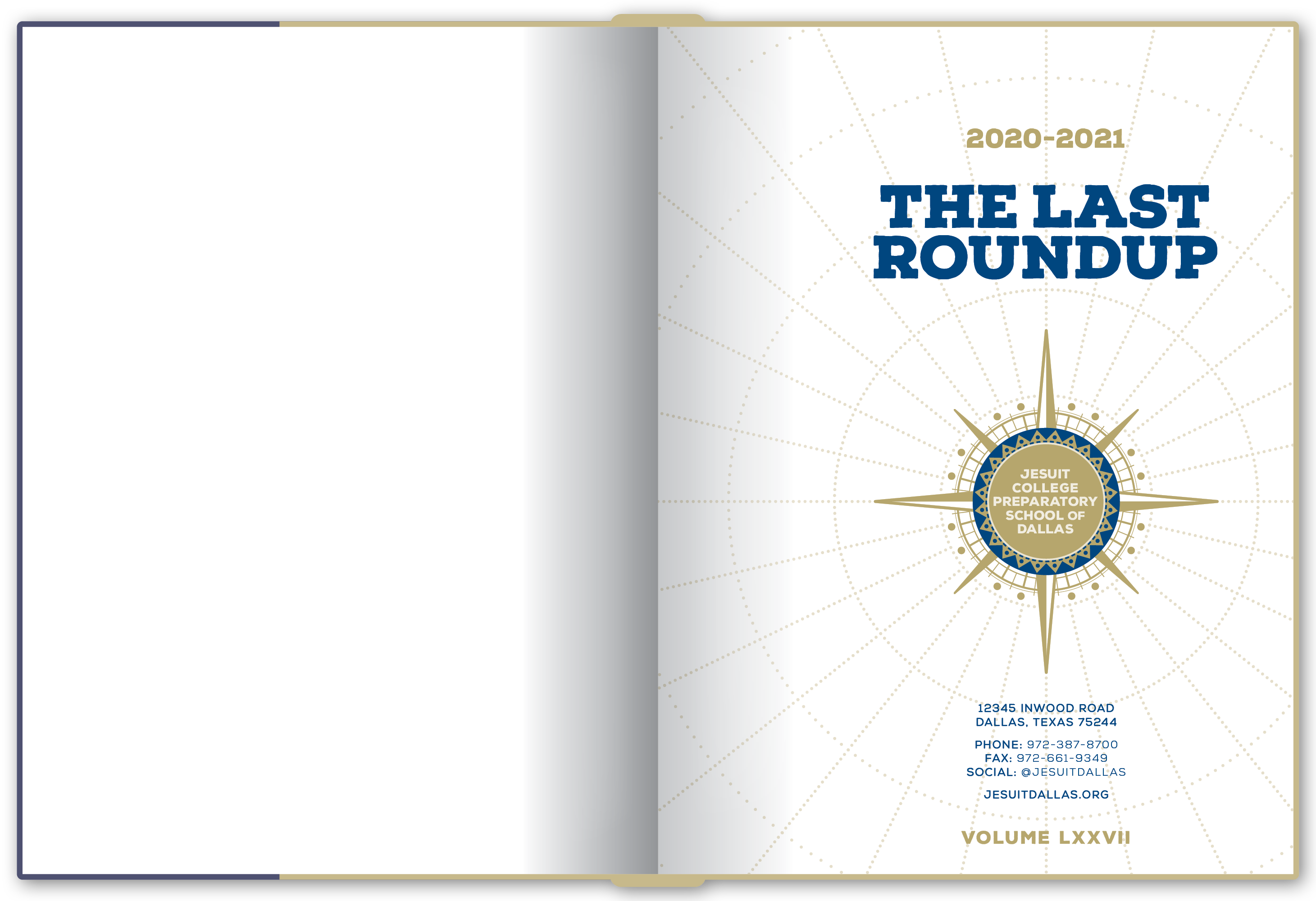
Cover of the 2020-21 yearbook.

2020-21

Atlas

In fall 2020, the staff wanted to acknowledge the feeling of navigating unfamiliar territory without building another book around COVID imagery. We eventually landed on maps as the metaphor, which gave us a flexible visual language for direction, distance, connection, and finding a way forward.

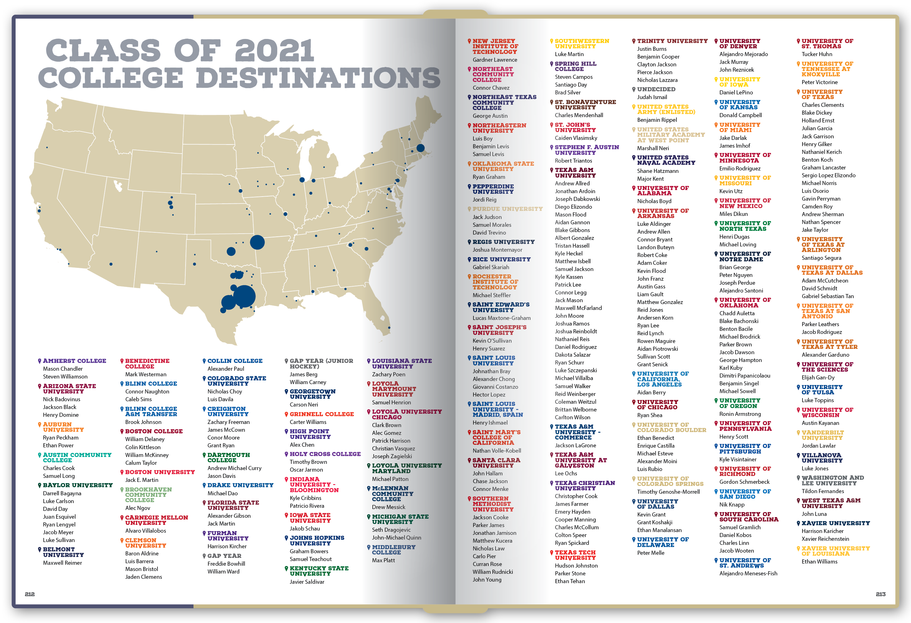
The theme opened up some of my favorite details from the entire eight-year run, including a detailed vector map of the neighborhood surrounding campus on the cover (created in painstaking detail in Illustrator), transit-map-inspired graphics, and a redesigned college destinations spread that turned the graduating class's next steps into geography.

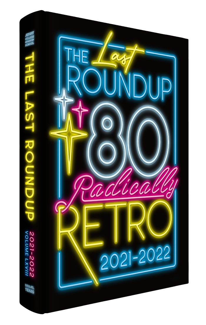
Cover of the 2021-22 yearbook.

2021-22

Radically Retro

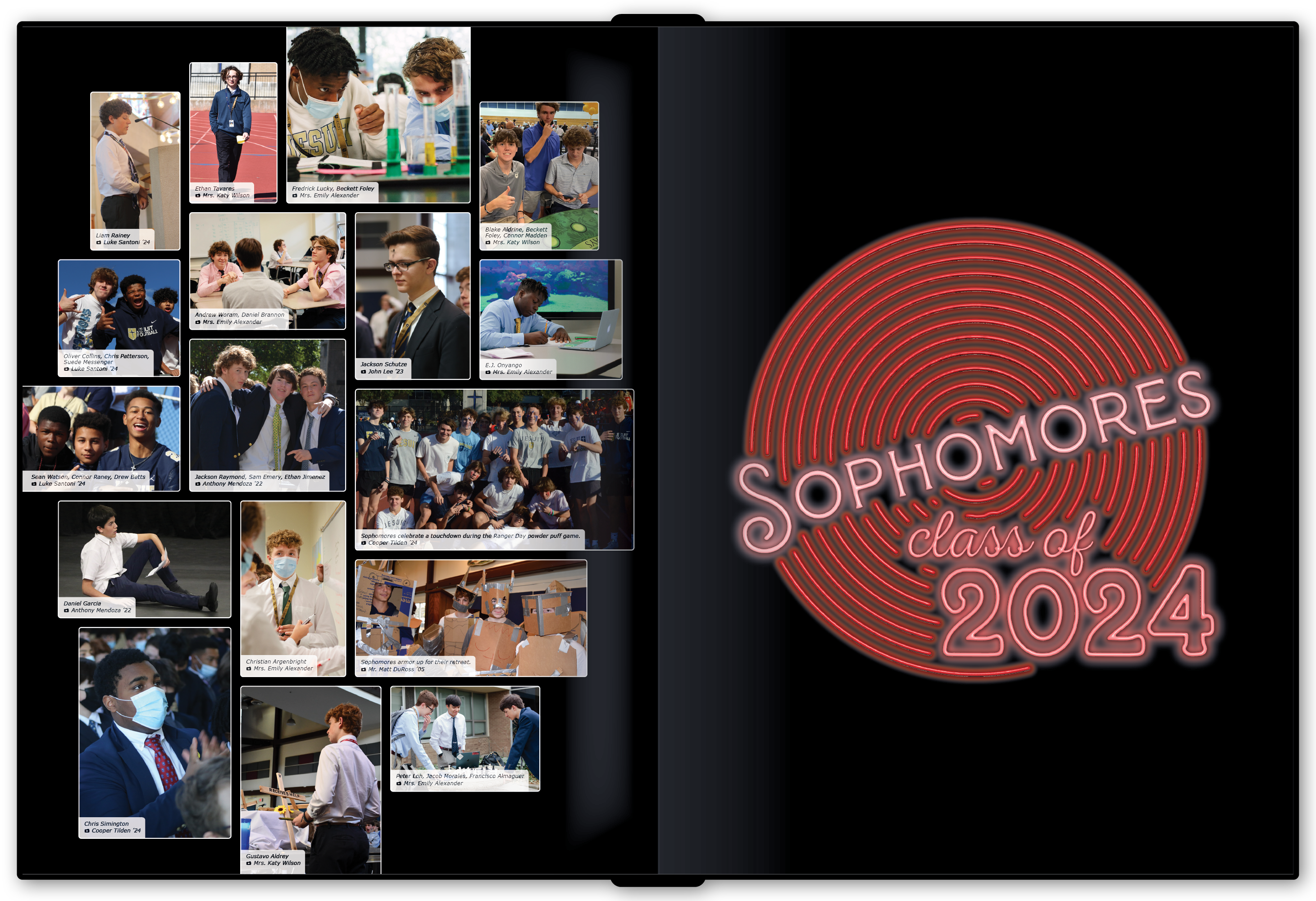
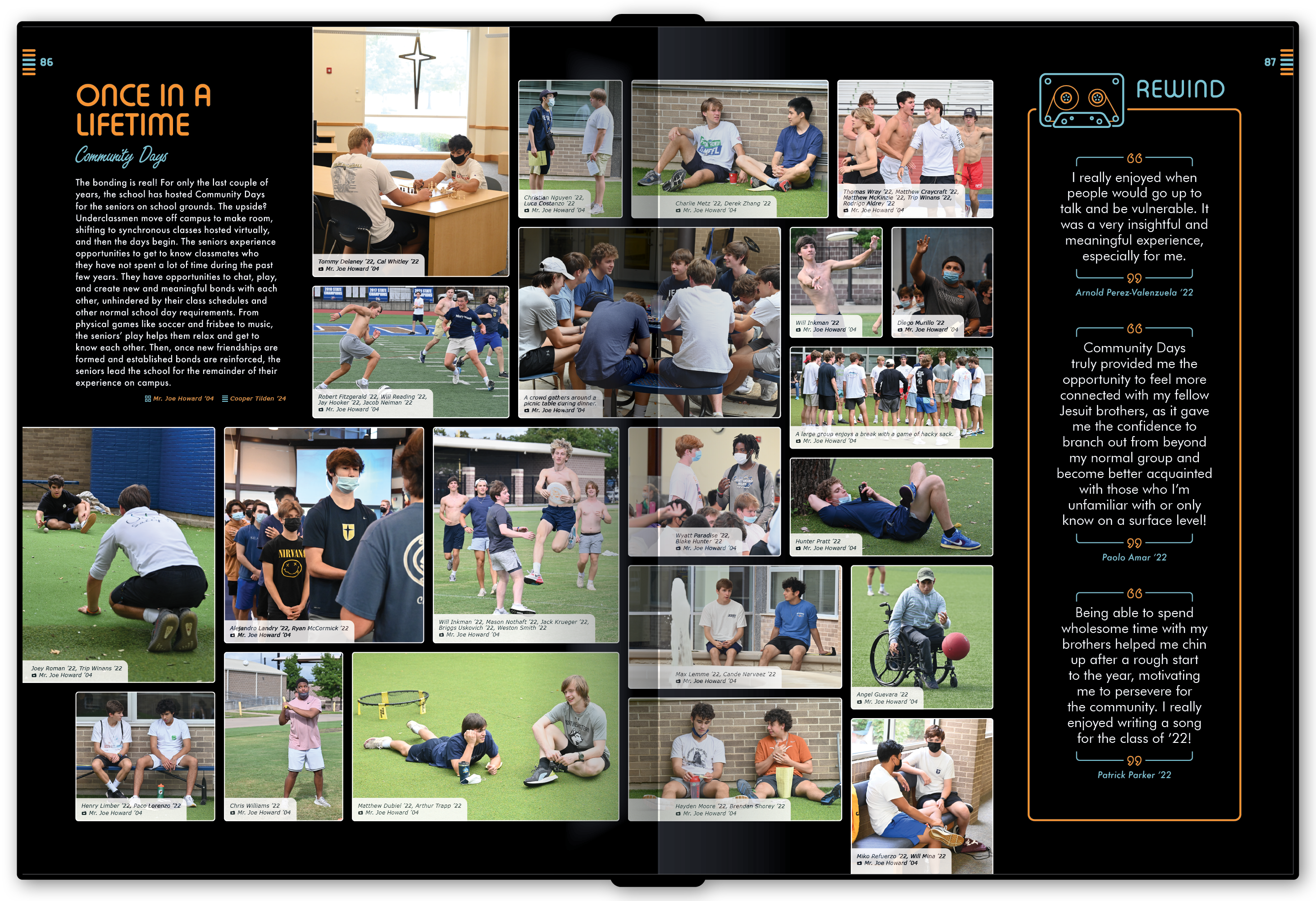
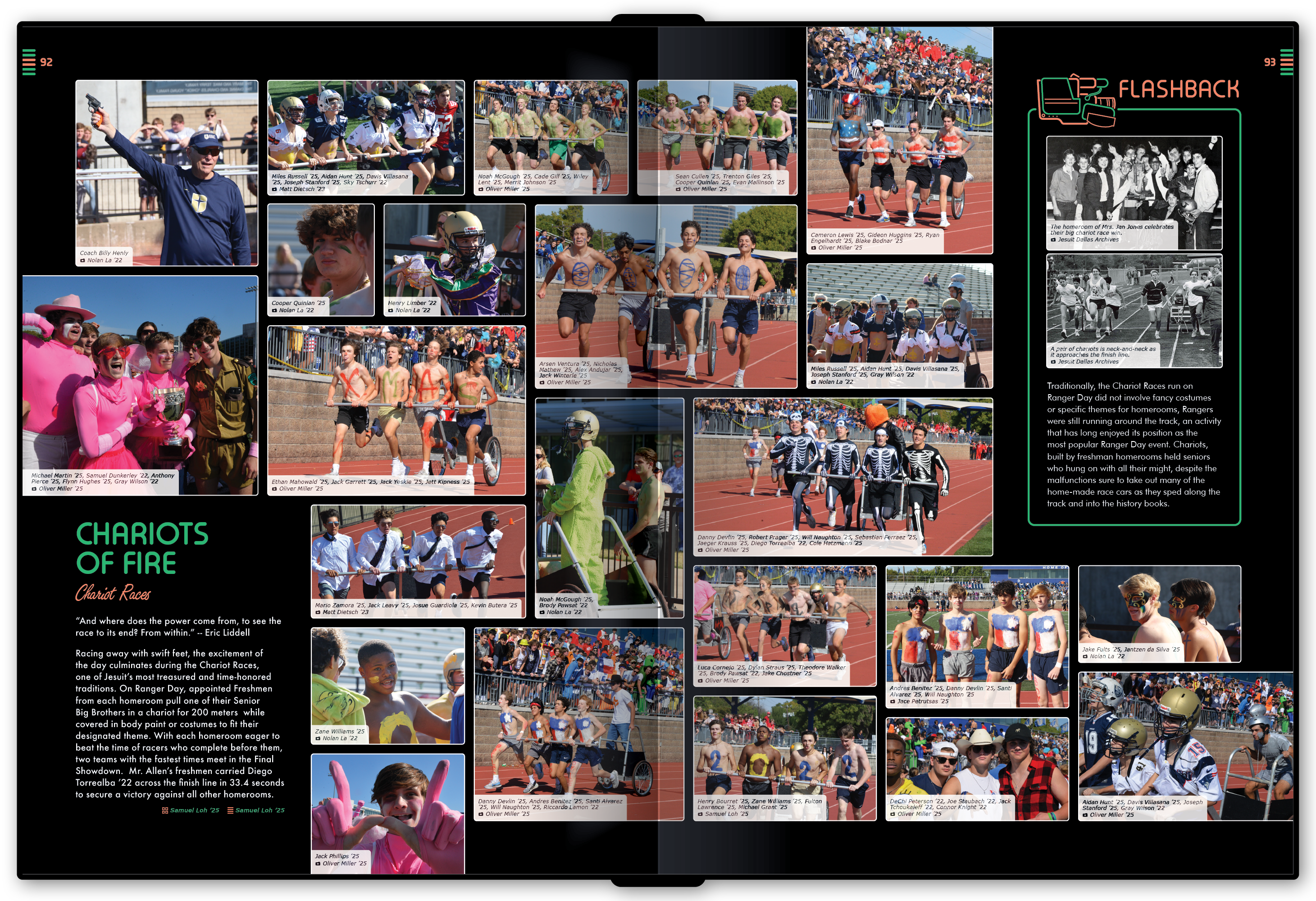
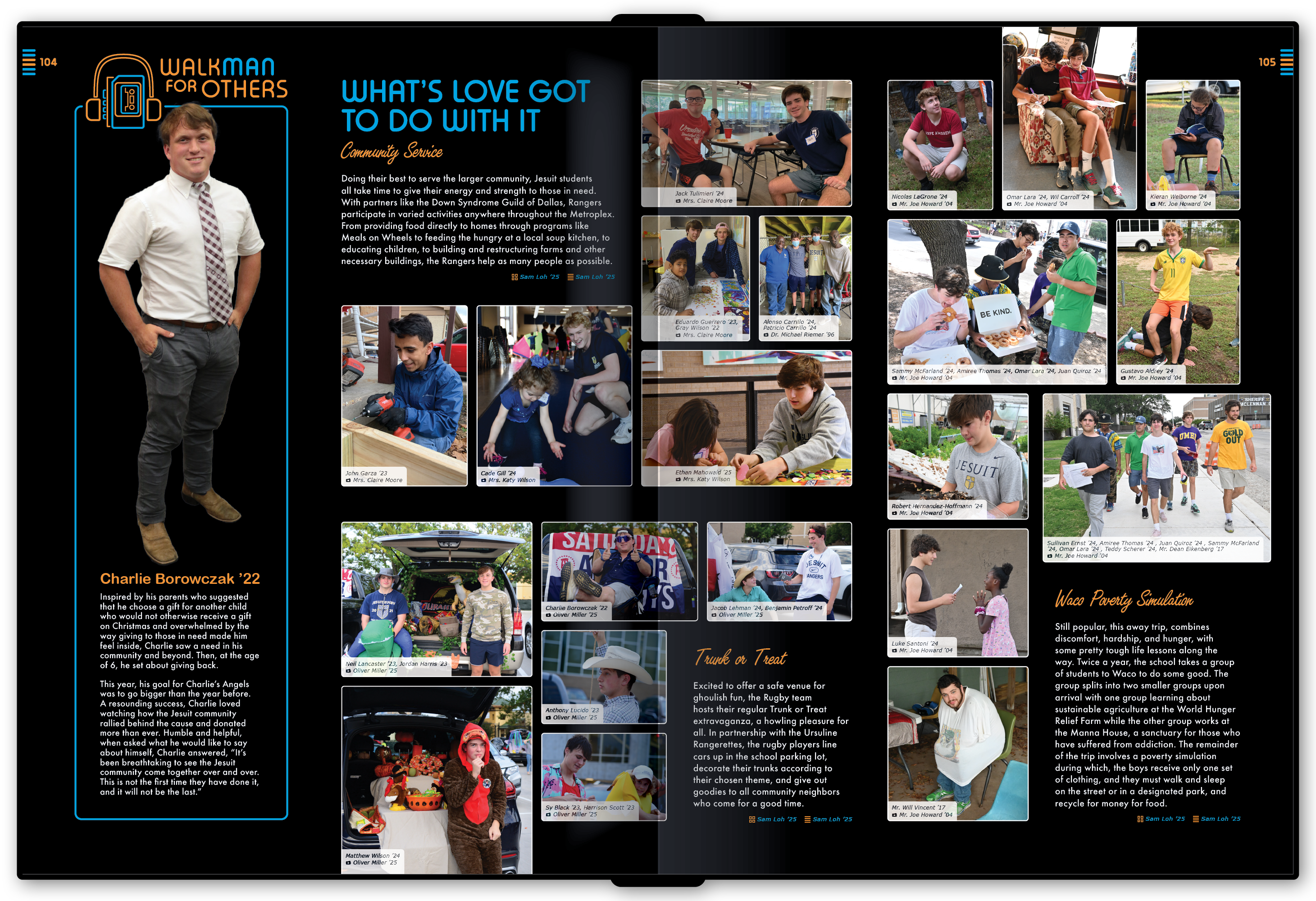
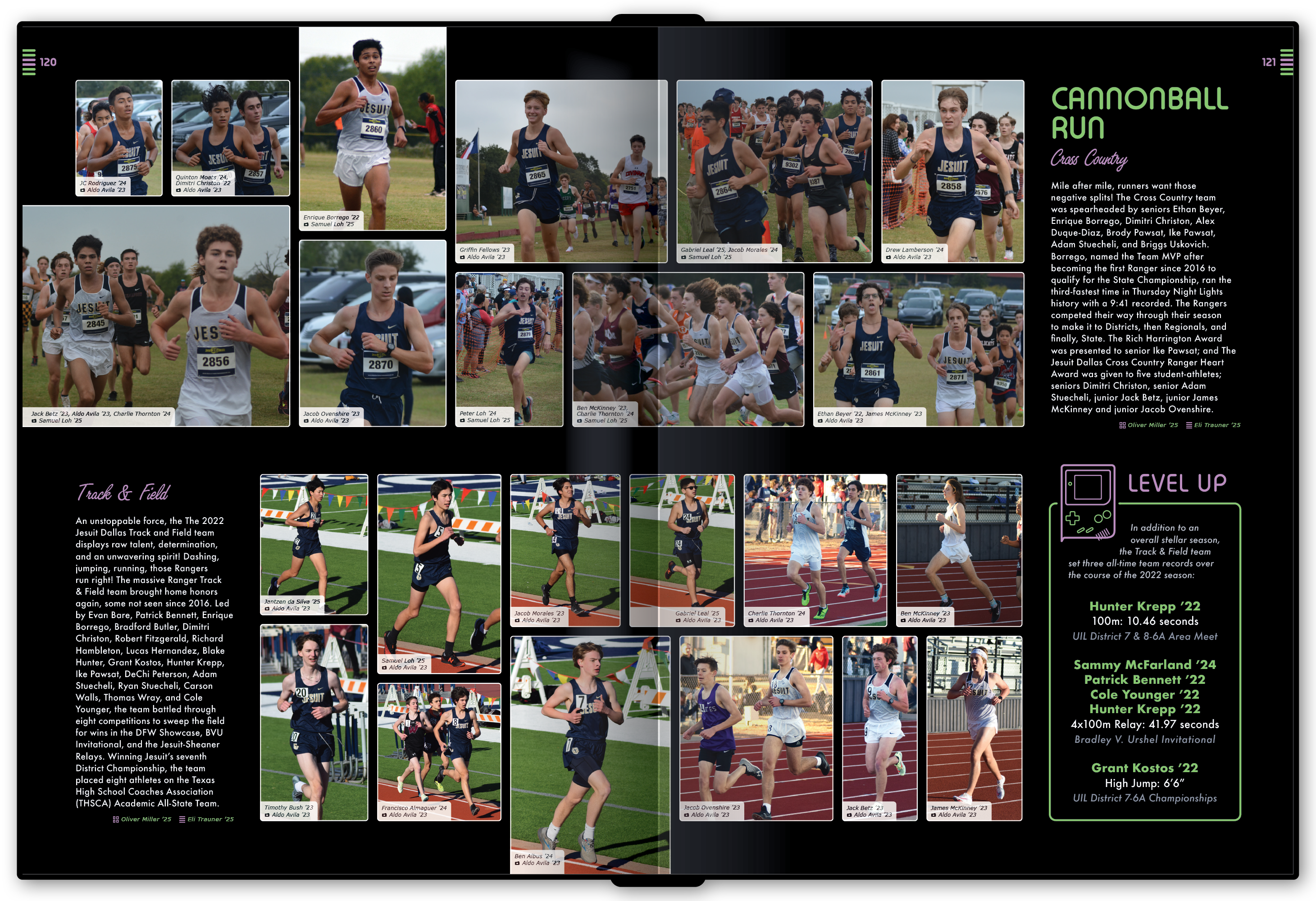
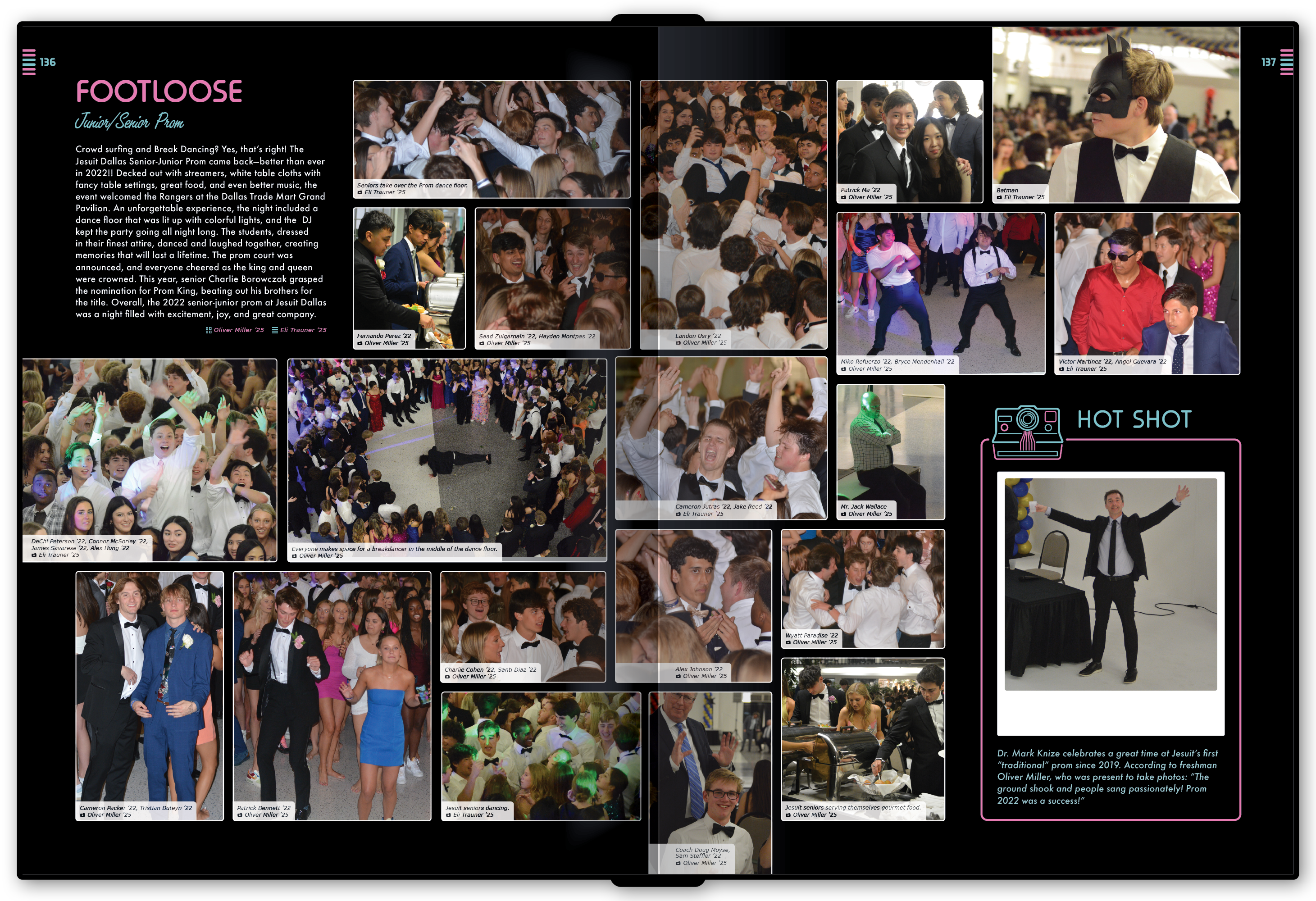
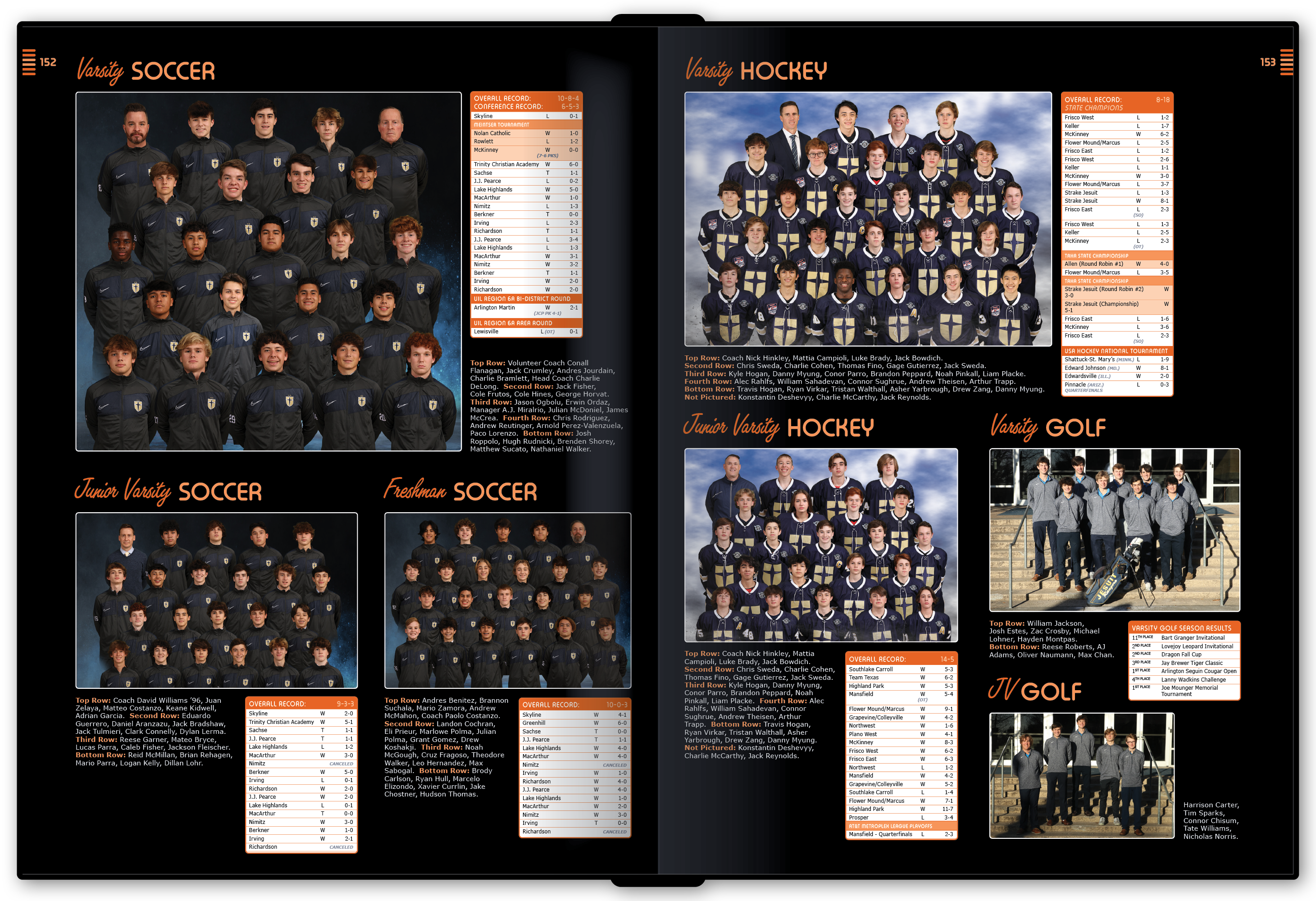
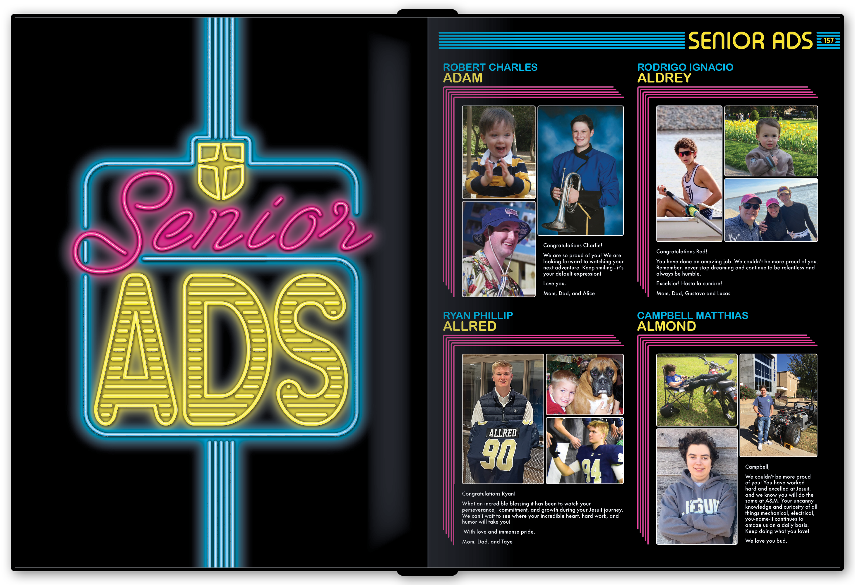
For the school's 80th anniversary, the staff chose "Radically Retro." Neon signage became the primary visual language, beginning with the cover and continuing through glowing section graphics, bright accent colors, rounded line work, and an all-black page background that made the color feel even more electric.

The broader retro theme gave students plenty of room to interpret the system. Modules referenced VHS cameras, Game Boys, cassette tapes, Walkmans, and other familiar objects, letting the book celebrate the past without becoming a literal history piece.

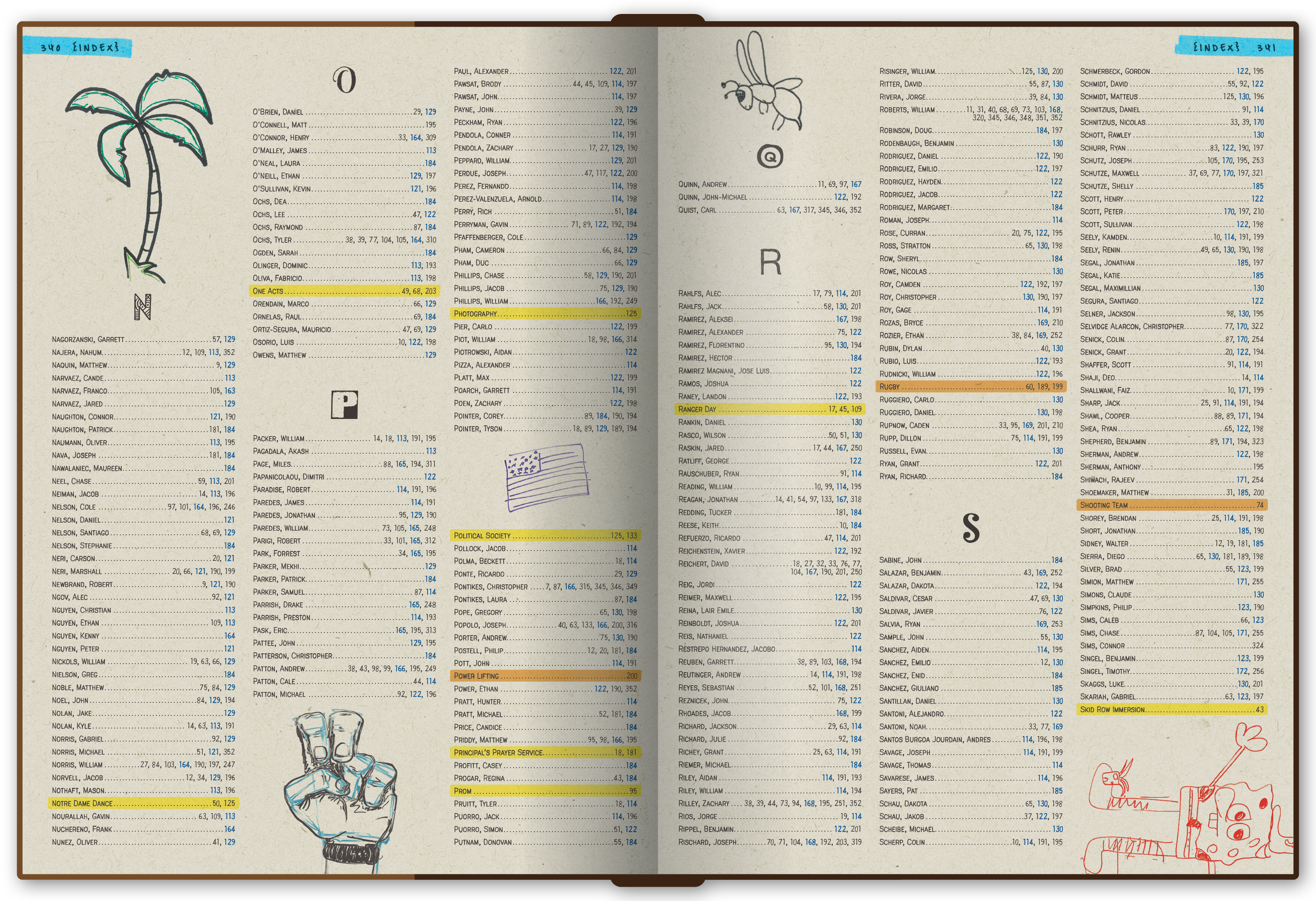
Creative direction was only part of running the publication. A yearbook is also a large production operation, with hundreds of page assignments, stories, photographs, deadlines, revisions, and handoffs happening at the same time.

I built custom tracking systems to help the staff manage writing and design assignments as well as the capture, selection, and editing of more than 100,000 photos in a typical year. Those tools reduced duplicated effort and gave editors a clearer picture of what was finished, what was falling behind, and where the team needed help.

Looking back, this was one of the places where I first started thinking in terms of creative systems: not just designing the final artifact, but designing the structure that made the work easier for a team to produce consistently.

Jesuit Dallas yearbook students working together in the publications lab. The publications lab functioned as both a classroom and a working creative studio, with students balancing writing, design, photography, and production deadlines.

2,416

Pages produced across the eight-year run

136

Student staff members mentored over eight years

100K+

Photos managed in a typical year

3

Awards or recognitions, including a "Book of the Year" honor

Yearbook is where I learned that creative direction is not about controlling every decision. Because the team changed every year, I had to build clarity quickly: help students understand the idea, give them useful guardrails, critique without taking over, and know when to step in when consistency or production quality needed it.

The moments I remember most are the ones when students stopped asking me what I thought and started explaining why they had made a decision. The strongest books were not the ones that looked most like something I would have designed alone. They were the ones where the staff understood the system well enough to push it somewhere I had not expected.

That lesson still shapes how I lead design work today: create a strong framework, give people the tools and confidence to use it, and leave enough room for them to make it better.